Worked example
Water Scarcity Map of India by District
You are a water resources analyst in a basin office and the summer contingency note is being drafted. Your sheet has the number of households on tanker supply by district and, beside it, a change in post-monsoon water level pulled from a different set of observation wells. One district is several times the next, and every map you have drawn so far comes out as one dark shape and twelve pale ones.
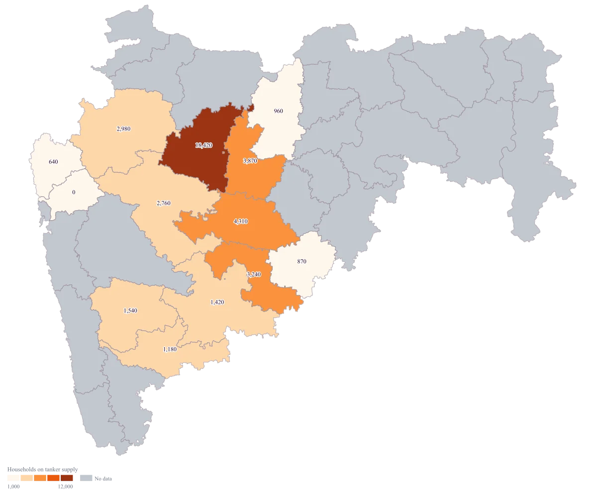
One map on which the worst district is visibly the worst and the ordering among the remaining twelve is still readable, rather than a map that says only "Aurangabad" and stops.
The four choices behind it
How this map was made
Four questions, in the order the builder asks them. Every picture below is the real renderer on the real geography, so this is the sequence you will see on your own screen.
- Step 1
Choose Maharashtra at district level.
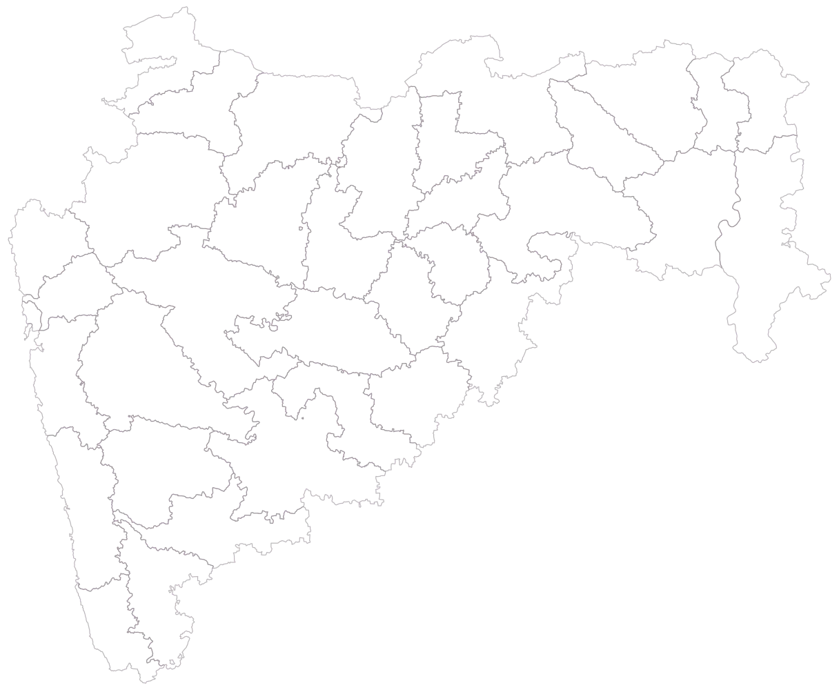
Thirty-six district outlines, empty, no legend. Count them against your sheet now. This is the vintage check: Palghar is drawn here as its own district beside Thane, so a source that still treats Thane as one district has a reconciliation to do before anything is pasted.
- Step 2
Paste the sheet with the district column first and let the names match.
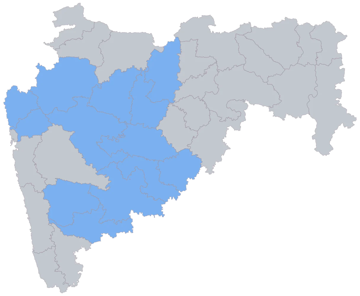
Thirteen districts turn flat blue and the other twenty-three stay grey. The flat fill is the point of this step: every joined district is the same blue whether it carries 18,420 or 0, so the outlier cannot distract you from the only question this picture answers. Sindhudurg matched by name and is grey anyway, because both its cells are empty — grey on this image means "nothing arrived here", and whether that is a spelling failure or a missing return is a question for the sheet.
- Step 3
Colour by the tanker column and take the plain defaults.
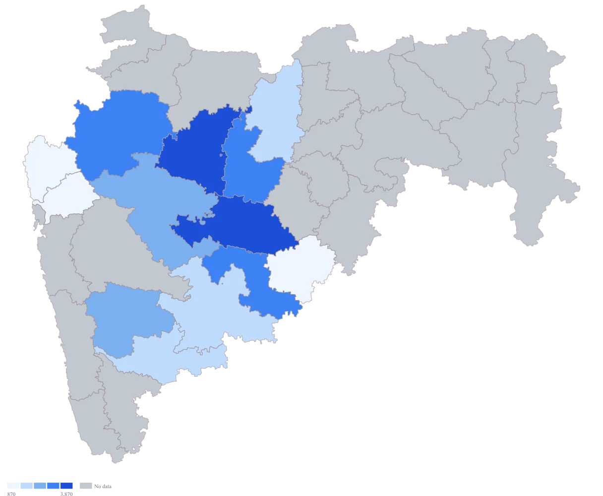
The map bands by rank, which keeps all five colours in use and avoids the wash that equal intervals would produce on this distribution. But the default breaks land at 870, 1,420, 2,760 and 3,870, so Aurangabad and Beed share the darkest band despite the fourfold gap between them, and the single most important fact on the sheet is exactly the one this picture cannot show.
- Step 4
Switch to the orange ramp, set a custom scale with breaks at 1,000, 3,000, 6,000 and 12,000, title the legend "Households on tanker supply" and turn value labels on.
Aurangabad now sits alone in the darkest orange and Beed drops a band, which restores the gap the rank scale had closed. The twelve remaining districts spread across three bands instead of crowding one, so the ordering through Beed, Jalna, Osmanabad and Nashik is readable off the colour. Value labels appear only where a value joined, so they print the count on each shaded district and leave grey Sindhudurg bare, and they put a legible 0 on Thane — a district supplied without tankers at all, which is a finding rather than a gap.
The sheet
Paste these columns straight from Excel. The first column names the place; the rest are numbers. Nothing is uploaded — your sheet is read in the browser.
| District | Households on tanker supply | Change in post-monsoon water level (m) |
|---|---|---|
| Aurangabad | 18420 | -3.4 |
| Beed | 4310 | -2.8 |
| Jalna | 3870 | -2.6 |
| Osmanabad | 3240 | -2.1 |
| Nashik | 2980 | -1.4 |
| Ahmednagar | 2760 | -1.7 |
| Satara | 1540 | -0.6 |
| Solapur | 1420 | -1.9 |
| Sangli | 1180 | -0.8 |
| Buldhana | 960 | -1.2 |
| Latur | 870 | -2.3 |
| Palghar | 640 | -0.4 |
| Thane | 0 | 0.3 |
| Sindhudurg | — | — |
Why this map
There is one operational number per district — households on tanker supply — and colour is the encoding that lets thirteen of them be compared at once. The distribution is the problem rather than the map: Aurangabad's 18,420 is more than four times Beed's 4,310 and is by itself more than two-fifths of the 42,190 households on this sheet. Thane is a genuine 0, supplied without tankers. All figures here are invented sample data made to demonstrate what an outlier does to a colour scale; they are not tanker figures, water levels or scarcity readings for Maharashtra or for any district in it.
What goes wrong
One district many times the rest flattens everything else. On equal intervals across this sheet the five bands are 3,684 wide, so ten of the thirteen coloured districts fall into the palest band, two bands in the middle come out empty, and the map reduces to Aurangabad plus a wash. The plain defaults band by rank instead, which fixes the wash — but rank banding has its own cost here: it puts Aurangabad and Beed in the same top colour, although Aurangabad is more than four times Beed, and a reader looking at two identical shapes has no way to know that.
Set the breaks by hand where an outlier is this severe, at values that mean something operationally rather than at whatever the data's quantiles produce — here 1,000, 3,000, 6,000 and 12,000, which leaves Aurangabad alone at the top and spreads the other twelve across three bands. The band between 6,000 and 12,000 comes out empty, and that is worth keeping rather than tuning away: the empty band is the gap between Aurangabad and everything else, drawn honestly. If the outlier is a data error rather than a finding, that is a different fix — correct the row, do not reshape the scale around it.
The two numeric columns here come from different places. The tanker count is an operational return from this season; the water-level change comes from observation wells, measured on their own schedule and, very often, for a different year. Subtracting one from the other, ranking on their difference, or drawing a single "stress index" from both produces a figure that looks precise and cannot be defended when somebody asks which year it describes.
Keep them as two columns, each with its own source and its own period written down, and map one of them at a time with the period in the legend title. Where both genuinely matter, map them side by side on the same geometry and let the reader do the comparison, rather than collapsing them into one number whose construction is invisible on the map. If a combined index is unavoidable, build it in the sheet where the weights are written out and can be argued with, and never on the map where they cannot.
The geometry is one administrative vintage and your sheet is very likely another. The shipped Maharashtra file carries 36 districts, including Palghar, which was created out of Thane — so a master that still reports Thane whole has no Palghar row at all, and its Thane figure quietly includes households the map is drawing in a separate district. Going the other way, a sheet built on the newer boundaries against an older geometry leaves the split district's rows with nowhere to land, and they simply do not appear.
Check the district count in your sheet against the count in the geography before you paste — 36 here — and reconcile the difference by name rather than assuming it is a spelling problem. Where a district has been split and your source predates the split, either aggregate the map back to the parent for this figure or state in the caption which vintage you used and which districts are affected. This is a reconciliation the map cannot do for you: a row that matches nothing is not reported anywhere on the finished image.
Other worked examples
- District-Wise Heat Map of India — Madhya Pradesh, district, colour
- Population Density Map of India by District — Pan India, district, colour
- Survey Results Map of India — Odisha, district, colour
- India Market Share Heat Map — Pan India, district, colour