Worked example
Survey Results Map of India
You ran the survey, and the district table is now in front of you: one percentage per district, and a respondent count beside it that runs from a handful to several hundred. The report needs a map, and the map will be the only part of the report most readers look at properly.
A map that shows where the finding is strong and stays honest about where you barely asked, so a district resting on eleven interviews is not coloured with the confidence of one resting on nine hundred.
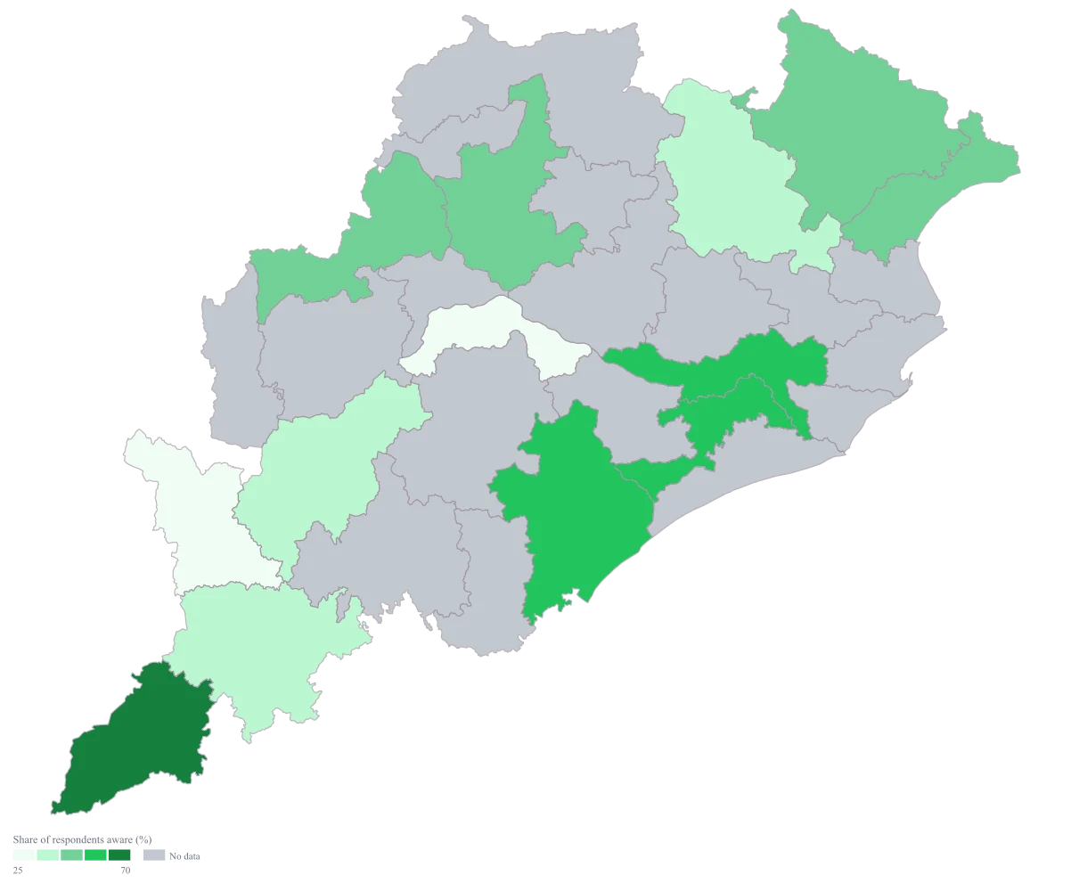
The four choices behind it
How this map was made
Four questions, in the order the builder asks them. Every picture below is the real renderer on the real geography, so this is the sequence you will see on your own screen.
- Step 1
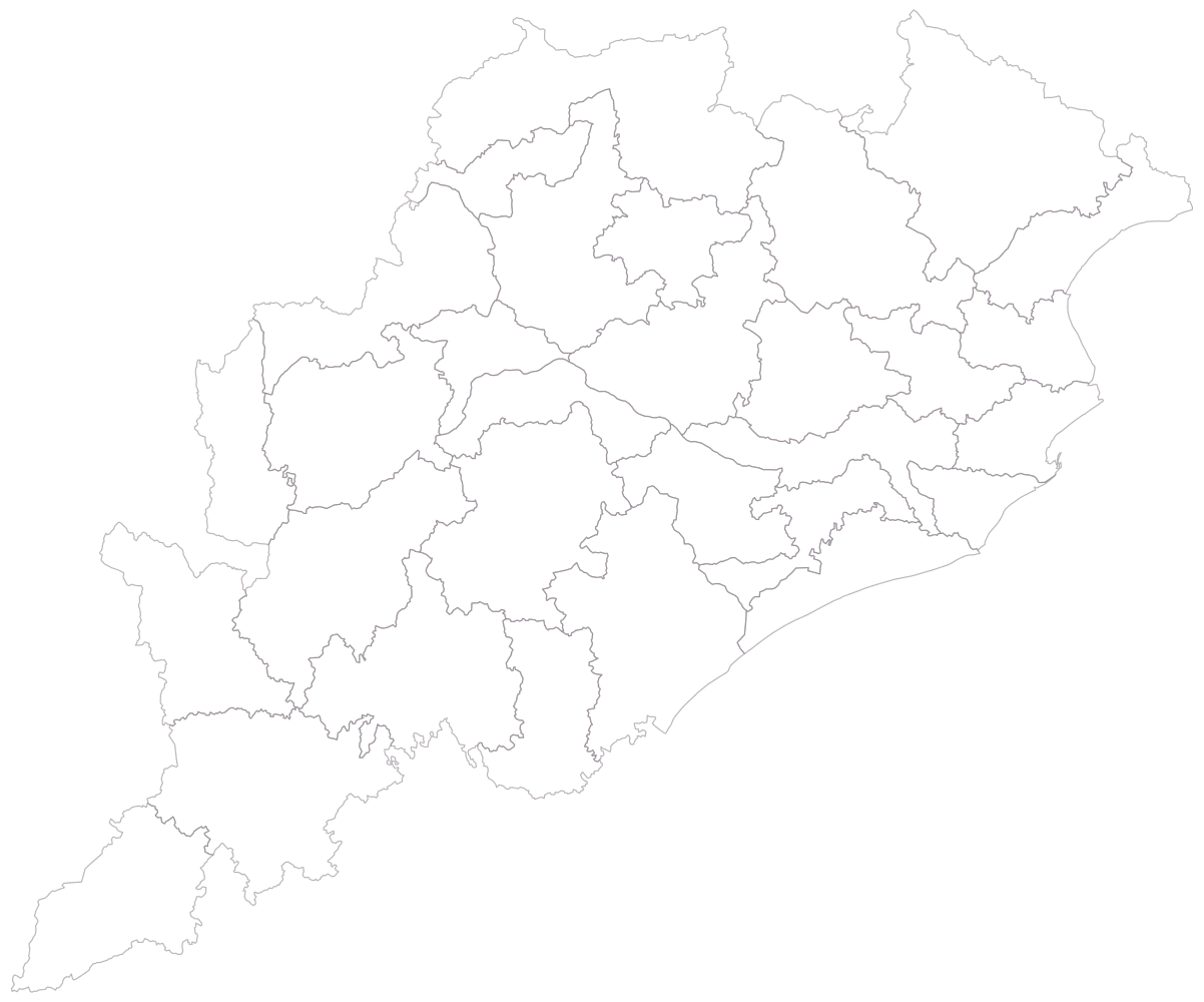
Choose Odisha at district level, the unit the study was sampled and reported at.
The districts arrive empty, which is the moment to confirm that every district a team went to is drawn here, and that none has been split or renamed since the sample was designed.
- Step 2
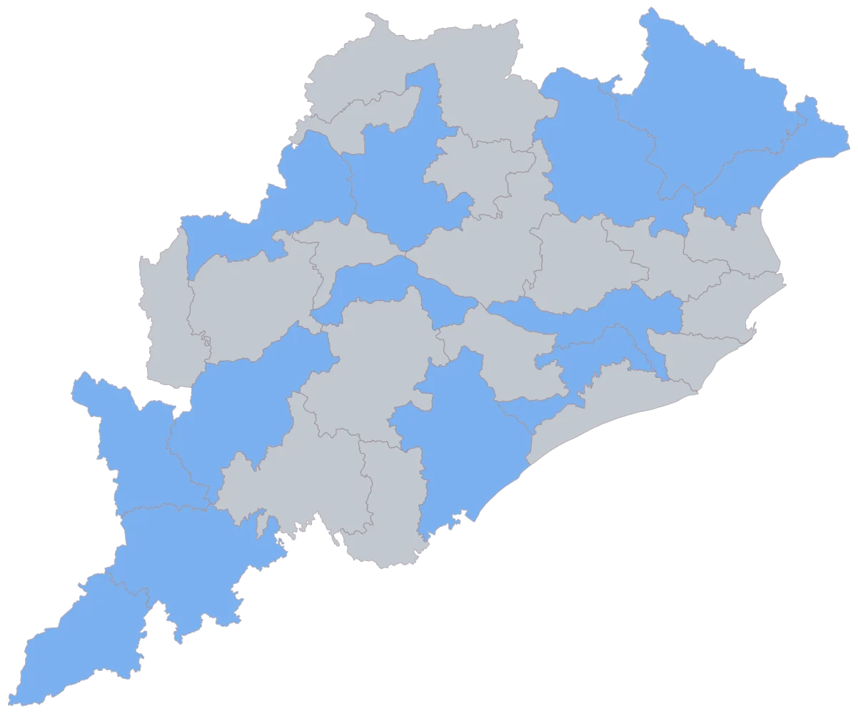
Paste the district column with the awareness percentage beside it, and keep the respondent count in the sheet as a third column.
Thirteen districts shade flat and the rest of the state stays grey, so the reach of the fieldwork is visible before the finding is. Deogarh is grey because the fieldwork there was not completed, which is not a low reading and must not be read as one.
- Step 3
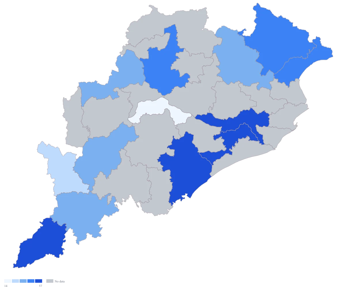
Send the awareness column to area colour and leave the scale on automatic.
Five even bands appear, and they overstate what you know: Malkangiri, resting on eleven interviews, lands in the top band beside Khordha on 912 and is drawn with exactly the same confidence.
- Step 4
Set the scale to custom breaks at 25, 40, 55 and 70 on a green ramp, and title the legend Share of respondents aware (%).
Fifteen-point bands replace the automatic cut, so two districts take different colours only when the gap between them is wider than the sampling error you are prepared to defend in the appendix. The legend now claims the respondents rather than the district, which is as far as an unweighted estimate can honestly reach.
The sheet
Paste these columns straight from Excel. The first column names the place; the rest are numbers. Nothing is uploaded — your sheet is read in the browser.
| District | Aware of the programme (%) | Respondents interviewed |
|---|---|---|
| Malkangiri | 71.4 | 11 |
| Khordha | 68.4 | 912 |
| Cuttack | 61.2 | 754 |
| Ganjam | 57.8 | 688 |
| Sambalpur | 54.1 | 402 |
| Baleshwar | 49.6 | 511 |
| Mayurbhanj | 44.3 | 466 |
| Bargarh | 41.7 | 288 |
| Kendujhar | 38.2 | 310 |
| Kalahandi | 33.5 | 197 |
| Koraput | 29.8 | 164 |
| Nabarangpur | 24.6 | 112 |
| Boudh | 0 | 96 |
| Deogarh | — | — |
Why this map
The mapped value is a share of respondents, which is a rate, so colour carries it and the respondent count stays on the sheet as the check on whether a band means anything at all. The figures here are illustrative sample data and are not a finding about any real programme or any real district.
What goes wrong
Malkangiri reads 71.4 per cent on eleven respondents and would sit among the darkest districts on the map. At that base the ninety-five per cent interval around the estimate runs to roughly twenty-seven percentage points either side, which is compatible with almost half the ramp; Khordha, on 912 respondents, has an interval of about three points. The map draws both as flat colour, and no hatching or texture exists to mark one of them as uncertain, so it states the two with equal confidence.
Decide the minimum base before you look at the results and blank every district below it, so those are drawn as no-data instead of colouring the map. For the rest use three or four bands wider than your margin of error rather than a smooth ramp, so two districts take different colours only when the difference survives the sampling error, and put the respondent count in the tooltip so any district you are challenged on can be checked. Deogarh is blank here because the fieldwork was not completed, which is the same grey — say in the caption that grey means not measured.
An unweighted district percentage describes the people who were interviewed, not the district. If most of one district's interviews happened in its largest town because that is as far as the team could reach in a day, while another's were spread across villages, then part of what the ramp shows is the fieldwork plan. The map has no way to know that and will present it as a geographical pattern.
Map the weighted estimate if the study has design weights, and name the weights in the caption. If it has none, title the legend "share of respondents" rather than "share of the district", and keep the achieved sample's composition in an appendix, because the claim the map can support is about your respondents and goes no further.
One colour per district carries one option and no more. Boudh is a genuine 0 here — nobody answered yes — and what the map cannot say is what those respondents did answer: no, or that they did not know, or nothing at all. A reader looking at the pale district will assume the first, and a district low on "yes" through lack of awareness needs a different response from one low on "yes" because the question was not understood.
Keep every option's share in the sheet, state in the caption what the complement of the mapped option contains, and where the do-not-know share is large enough to change the reading, publish a second map of that option beside the first. Fix the denominator once and use it everywhere as well: a percentage of all respondents in some districts and of valid answers in others is two different measures sharing one ramp.
Other worked examples
- District-Wise Heat Map of India — Madhya Pradesh, district, colour
- Population Density Map of India by District — Pan India, district, colour
- India Market Share Heat Map — Pan India, district, colour
- District Prioritisation Map for India — Pan India, district, colour