Worked example
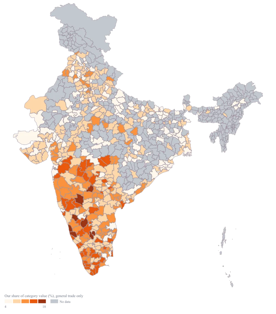
India Market Share Heat Map
You handle category insights for a consumer brand, and the retail panel report lands as a district table every quarter. Your own billing tells you where you sell; the panel tells you what the category did; the number leadership actually asks for is the ratio, and the table hides the places where that ratio is built on four audited outlets.
A single ramp that shows where you are strong relative to the category rather than absolutely — so a district contributing modest rupees but holding a fifth of its category stops looking like a weak market, and a large district you thought you owned turns out to be a large district you merely appear in.
The four choices behind it
How this map was made
Four questions, in the order the builder asks them. Every picture below is the real renderer on the real geography, so this is the sequence you will see on your own screen.
- Step 1
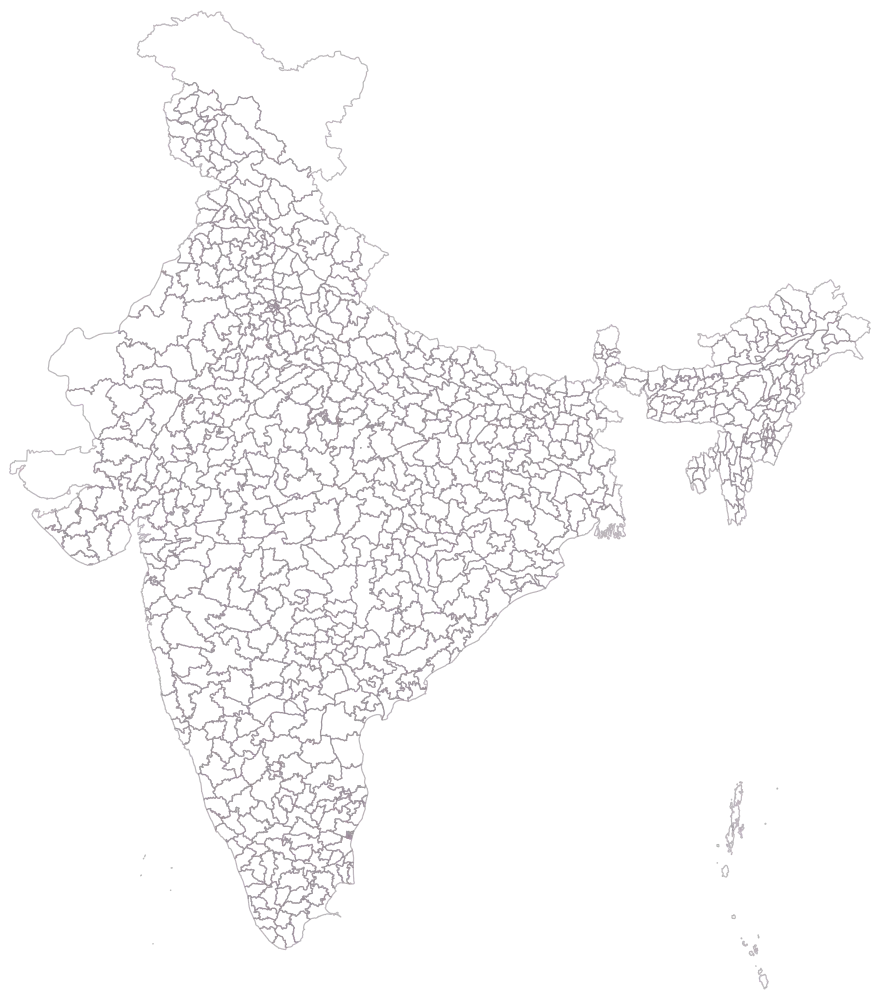
Choose Pan India at district level, since the panel reports by district and that is as fine as a share can honestly be drawn.
You get 785 empty outlines, and with them the scale of the claim you are about to make: the panel tracks 461 of these districts, not the country.
- Step 2
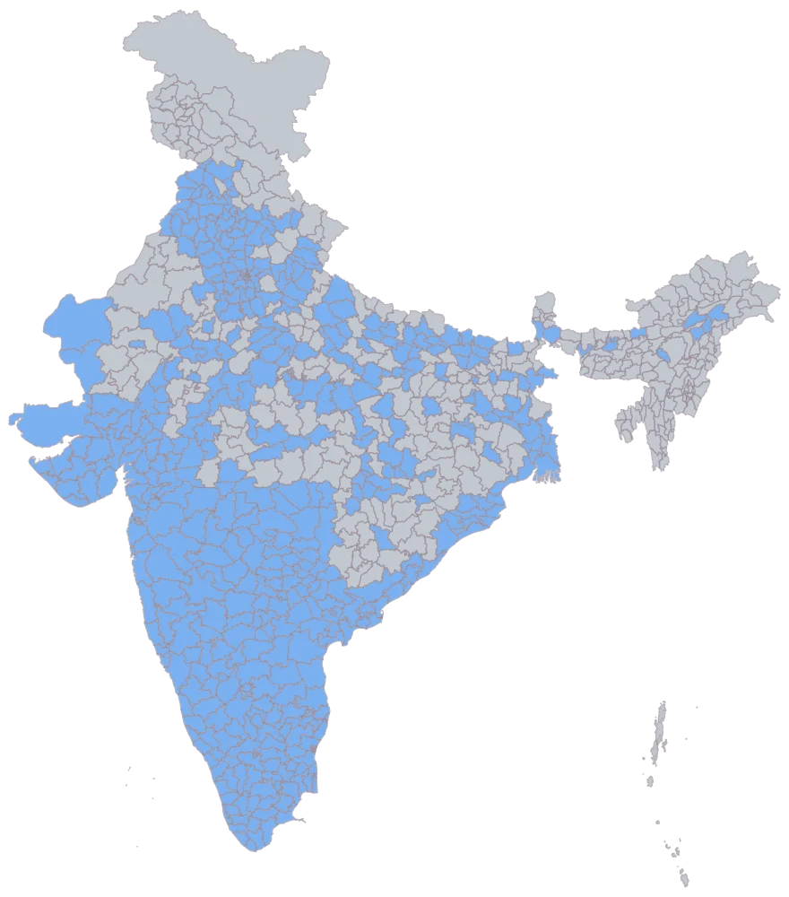
Paste the district column with your share of category value beside it.
460 districts shade flat blue and 325 stay grey. Grey here means the panel does not cover the district, not that your share is nil, and Shravasti is grey by your own choice because 90 lakh of tracked category value is too thin a base to publish a share on.
- Step 3
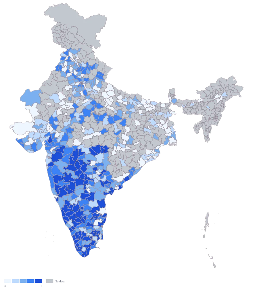
Send the share column to area colour.
The ramp arrives and reads plausibly, and that is the trouble. The column is lopsided, so the automatic scale cuts by rank: the top band holds the 89 districts above 10.5, which draws Udupi at 22.1, Dakshina Kannada at 18.4 and a district on 10.6 in one colour. The legend has no title either, so nothing on the map says what universe the percentage is a percentage of.
- Step 4
Take the ramp to orange, pin the scale to equal intervals, and title the legend Our share of category value (%), general trade only.
Pinning the scale to equal intervals holds the bands at a fixed width cut from the value range — 4.4 share points each here — so a band is always the same number of share points and the scale will not quietly switch to a rank-based cut when next quarter arrives more lopsided. The top band thins out to the 8 districts above 17.7, which is the honest shape of the sheet: strength that concentrated should look concentrated. The orange ramp separates this map from every other district map in the pack, and the legend carries the universe with it, which is the one caption line this map cannot afford to lose on the way into a slide.
The sheet
Paste these columns straight from Excel. The first column names the place; the rest are numbers. Nothing is uploaded — your sheet is read in the browser.
| District | Our share of category value (%) | Category value tracked (₹ lakh) |
|---|---|---|
| Udupi | 22.1 | 690 |
| Dakshina Kannada | 18.4 | 1240 |
| Nagpur | 16.5 | 1810 |
| Virudhunagar | 14.2 | 760 |
| Solapur | 12.9 | 980 |
| Shivamogga | 11.6 | 810 |
| Kolar | 9.8 | 520 |
| Saharanpur | 8.4 | 1150 |
| Chikkaballapura | 7.3 | 430 |
| Theni | 6.1 | 380 |
| Tenkasi | 4.7 | 340 |
| Gonda | 0 | 470 |
| Shravasti | — | 90 |
| 24 Paraganas North | 6 | 630 |
| 24 Paraganas South | 3.1 | 740 |
| Adilabad | 3.1 | 820 |
The first 16 rows of 461. The map above is drawn from all of them — a national map wants a national sheet, and yours will be longer than this too.
Why this map
Share is already a ratio, so there is nothing left to size — the whole story is the ramp, and adding bubbles would only draw the same number twice.
What goes wrong
The numerator and the denominator come from different places. Your share is your billing divided by a panel universe, and if your billing includes institutional or e-commerce volume that the panel does not audit, the ratio drifts upward district by district. A value above 100% is the obvious symptom; values quietly inflated by a third are the common one.
Restrict the numerator to the same trade the panel measures before you divide, and state the universe in the caption — general trade only, modern trade included, and so on. Reconcile one district by hand against the panel definition; if you cannot make it tie, the map is not ready to show.
A share computed on a thin panel is arithmetic, not an estimate. Shravasti here has only ₹90 lakh of category value tracked, which may be a handful of outlets, and a single audit correction can move its share by several points and change its colour band.
Set a minimum tracked base — pick the threshold your panel provider recommends — and blank the share cell for any district below it rather than publishing a number you would not defend. The map draws those districts as no-data, which is the correct statement: you do not know. Note Gonda, by contrast, has a real 0 because you do not sell there at all, and that belongs on the scale.
Share is only comparable across districts if the category means the same thing everywhere. If the panel counts loose and unbranded product in some regions and only packaged in others, the ramp is mapping the panel’s definitions rather than your performance, and the north-south pattern you are about to explain is an artefact.
Pull the category definition per region from the panel documentation and confirm it is constant across every district you are mapping. Where it is not, map the subset of districts that share one definition and make a second map for the rest, rather than one map with a footnote nobody reads.
Other worked examples
- District-Wise Heat Map of India — Madhya Pradesh, district, colour
- Population Density Map of India by District — Pan India, district, colour
- Survey Results Map of India — Odisha, district, colour
- District Prioritisation Map for India — Pan India, district, colour