Worked example
Population Density Map of India by District
You are writing up research — a paper, an article, a term submission — and district density is the exhibit that carries the argument. You have a population column and an area column in a spreadsheet, and what you need is a map a reader can take in at one pass without being quietly misled by it.
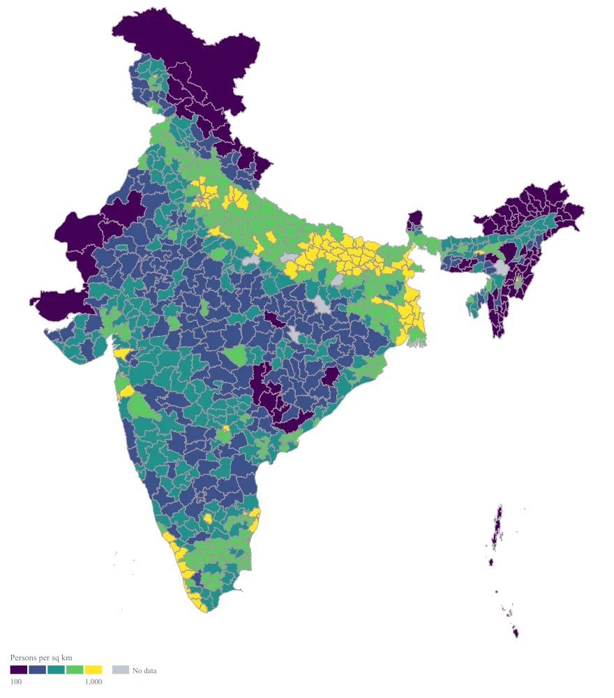
One shaded map of persons per square kilometre across India, with the ramp doing the reading and the arithmetic behind it still visible in the sheet beside it.
The four choices behind it
How this map was made
Four questions, in the order the builder asks them. Every picture below is the real renderer on the real geography, so this is the sequence you will see on your own screen.
- Step 1
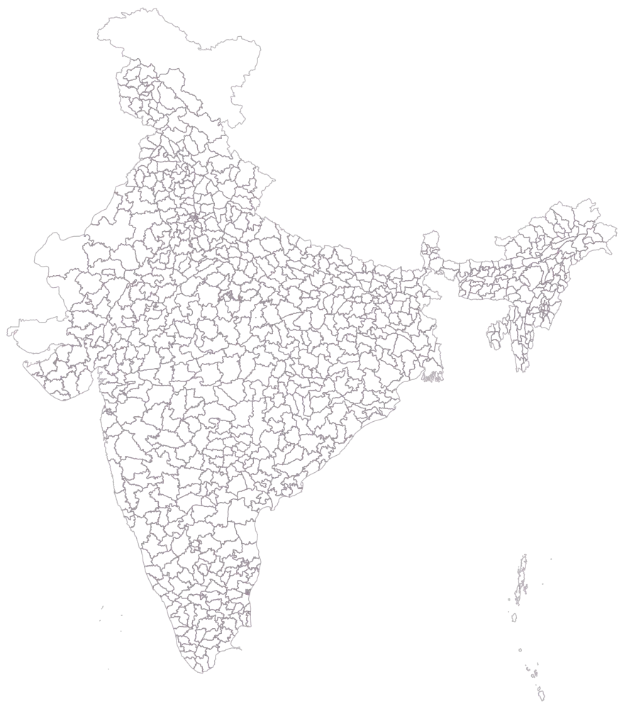
Pick Pan India at district level, since the exhibit is an argument about the country rather than about one state.
All 785 district outlines are drawn empty, and they state the difficulty before any number does: Jaisalmer and Barmer already hold a large part of the frame, and Howrah is a shape you have to be told to look for.
- Step 2
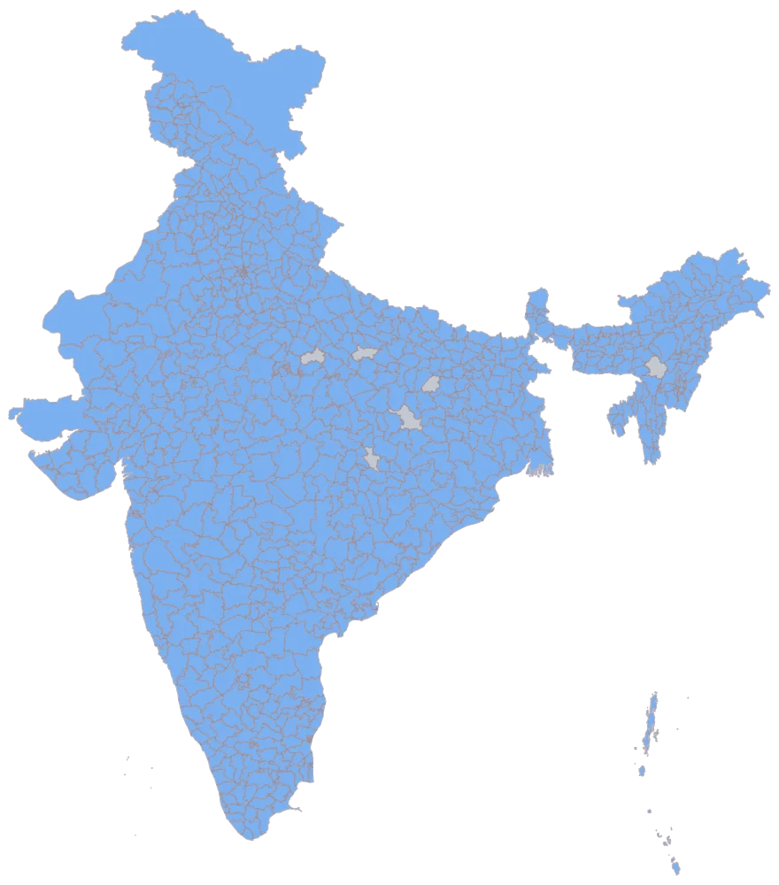
Paste the district column with the persons-per-square-kilometre figure you computed beside it.
779 districts take a flat blue and six stay grey. That picture is the join, not the finding: it shows which rows found their geometry, and Dima Hasao staying grey tells you the area column failed to join for it. The other five are a limit of the location column rather than of your data — Aurangabad, Balrampur, Bilaspur, Hamirpur and Pratapgarh each name two different districts in this geometry, and a column of bare district names can only address one of each pair however complete the sheet is.
- Step 3
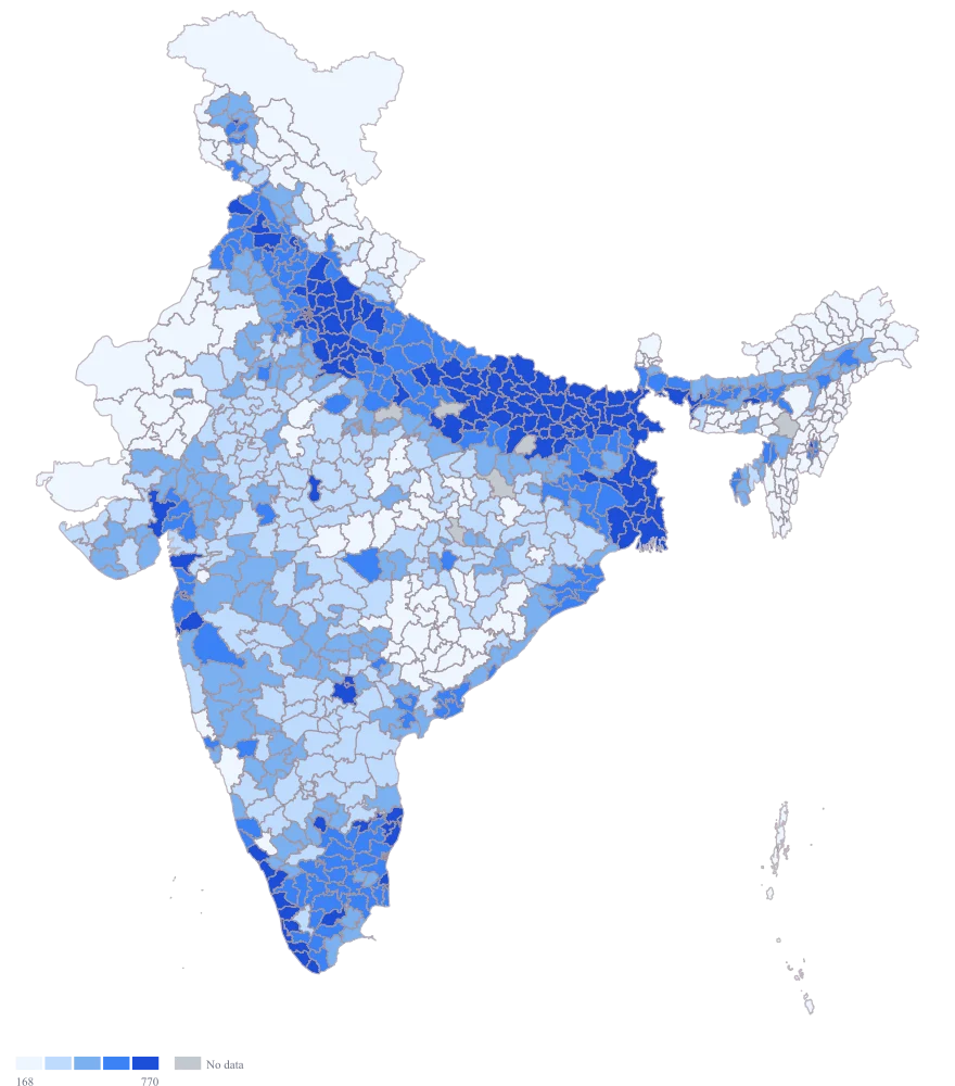
Send the density column to area colour and leave the scale alone.
The column is lopsided enough that the automatic scale abandons equal widths and cuts the five bands by rank instead, so each band holds about 156 districts and the breaks land at 168, 271, 436 and 770 persons per sq km. Those four numbers are positions in this sheet’s own ordering: drop a state, or map next year, and every one of them moves.
- Step 4
Set the scale to custom breaks at 100, 250, 500 and 1000, take the ramp to viridis, and title the legend Persons per sq km.
The bands are now quantities rather than positions in a ranking: 91 districts fall below 100 persons per sq km, 104 sit above 1000, and the crowded middle splits at 250 and 500. A colour therefore means the same thing on this map as on the next one cut the same way, which a rank-based band cannot promise. The thin end still shares one colour — five bands cannot separate Lahul And Spiti at 2 from Barmer at 92 and also carry the districts in the thousands — so that belongs in the ranked table beside the map. Viridis keeps the order legible for a colour-blind reader and in a greyscale print of the paper, which a light-to-dark blue does not reliably do.
The sheet
Paste these columns straight from Excel. The first column names the place; the rest are numbers. Nothing is uploaded — your sheet is read in the browser.
| District | Persons per sq km | Urban population share (%) |
|---|---|---|
| Howrah | 3180 | 63.5 |
| Kamrup Metro | 2290 | 82.6 |
| Patna | 1840 | 43.1 |
| Vaishali | 1490 | 8.9 |
| Thrissur | 1060 | 67.4 |
| Ludhiana | 980 | 59.2 |
| Jaipur | 760 | 52.4 |
| Nagaon | 640 | 12.8 |
| Barmer | 92 | 7.2 |
| Chamoli | 48 | 15.3 |
| Jaisalmer | 17 | 14.6 |
| Kinnaur | 13 | 9.4 |
| Lahul And Spiti | 2 | 0 |
| Dima Hasao | — | — |
| 24 Paraganas North | 2720 | 59.3 |
| 24 Paraganas South | 930 | 32.1 |
The first 16 rows of 780. The map above is drawn from all of them — a national map wants a national sheet, and yours will be longer than this too.
Why this map
Density is already a ratio — the population has been divided by the land — so there is nothing left for a bubble to carry. Sizing a circle by density would draw the same rate a second time and invite a reader to add the circles up, which a rate does not permit. Colour is the honest encoding: the ramp carries the rate, and the two columns it came from stay on the sheet. The figures here are illustrative and are not census values.
What goes wrong
A rate cannot be sized and cannot be averaged. Sized, a district holding few people across a lot of land draws a circle that says "more". Averaged, the 779 rates on this sheet produce a number belonging to no place at all: the density of a group of districts is their total population over their total area, never the mean of their densities.
Colour the rate and leave bubbles switched off. Keep the population and area columns beside the density column, so that any figure you quote in the prose — a state, a region, the whole set — is computed from those totals rather than read off the legend.
The map spends its ink on land, not on people. Jaisalmer and Barmer are among the largest districts in the country and will hold a large part of the frame at the pale end of the ramp, while the districts at the crowded end are small enough to be specks — Howrah is a shape a reader has to be told to look for. The impression the map leaves is therefore emptier than the population it describes, and no setting repairs that: this is a district map, not a cartogram, so it cannot resize a district to match its people.
Say so in the caption in one line, and print a short ranked table of the densest districts beside the map so the places it cannot draw legibly are at least named. Where the crowded end is the whole point of the exhibit, map one state or one cluster of districts instead of all of India, so those shapes get the room to be seen.
Density is two numbers, and the one that goes wrong is the area. Population and area usually arrive from different tables, and an area column that is in square miles for a few rows, or that measures the revenue district rather than the district the map draws, yields a density that is wrong and entirely plausible. Nothing on the map can flag it.
Compute the density yourself in the sheet from the two columns instead of importing a density column somebody else calculated, and check one district by hand against its published area. Note which side of the division failed when a district is blank: Dima Hasao is blank here because the area did not join, not because the population is unknown. Set no-data to grey and say in the caption that grey means not computed — a genuine 0, like the urban share for Lahul And Spiti, is a measurement and belongs on the scale.
Other worked examples
- District-Wise Heat Map of India — Madhya Pradesh, district, colour
- Survey Results Map of India — Odisha, district, colour
- India Market Share Heat Map — Pan India, district, colour
- District Prioritisation Map for India — Pan India, district, colour