Worked example
District-Wise Heat Map of India
You look after operations planning and the monthly review pack is due. Your system gives you one number per district — a volume, a count, a total — as a long export, and the slide carrying it is still a fifty-row table nobody reads past the top five.
One shaded map that puts the whole state on a single slide, so the pattern is settled in the first few seconds and the meeting can move on to what to do about it.
The four choices behind it
How this map was made
Four questions, in the order the builder asks them. Every picture below is the real renderer on the real geography, so this is the sequence you will see on your own screen.
- Step 1
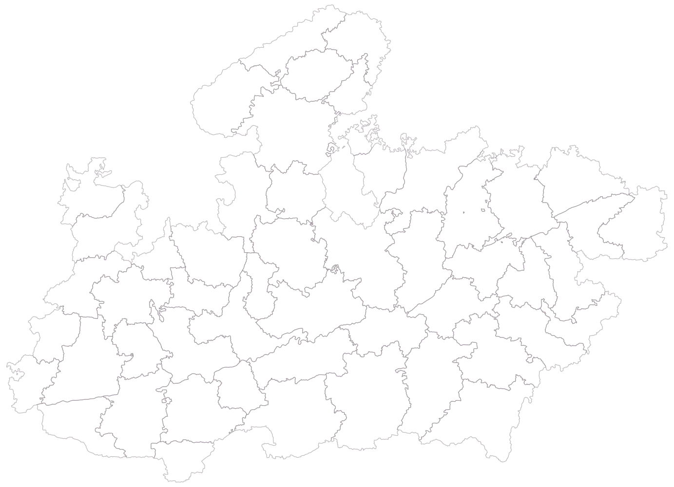
Choose Madhya Pradesh at district level, so the map draws every district in the state and nothing outside it.
The state arrives in outline only, no colour and no legend, which is the moment to check that the boundaries drawn here are the ones your operation is actually keyed to.
- Step 2
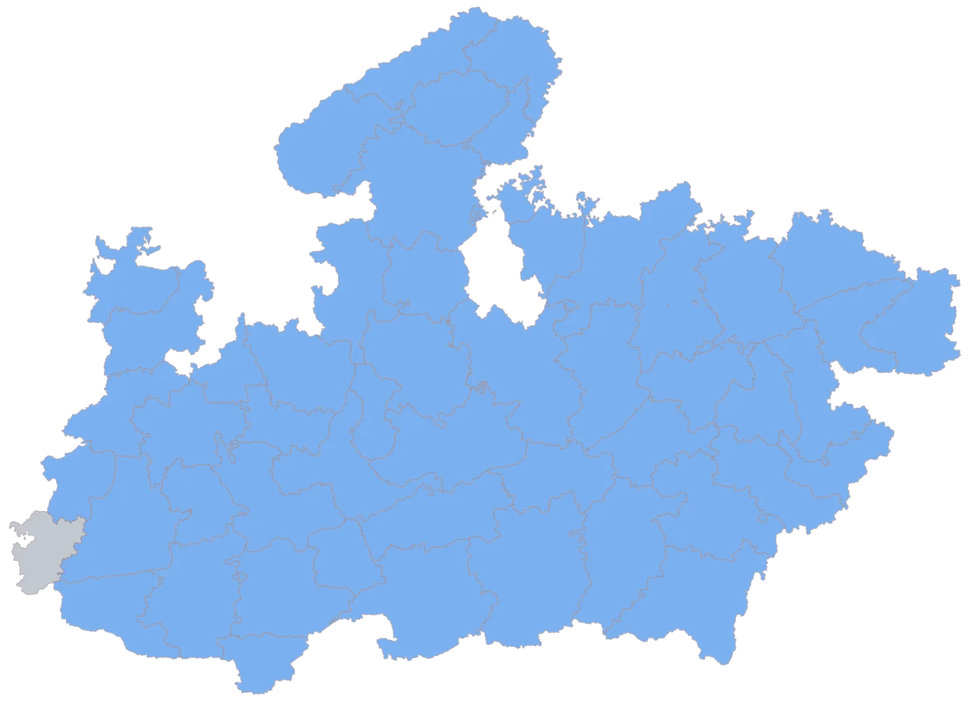
Paste the two columns, District and Volume handled, and let the sheet match on the district name as the geometry spells it.
Fifty-one districts come up in one flat blue and Alirajpur alone stays grey, because its cell is empty. Any second grey district would be one your export never named, or named differently, which is where East Nimar against Khandwa catches people.
- Step 3
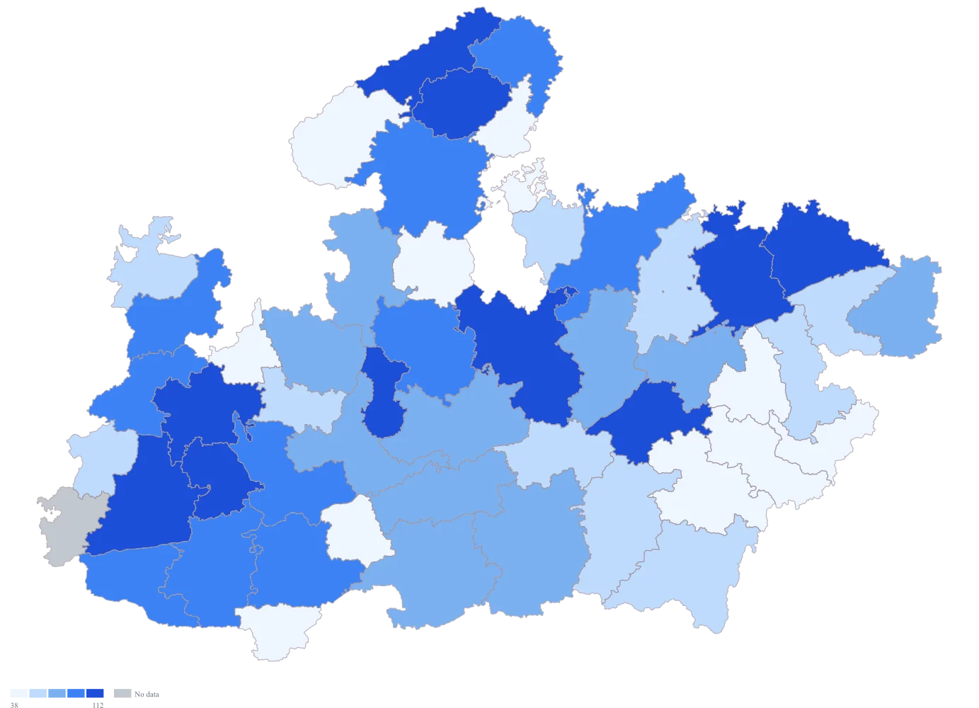
Send the volume column to area colour and switch the legend on.
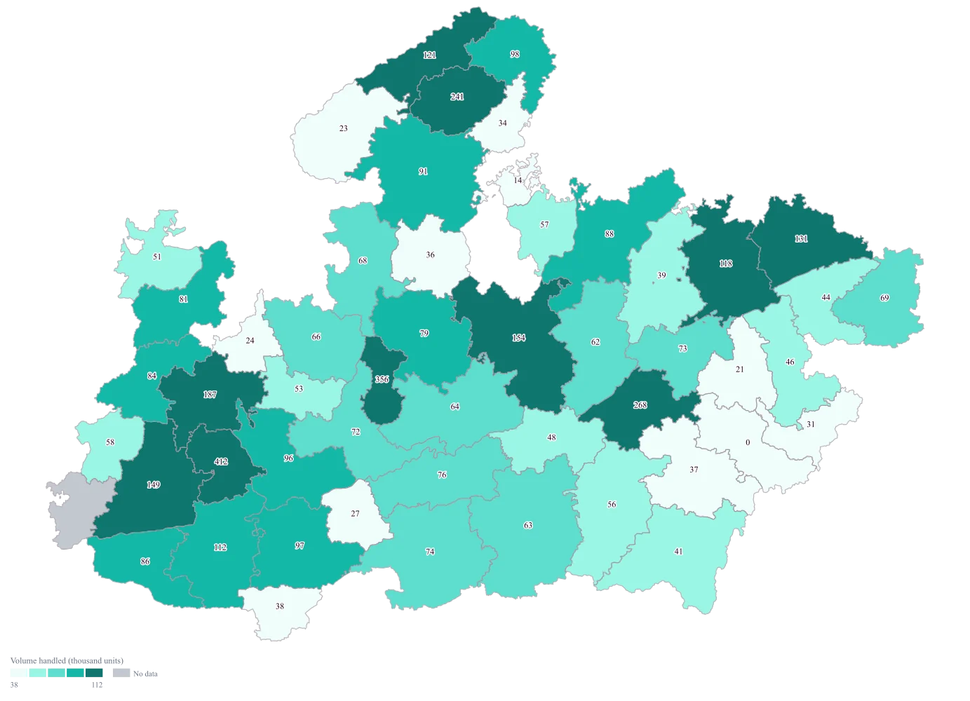
The column is lopsided enough that the automatic scale cuts its five bands by rank rather than by width, putting ten or eleven districts in each and landing the breaks at 38, 58, 76 and 112. Indore and Bhopal take the dark end, Dindori, Niwari and Umaria the pale one, and Dindori draws its real 0 in the lightest band rather than dropping off the map.
- Step 4
Take the ramp to teal, switch value labels on, and title the legend Volume handled (thousand units).
The numbers now sit on the districts, so you can tie the map back to the sheet without hovering anything, and the 412 on Indore against the 41 on Balaghat is stated rather than inferred from two shades. Dindori carries a printed 0 while Alirajpur carries no label at all, which is the distinction the colour alone could not make.
The sheet
Paste these columns straight from Excel. The first column names the place; the rest are numbers. Nothing is uploaded — your sheet is read in the browser.
| District | Volume handled (thousand units) |
|---|---|
| Indore | 412 |
| Bhopal | 356 |
| Jabalpur | 268 |
| Gwalior | 241 |
| Ujjain | 187 |
| Sagar | 154 |
| Rewa | 131 |
| Satna | 118 |
| Dewas | 96 |
| Ratlam | 84 |
| Chhindwara | 63 |
| Balaghat | 41 |
| Dindori | 0 |
| Alirajpur | — |
| Agar Malwa | 24 |
| Anuppur | 31 |
The first 16 rows of 52. The map above is drawn from all of them — a national map wants a national sheet, and yours will be longer than this too.
Why this map
There is one number per district and nothing to compare it against, so shading each district by that number is the whole map. Indore and Bhopal together carry a sixth of the mapped volume, and Indore alone is about ten times Balaghat — differences a sorted table states but never lets anybody see at once.
What goes wrong
The map joins on the district name as the geometry spells it, and your export almost certainly spells some districts differently. The geometry here carries East Nimar for the district most systems call Khandwa, and Narmadapuram for what older masters still call Hoshangabad. A row that does not match is not announced anywhere on the map: the district simply comes out blank beside a coloured neighbour.
Take the district names from the map's own list, match your export to them before you upload, and check the number of rows that matched against the number you pasted. If you later map all of India, carry the state column too — a bare district name is not unique, and Aurangabad sits in both Bihar and Maharashtra while Hamirpur sits in both Himachal Pradesh and Uttar Pradesh.
Long exports usually end in rows that are not districts: a grand total, and an "Others" or "Unallocated" bucket holding the volume the system could not attribute anywhere. The total row matches nothing and vanishes, the unallocated bucket vanishes with it, and the map then shows less volume than your own report does. Nobody catches it until somebody adds up the tooltips.
Delete the total row, then add the mapped values up yourself and tie the sum to your report. Whatever is missing is the unattributed volume, and it belongs in the caption as a stated figure rather than being left off the map in silence.
Numbers written the way a report formats them do not parse. A value typed as 1,24,500, a cell carrying a currency symbol or a per cent sign, a footnote marker, a trailing space — each of those arrives as no data, and a district that failed to parse looks exactly like a district you never had a figure for. The no-data styles are grey, white, none and custom, so there is no hatching available to mark "this one broke".
Strip the column to plain numbers before pasting, then read the map back against the sheet once. Dindori here is a real 0 — covered, and handled nothing — while Alirajpur is genuinely blank. If a second district turns up blank, that is a parsing failure rather than a gap in your operations.
Other worked examples
- Population Density Map of India by District — Pan India, district, colour
- Survey Results Map of India — Odisha, district, colour
- India Market Share Heat Map — Pan India, district, colour
- District Prioritisation Map for India — Pan India, district, colour