Worked example
Voter Turnout Map of Uttar Pradesh by Constituency
You are the desk editor putting the turnout page together, the copy is filed, and the art has to be with the press by ten. The Commission's seat-wise table is open in front of you and the map that goes with it has to survive two things at once: a reader giving it four seconds over breakfast, and a print run in black and white on newsprint.
One map of all eighty of Uttar Pradesh's constituencies in which the eighteen-point spread between the busiest and the quietest seat is actually visible, and which still reads as a map after the plate has thrown away every colour you chose.
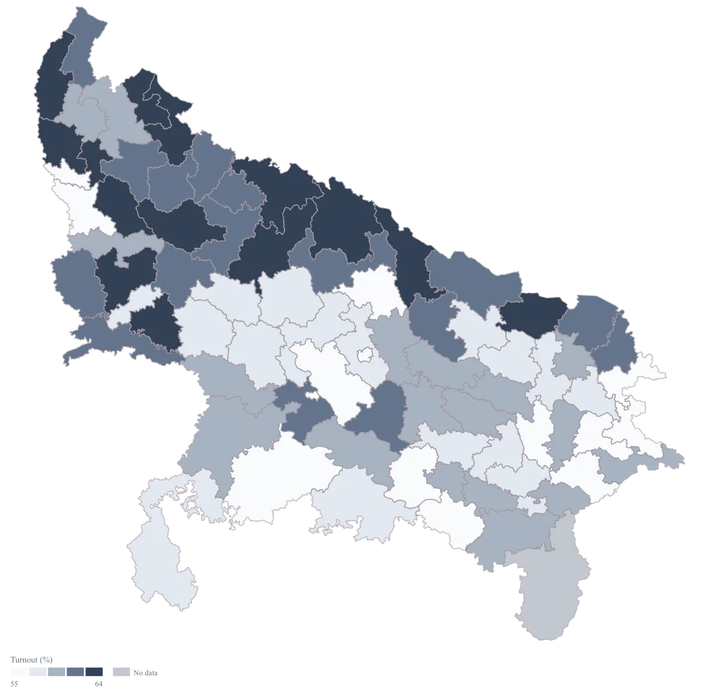
The four choices behind it
How this map was made
Four questions, in the order the builder asks them. Every picture below is the real renderer on the real geography, so this is the sequence you will see on your own screen.
- Step 1
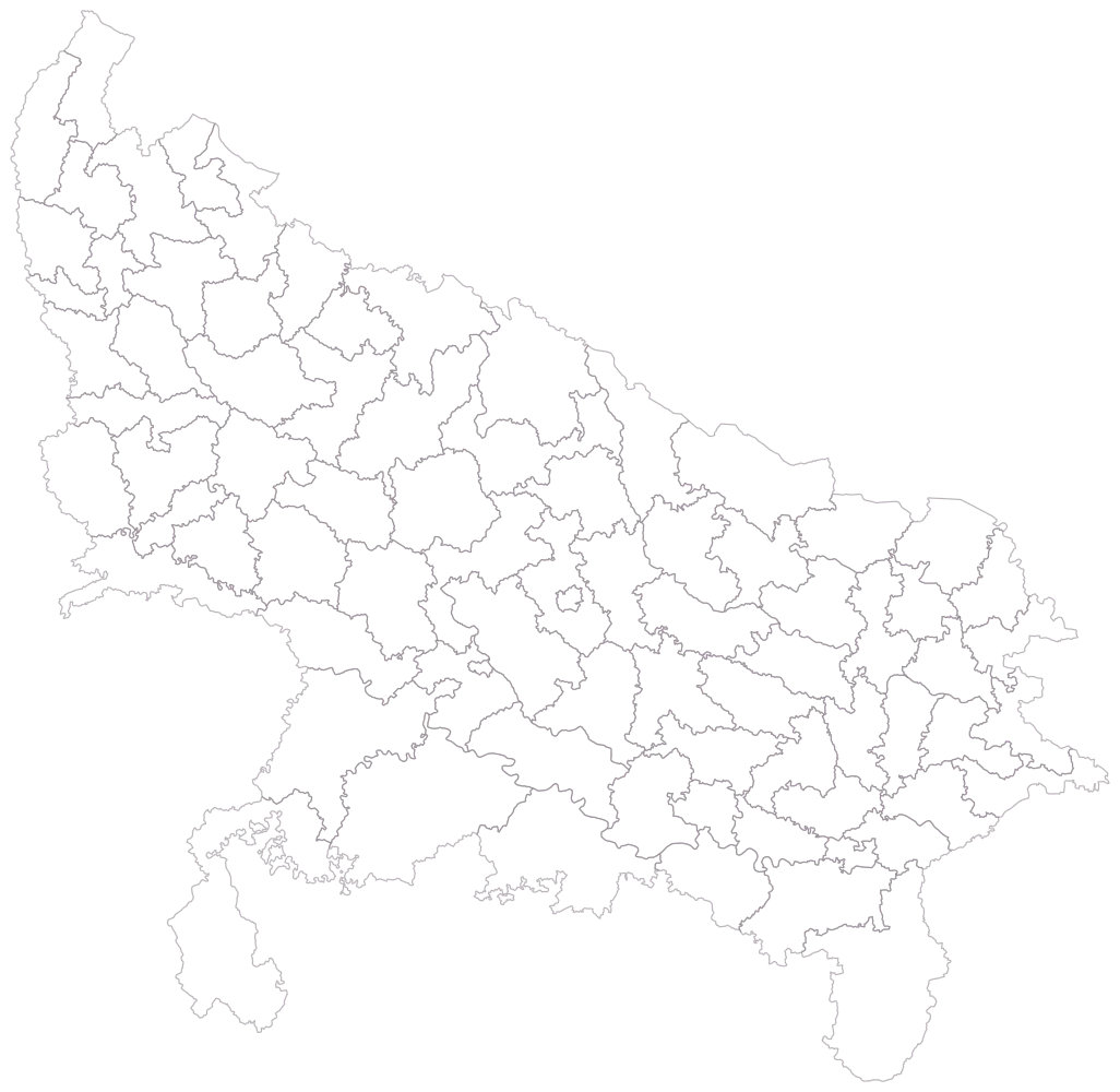
Choose the Parliamentary level and set the area to Uttar Pradesh, then look at the bare outline.
All eighty of the state's seats are drawn empty, with no colour and no legend. They are noticeably more even in size than a district map of the same state would be, because seats are cut to hold roughly equal numbers of people — which is exactly why an area on this map is a poor guide to anything except itself.
- Step 2
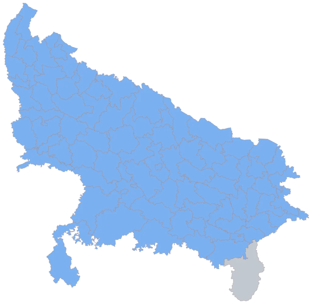
Paste the seat-wise table with the constituency in the first column, and read the unmatched list.
All eighty names resolve, seventy-nine seats come up in one flat blue and the state has no holes in it. The one grey seat is Robertsganj, and it is grey because its row is empty rather than because its name failed — which is the distinction this picture cannot draw for you and your unmatched list can. A seat you expected to be blue and is not has a spelling problem, and on a full-coverage sheet that is the only thing grey can mean once you have accounted for your blanks.
- Step 3
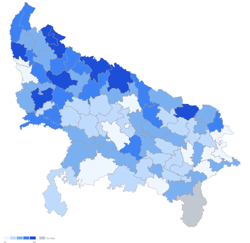
Point the colour at the turnout column and leave the scale on automatic.
The spread is wide but not lopsided, so the automatic scale stays on even widths and the bands fall at roughly 54.8, 58.4, 62.1 and 65.7 — even intervals across the range your data actually occupies, which already spreads the seats far better than a nought-to-hundred scale would. It is a usable map, but the intervals are set by the two extreme seats rather than by anything a caption can quote, it is in the default blue, the legend is untitled, and nothing on it tells a reader that the palest seat is 51 per cent rather than nothing.
- Step 4
Switch the scale to custom with breaks at 55, 58, 61 and 64, change the palette to grey, and title the legend "Turnout (%)".
The bands now sit on round numbers a caption can quote, three points apart, and they fill almost evenly — fourteen, seventeen, eighteen, sixteen and fourteen seats. That is a flatter split than the automatic widths gave, which piled twenty-five seats into the middle band and left eight in the top, so the busiest and quietest ends of the state both gain a colour of their own. The grey ramp looks flatter on screen than the blue did and that is the trade being made deliberately: this is what the page will look like off the press, so it is what you should be judging. The titled legend stops the darkest seats being read as "high" in the abstract and ties them to a number.
The sheet
Paste these columns straight from Excel. The first column names the place; the rest are numbers. Nothing is uploaded — your sheet is read in the browser.
| Constituency | Turnout (% of electors who voted) | Electors on roll (thousand) | Change since the previous general election (percentage points) |
|---|---|---|---|
| Kheri | 68.7 | 1712 | 2.4 |
| Moradabad | 66.9 | 1980 | 1.6 |
| Meerut | 64.8 | 1836 | -0.9 |
| Bareilly | 63.5 | 1794 | 1.1 |
| Rae Bareli | 62.1 | 1682 | 3.2 |
| Gorakhpur | 60.4 | 2010 | -1.4 |
| Azamgarh | 59.7 | 1868 | 0.8 |
| Mirzapur | 58.6 | 1742 | 2.1 |
| Varanasi | 57.3 | 1826 | -2.3 |
| Jhansi | 56.2 | 1704 | 0 |
| Kanpur | 54.8 | 1652 | -1.8 |
| Ghaziabad | 53.4 | 2934 | -3.1 |
| Allahabad | 52.1 | 1908 | 1.9 |
| Lucknow | 51.2 | 2170 | -2.6 |
| Robertsganj (sc) | — | — | — |
| Kairana | 65 | 1557 | 2.6 |
The first 16 rows of 80. The map above is drawn from all of them — a national map wants a national sheet, and yours will be longer than this too.
Why this map
Turnout is a share of the electorate, which is a rate, so colour carries it and the roll size stays beside it on the sheet as the thing that tells you how much each seat weighs. The spread here runs from 51.2 in Lucknow to 69.3 in Domariyaganj — eighteen points across all eighty seats, which is a large difference in turnout and a small slice of a percentage scale, and that tension is the whole design problem on this page. Every figure is invented to exercise the map; none of it is a published turnout for any seat or any election.
What goes wrong
A rate is not a quantity, and turnout in particular invites two mistakes that both feel reasonable. The first is to size a bubble by it, which draws a circle whose area says "more" for a seat that may have a modest electorate voting keenly. The second is to quote a state figure by averaging the seat percentages. On this sheet the plain mean of the seventy-nine seat turnouts is 59.7 per cent, while votes divided by electors across the same seventy-nine seats is 59.4 — because the largest rolls sit under some of the lowest turnouts, Ghaziabad at 2,934 thousand electors above all, and the plain average gives that seat the same weight as the 1,485 thousand-elector seat at the other end.
Keep turnout on colour and leave bubbles switched off; there is nothing on this page a circle can honestly carry. Keep the roll column beside the percentage and compute any headline figure as total votes over total electors, in the sheet, where the arithmetic is visible. If the copy quotes a state turnout, it should be that weighted figure and not the number the legend happens to sit in the middle of.
Every instinct says a percentage belongs on a nought-to-hundred scale, and any attempt to put it there kills the map. On even bands across the full range, all seventy-nine seats carrying a figure land in just two of the five colours — forty-five in the forty-to-sixty band and thirty-four in the sixty-to-eighty band — so an eighteen-point spread is drawn as a two-tone map and the reader concludes, reasonably, that turnout was much the same everywhere. The same thing happens by accident whenever a second map in the same package forces a shared scale for comparability.
Set the breaks around the spread you actually have rather than the range the unit theoretically allows. Breaks at 55, 58, 61 and 64 split the seventy-nine seats fourteen, seventeen, eighteen, sixteen and fourteen — five bands all doing very nearly the same amount of work. Then put the range in the legend title or the caption, because a reader who is not told the scale starts at 51 will assume the palest seats had almost nobody vote.
A turnout map on a civic page is read by everybody, and the ramp most people reach for to say low-and-high is red to green. Deuteranopia and protanopia between them affect roughly one man in twelve, and for those readers the two ends of a red-to-green ramp are the same colour — the map has no high and no low. Newsprint finishes the job: the page prints in black and white, and a ramp chosen for its hues rather than its lightness collapses into three indistinguishable greys.
Use a single-hue ramp that runs light to dark, so the encoding is lightness and survives both colour blindness and the press. This tool marks red-to-green and red-to-amber-to-green as unsafe and the single-hue ramps as safe, and for a page that is definitely printing in black and white the grey ramp is not a compromise but the honest choice — it is the map the reader will see anyway. Check the proof in greyscale before it goes, not after.
Other worked examples
- Election Results Map of India by Constituency — Pan India, parliamentary, colour
- District-Wise Heat Map of India — Madhya Pradesh, district, colour
- Population Density Map of India by District — Pan India, district, colour
- Survey Results Map of India — Odisha, district, colour