Worked example
Election Results Map of India by Constituency
You are a psephologist at a policy research centre and the post-result note goes out on Monday. The result sheet in front of you has a row per seat with the winner, the runner-up and the votes each polled, and the argument you want to make is about where contests were close and where they were not — which is a claim about the whole country at once, and therefore a claim no table of 543 rows will ever make for you.
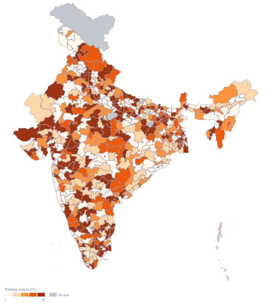
One national map shaded by the winning margin, with 540 of the 543 seats carrying a row, so the belt of close contests and the belt of walkovers are visible in the same glance, and the note can spend its words on why rather than on where.
The four choices behind it
How this map was made
Four questions, in the order the builder asks them. Every picture below is the real renderer on the real geography, so this is the sequence you will see on your own screen.
- Step 1
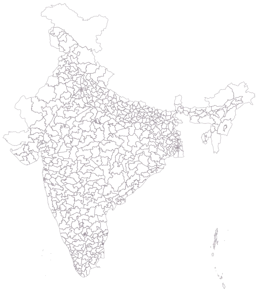
Choose the Parliamentary level and set the area to India, then look at the empty map before you load anything into it.
All 543 seats are drawn as outlines, unshaded, with no legend. This is the sanity check that matters most on a constituency map: the outlines are seats, not districts, so the shapes will not look like the India you are used to. Satisfy yourself now that the unit is right, because every argument after this depends on it.
- Step 2
Paste the sheet with the constituency name in the first column, and read the match report before touching any setting.
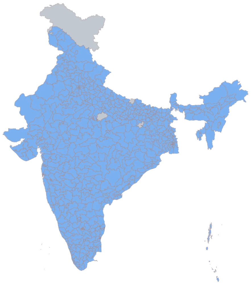
All 540 names resolve, and 540 of the 543 seats come up shaded in one flat blue. Four stay pale, and the four are pale for two different reasons. Ladakh has a row and no figure. The other three are namesakes: the geometry spells two seats Aurangabad, two Hamirpur and two Maharajganj, and an exact match on a bare name reaches only the first of each pair — here Maharashtra's Aurangabad, Himachal Pradesh's Hamirpur and Bihar's Maharajganj — so Aurangabad in Bihar, Hamirpur in Uttar Pradesh and Maharajganj in Uttar Pradesh have no row of their own. Read that here, where it is obvious, rather than three steps later where it is not.
- Step 3
Point the colour at the margin column and leave every scale setting alone.
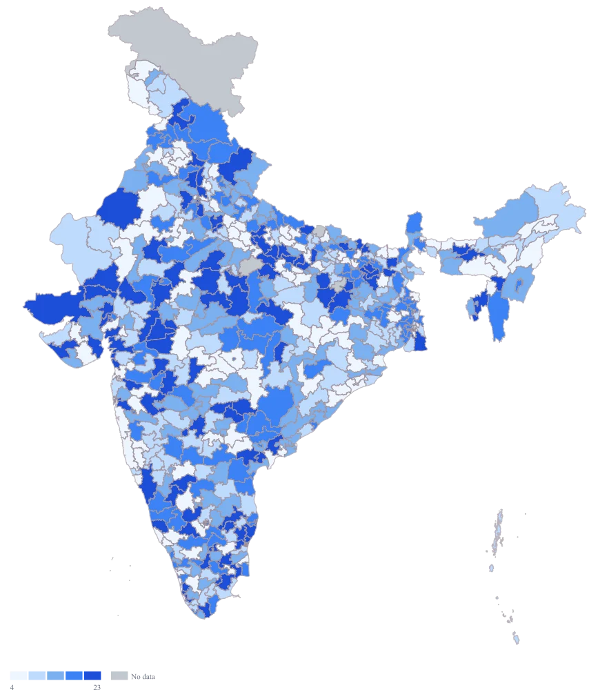
The flat blue becomes a ramp and the legend appears. Because Indore sits so far above the rest, the automatic scale detects the skew and falls back to equal counts, so the bands break at roughly 4.0, 8.9, 15.6 and 22.9 rather than at even intervals. That is already a better map than equal widths would have given you, but the legend now carries uneven spans and a reader will not notice unless told.
- Step 4
Switch the scale to custom, set the breaks at 5, 10, 15 and 20, change the palette to orange, and title the legend "Winning margin (%)".
The bands now sit on thresholds that mean something — under five points, under ten, under fifteen, under twenty, and everything wider sharing the top colour — and they hold 135, 101, 81, 70 and 152 seats. Indore and Thiruvananthapuram fall into that top band together, so the landslide no longer owns three colours to itself. Compared with the automatic bands the difference is that these four numbers stay put: equal counts had cut the lowest band at 4.0 and the highest at 22.9, figures that describe this sheet and will move the moment the sheet does, whereas five, ten, fifteen and twenty points are the thresholds a psephologist actually argues about and will mean the same thing on next season's map. The orange ramp reads darker at the wide-margin end than the default blue did, which is the right way round for an exhibit whose finding is about closeness.
The sheet
Paste these columns straight from Excel. The first column names the place; the rest are numbers. Nothing is uploaded — your sheet is read in the browser.
| Constituency | Winning margin (% of votes polled) | Votes polled (lakh) |
|---|---|---|
| Indore | 54.6 | 12.4 |
| Thiruvananthapuram | 21.3 | 9.1 |
| Nagpur | 18.7 | 11.2 |
| Lucknow | 16.4 | 10.6 |
| Jaipur | 14.9 | 13.1 |
| Ranchi | 12.2 | 10.8 |
| Patna Sahib | 10.8 | 9.7 |
| Varanasi | 9.5 | 10.3 |
| Kolkata Dakshin | 7.6 | 11.9 |
| Raipur | 6.1 | 12.7 |
| Ludhiana | 4.3 | 8.9 |
| Dibrugarh | 2.8 | 8.2 |
| Puri | 1.2 | 9.4 |
| Kalahandi | 0 | 8.6 |
| Ladakh | — | — |
| Shimoga | 18.1 | 13.4 |
The first 16 rows of 540. The map above is drawn from all of them — a national map wants a national sheet, and yours will be longer than this too.
Why this map
The margin is one number per seat, so shading the seat by it is the whole map, and the pattern it draws is a national one. On this sheet 317 of the 539 seats carrying a figure come in under fifteen points and 152 come in wider than twenty, while the widest of all is a quarter again as wide as the next widest — a shape a sorted column states and never shows. Every figure here is invented to exercise the map. None of these is a real result, no party is named anywhere, and nothing on this page should be read as a finding about any seat.
What goes wrong
The first thing anybody asks a results map for is the party colour, and this tool cannot give it. It shades an area from a number, so it can carry a margin, a vote share, a swing or a turnout — anything on a scale. A winning party is a category, not a quantity, and there is no categorical fill, no legend of party names and no way to say "this seat is orange because of who holds it". Colouring parties by giving each a code — 1, 2, 3 — produces a ramp that says party 3 is three times party 1, which is nonsense the reader will nonetheless absorb.
Map the margin and say plainly in the caption that the colour is the size of the gap and not the identity of the winner. Where the party map is genuinely what the note needs, that is a different exhibit and this is not the tool for it: keep the party in the sheet as a column, keep it in the table beside the map, and let the map do the one thing it can do honestly, which is carry the number.
Kalahandi is a genuine 0 on this sheet: the two leading candidates finished level and the seat went to the draw of lots the statute provides for, so the gap between first and second really is nothing. Ladakh is blank, because the poll there was countermanded and there is no result to carry. On a default render those two are hard to tell apart, and a 0 that is styled as missing is the single most misleading thing a results map can do — a dead heat is the most interesting seat on the page, and it disappears.
Set no-data to grey and check that the palest band of the ramp is not itself grey, so a true zero sits on the scale and a missing seat sits off it. Then say in the caption what grey means — here, no declared result — and name the tied seat in the text. There is no hatching or pattern fill to fall back on, so the caption and the legend are the only places that distinction can be made.
One landslide drags the whole ramp. Indore's 54.6 here sits far above everything else, and on equal-width bands the scale runs 0 to about 10.9, 10.9 to 21.8, and so on — which puts 416 of the 539 seats carrying a figure into the bottom two bands and leaves the top two bands to describe seventeen. The close contests, which are the entire point of the exhibit, all come out the same colour. Filling the sheet out to the whole country makes this worse rather than better: every seat you add sits around the middle, and the same handful of runaway margins flattens all of them.
Do not leave it on equal widths. This tool's automatic scale already guards against the worst of it — when the top of the range sits far above the median it switches from equal widths to equal counts on its own — but equal counts has its own cost, because the bands then hold the same number of seats rather than the same span of margin, and the legend has to say so. The cleaner answer is breaks you choose: set them at 5, 10, 15 and 20 points, which are the thresholds a psephologist actually argues about, and let everything above 20 share the top band. The landslide stops setting the scale for everybody else.
Other worked examples
- Voter Turnout Map of Uttar Pradesh by Constituency — Uttar Pradesh, parliamentary, colour
- District-Wise Heat Map of India — Madhya Pradesh, district, colour
- Population Density Map of India by District — Pan India, district, colour
- Survey Results Map of India — Odisha, district, colour