Worked example
Tourism Footfall Map of Rajasthan by District
You do research for a state tourism board and the season review is due. Footfall comes in by district from more than one collection — gate counts, registrations, a monument return — and the draft deck currently carries a fifty-row table that the board members skim to find their own district and then stop reading.
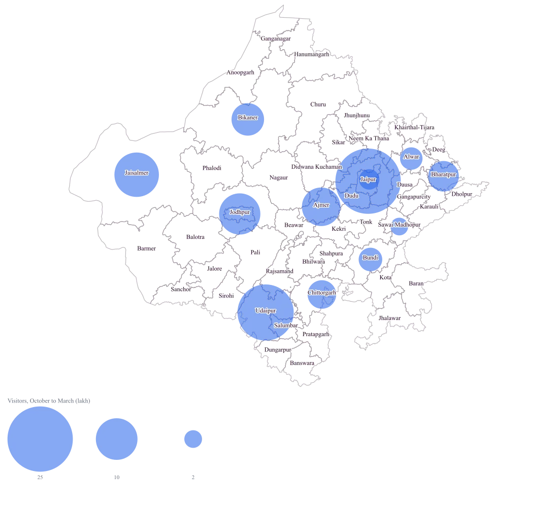
One Rajasthan map where the size of a circle is the size of the season's traffic, so the concentration is obvious in a glance and the conversation can start at why the second tier is the second tier rather than at which district is which.
The four choices behind it
How this map was made
Four questions, in the order the builder asks them. Every picture below is the real renderer on the real geography, so this is the sequence you will see on your own screen.
- Step 1
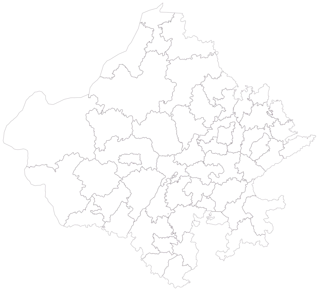
Choose Rajasthan, and district as the level.
All fifty districts in the current Rajasthan file, empty outlines, no legend. This is the step at which to notice that the file carries the 2023 districts — Jaipur and Jaipur Gramin are two shapes here, as are Jodhpur and Jodhpur Gramin — because a footfall return built on the older thirty-three-district master will not match this map row for row.
- Step 2
Paste the sheet and match the district column against the map.
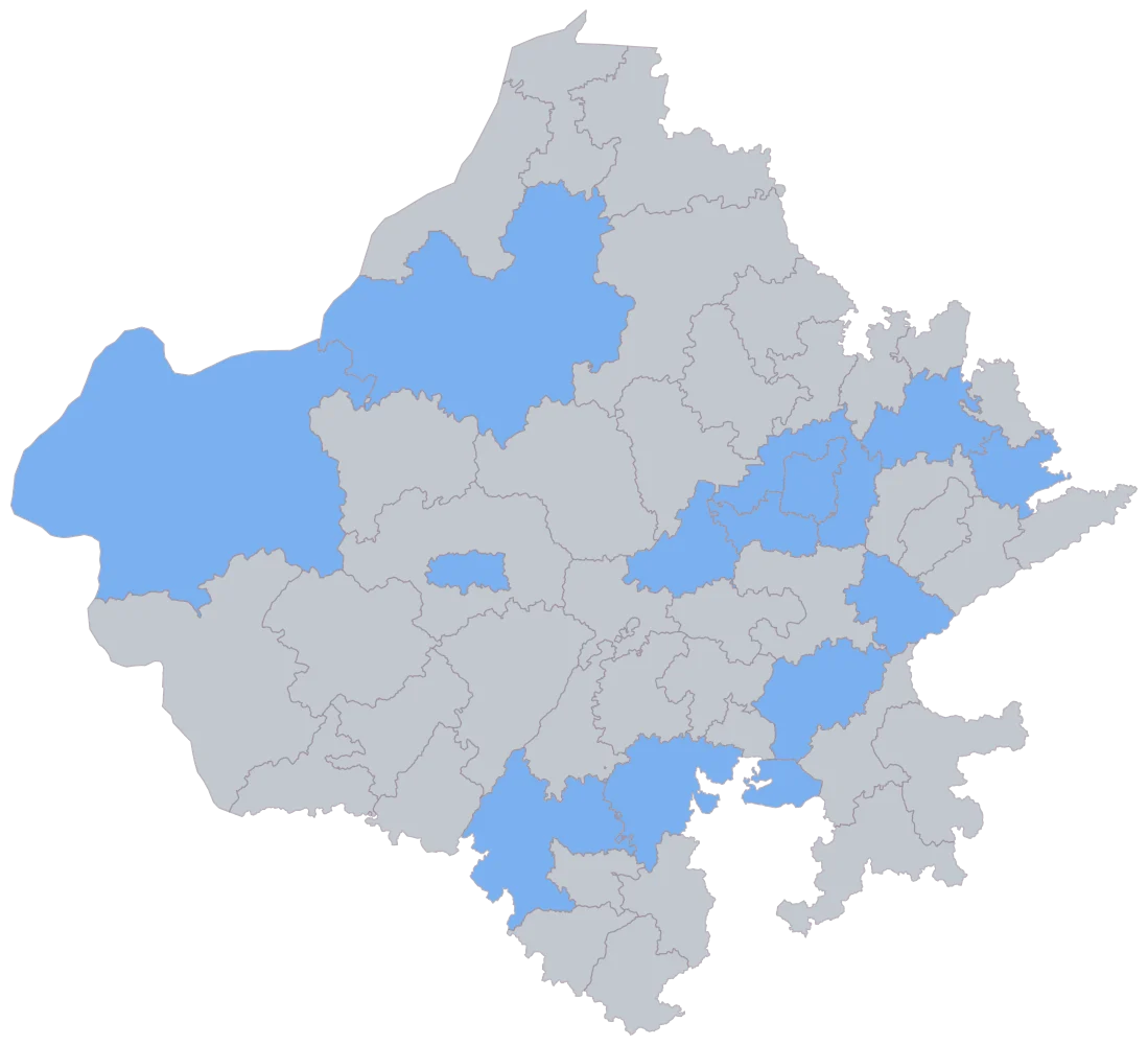
Fourteen districts take one flat blue, the other thirty-six stay grey. The blue is saying the name matched and nothing more, and it is the cheapest check you will get that your district column speaks the same dialect as the geometry — Dudu, Sanchor and Jaipur Gramin either light up here or they never will.
- Step 3
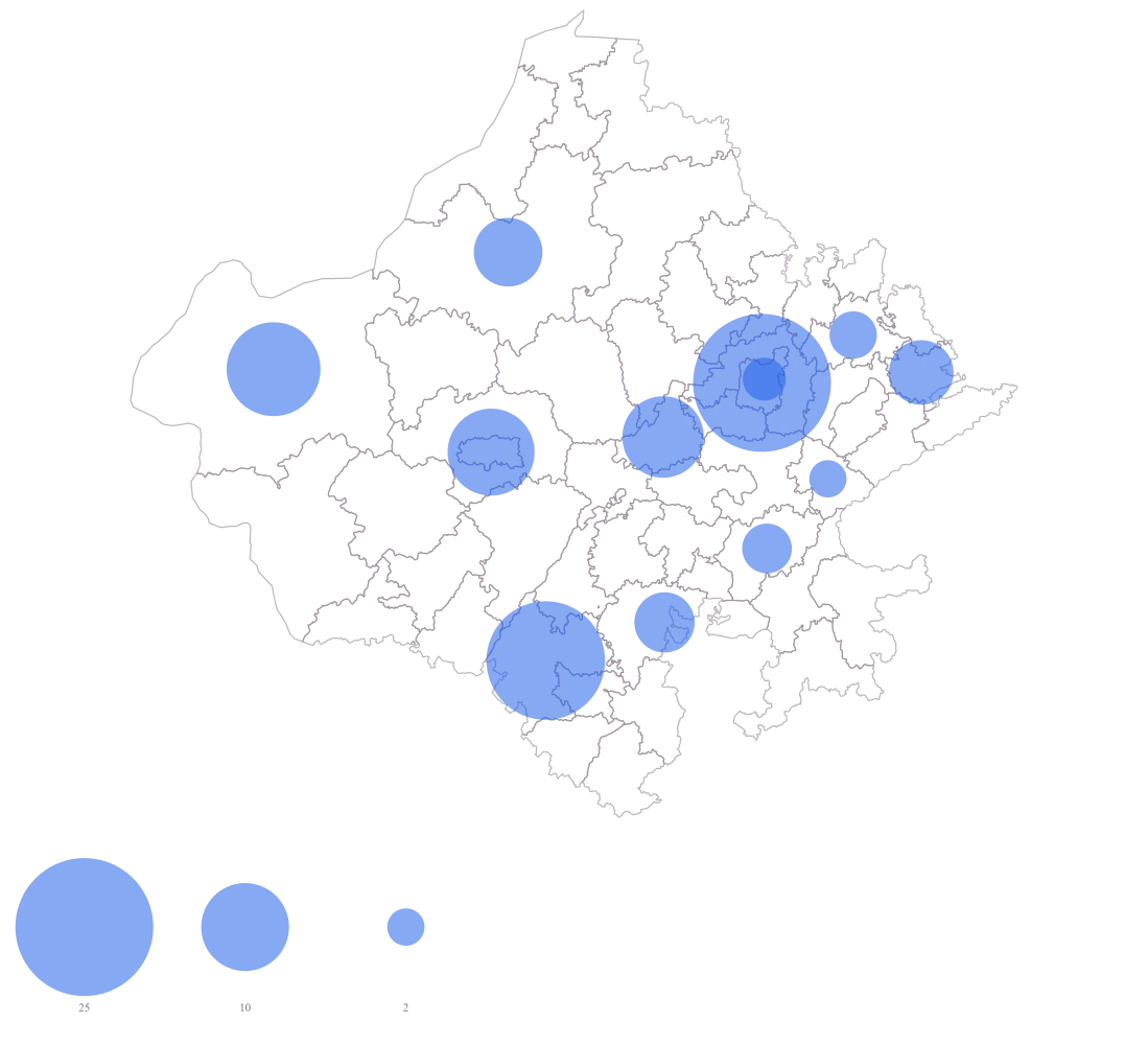
Set the map type to bubble and point it at the October-to-March column.
The fills go and twelve circles sit over the outlines, area-sized from 1.8 up to 24.6, with the size legend on. Dudu is a genuine 0 and draws no circle at all, which is the right arithmetic and a poor communication: at this point it looks the same as Sanchor, which has no figure. Jaipur and Jaipur Gramin are already overlapping.
- Step 4
Switch labels to name and title the legend "Visitors, October to March (lakh)".
Each circle now carries its district's name, so the pair sitting almost on top of each other around Jaipur can be told apart and Dudu's empty spot is at least labelled. The legend title carries the two things the circles cannot: that the unit is lakh, and that this is one winter half and not a year.
The sheet
Paste these columns straight from Excel. The first column names the place; the rest are numbers. Nothing is uploaded — your sheet is read in the browser.
| District | Visitors, October to March (lakh) | Paid monument entries, October to March |
|---|---|---|
| Jaipur | 24.6 | 1842500 |
| Udaipur | 18.2 | 1364000 |
| Jaisalmer | 11.4 | 726400 |
| Jodhpur | 9.8 | 688200 |
| Ajmer | 8.6 | 512700 |
| Bikaner | 6.1 | 398100 |
| Bharatpur | 5.4 | 361800 |
| Chittorgarh | 4.7 | 302600 |
| Bundi | 3.2 | 184900 |
| Alwar | 2.9 | 167300 |
| Jaipur Gramin | 2.4 | 96400 |
| Sawai Madhopur | 1.8 | 84100 |
| Dudu | 0 | 0 |
| Sanchor | — | — |
Why this map
Footfall is a count, and counts add up, so a circle is the encoding that lets a reader add them: Jaipur is about a quarter of the mapped season on its own and Jaipur with Udaipur is over two-fifths, which is a statement about circles you can make by eye. Filling the districts instead would hand the loudest colour to whichever large shape happened to score, and the largest shapes in this state are not where the traffic is. All figures here are invented sample data and are not arrival counts for any district.
What goes wrong
A bubble is drawn at the centre of a district's shape, and a centre is not a place. Two of the fifty districts in the shipped Rajasthan file — Jaipur Gramin and Jodhpur Gramin — wrap around the city district that shares their name, and their area-weighted centre falls outside their own boundary altogether, inside the city district. Jaipur Gramin's centre sits about four kilometres from Jaipur's, so the two circles print almost on top of one another and the smaller one, which is the interesting one, disappears under the larger. At the other extreme Jaisalmer is the largest shape in the file, roughly eighteen times the ground Jaipur district covers, and its single circle is pinned at one point in the middle of all that, saying nothing about which part of it anybody reached.
Turn name labels on so a reader can tell which circle belongs to which district when two of them overlap, and name the overlapping pairs in the caption. Where the ring-and-city pair is genuinely one destination for your purposes, add the two rows together in the sheet and map the total against the city district, with the merge stated — the map cannot group two districts into one for you. And read a large district's circle as a district total, never as a location: there are no pins and no latitude and longitude here, so no site, fort, gate or hotel can be plotted on this map at all.
One column is in lakh and the next is in plain units, and the map is drawn from the number in the cell, not from the word in the header. Jaipur's 24.6 and its 18,42,500 are the same season counted twice; point the map at the wrong column and the scale changes by five orders of magnitude while every relative size stays identical, so the picture looks completely correct. Worse, a contributor who types "2.4 lakh" with the word in the cell does not get 240000 — that cell fails to parse and the district comes out blank beside a shaded neighbour.
Settle one unit per column before anybody fills it in, keep the unit in the header, and strip the column to bare digits — a district office that sends you "24.6 lakh" needs its cell rewritten as 24.6 or as 2460000, not both in one column. Then read the size legend once after the map draws: if its largest reference bubble is a number you do not recognise, you are pointed at the other column.
This sheet covers October to March. A six-month season presented with no period in the title becomes an annual figure the moment somebody lifts the map into another deck, and a half year cannot be turned into a year by doubling — Rajasthan's two halves are nothing like each other, and the multiplier is not two and is not the same in every district. The map itself has no memory of what period it drew.
Put the period in the legend title, as the refine step does here, so it travels with the picture rather than with the slide it started on. When you compare two seasons, compare the same months, and where a district's collection started mid-season say so in the caption instead of scaling it up to a full six months. If the board wants a year, map a year: a second map over twelve months is cheaper than a footnote nobody reads.
Other worked examples
- District-Wise Revenue Map of India — Pan India, district, bubble
- PIN Code Map of India for Customer Concentration — Maharashtra, pin code, bubble
- Store Catchment Map by PIN Code — Karnataka, pin code, bubble
- District-Wise Heat Map of India — Madhya Pradesh, district, colour