Worked example
District-Wise Revenue Map of India
You are the revenue operations analyst for a national equipment supplier and the quarterly business review is being written around you. The billing export gives you rupees by district, one row per sales office, and the slide it currently lives on is a table whose top four rows everybody reads and whose remaining hundred and thirty-eight nobody does.
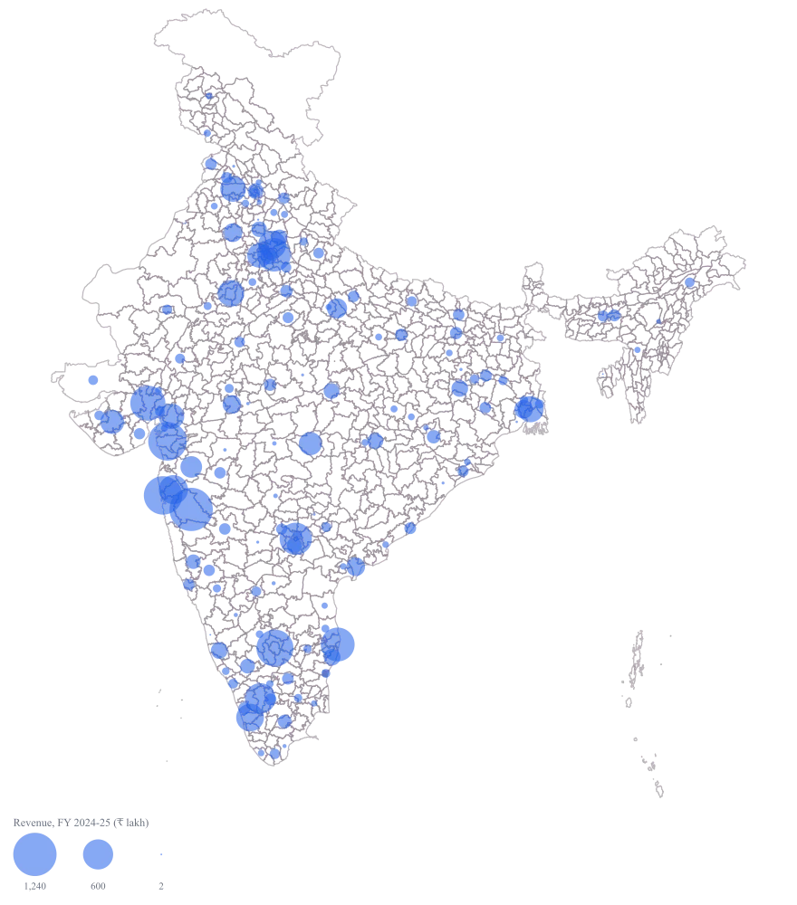
One map on which the size of a circle is the size of the business, so the handful of districts carrying most of the revenue announce themselves before anybody has read a row, and the argument moves on to what to do about the rest.
The four choices behind it
How this map was made
Four questions, in the order the builder asks them. Every picture below is the real renderer on the real geography, so this is the sequence you will see on your own screen.
- Step 1
Choose India, and district as the level.
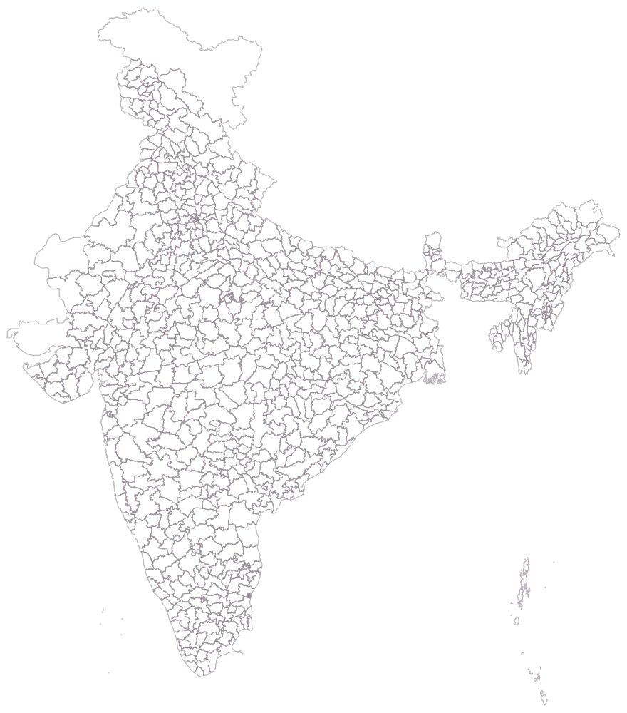
All 785 district outlines in the shipped India file, drawn empty — no colour, no circles, no legend. This is the frame you are about to put 142 numbers on, and seeing it bare is the moment to notice how small Ernakulam and Gurugram are against Jaisalmer and Barmer, neither of which is in your sheet.
- Step 2
Paste the sheet and let the district column match against the map.
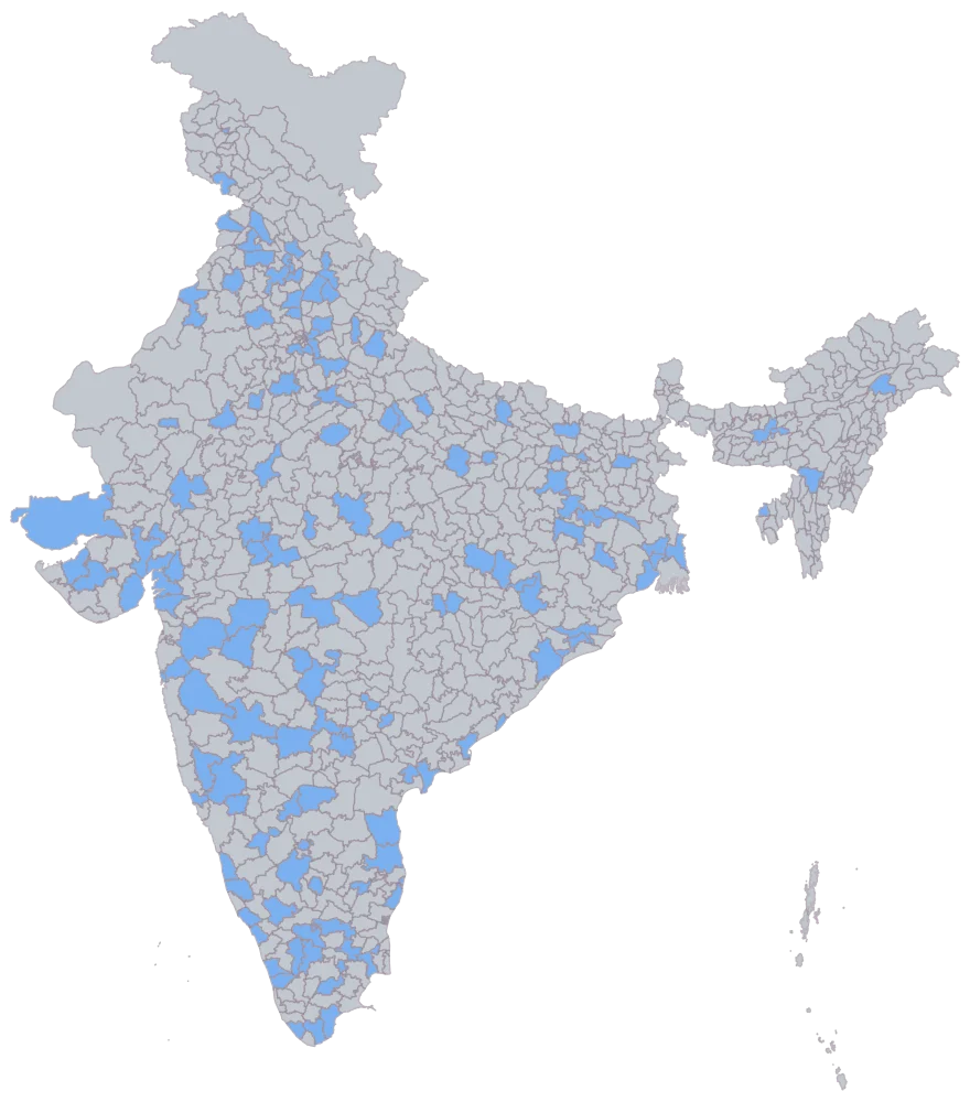
A hundred and forty-two districts come up in one flat blue and the other 643 stay grey. That flat blue is the join and nothing else: it says the name matched, not that the value is any good. Simdega is shaded here even though its cell is empty, which is the useful part — a district that stays grey at this step has a spelling problem, while a district that shades and then draws nothing later has a data problem.
- Step 3
Set the map type to bubble and point it at the revenue column.
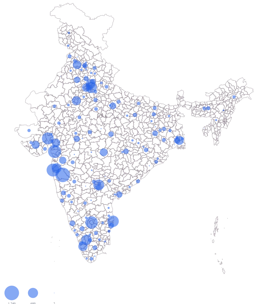
The fills drop away and 140 circles appear over the outlines, sized by area from ₹2 lakh up to ₹1,240 lakh, with the size legend on. A hundred and forty, not 142: Simdega's cell is empty, and Hingoli is a genuine 0 — a zero has no area to draw, so it goes silent at exactly the point where it is a finding.
- Step 4
Title the legend "Revenue, FY 2024-25 (₹ lakh)" and leave the value labels off.
The legend title does the work: it fixes the unit as lakh and the period as one financial year, which is what stops the next reader from treating 1,240 as rupees, or as this quarter. Labels stay off deliberately — 140 numbers printed over circles this close together is unreadable. So is any attempt to count circles around Mumbai and Pune, or north and east of Delhi, where they overlap however you set the map: each circle is drawn at its district's centroid, and neighbouring centroids are a few pixels apart at this zoom. Read those two clusters as clusters, take the individual figures from the table or from a tooltip, and build the one belt that carries an argument as its own state map, where the same circles separate.
The sheet
Paste these columns straight from Excel. The first column names the place; the rest are numbers. Nothing is uploaded — your sheet is read in the browser.
| District | Revenue, FY 2024-25 (₹ lakh) | Invoices raised |
|---|---|---|
| Pune | 1240 | 862 |
| Surat | 986 | 704 |
| Gautam Buddha Nagar | 742 | 515 |
| Coimbatore | 615 | 468 |
| Ernakulam | 508 | 391 |
| Ludhiana | 437 | 352 |
| Gurugram | 396 | 274 |
| Nashik | 310 | 249 |
| Kanpur Nagar | 268 | 216 |
| Ranchi | 184 | 147 |
| Sambalpur | 121 | 98 |
| Kamrup Metro | 96 | 74 |
| Hingoli | 0 | 0 |
| Simdega | — | — |
| Mumbai Suburban | 980 | 589 |
| Bengaluru Urban | 905 | 669 |
The first 16 rows of 142. The map above is drawn from all of them — a national map wants a national sheet, and yours will be longer than this too.
Why this map
Revenue is a total, and totals add up, which is exactly what a circle can show and a colour ramp cannot: the fifteen largest circles on this map are about half of the mapped revenue, and a reader gets that from the picture rather than from the column. The shapes stay uncoloured so that a large district and a large business are not confused with one another — Pune and Surat between them are about a tenth of the mapped revenue, drawn on two districts out of the 142 the sheet names and the 785 the country has. All figures on this page are invented sample data and are not any company's revenue.
What goes wrong
The circle's area is the value, not its width. Pune at ₹1,240 lakh is almost exactly twice Coimbatore at ₹615 lakh, and its circle comes out only about 1.4 times as wide, because width grows with the square root. A reader who reads width and stops there will call Pune half again as big as Coimbatore rather than twice. The opposite error is worse and far more common in hand-built decks: size the radius by the value instead, and Pune covers four times Coimbatore's ink for twice the money, which flatters every large district on the map.
Leave the sizing alone — it is already area-proportional — and put the reading where the eye can get at it. With 140 circles drawn, printed labels collide into illegibility, so they stay off on this map and the readings come from two other places: the size legend, which draws its reference bubbles from readings that actually occur in your sheet rather than from invented round figures, and the tooltip on the circle itself. When you need a ratio in the commentary, take it from the column, never from the picture — and where one belt is the whole argument, build that state as its own map, at which point a dozen labelled circles fit.
Indian digit grouping and international digit grouping put the commas in different places for the same number. A sheet that writes twelve lakh forty-five thousand as 12,45,000 is read by somebody expecting 1,245,000 as roughly twelve million — off by a factor of ten, with nothing on the map to catch it. This is not a parsing failure: commas are stripped before the value is read, so 12,45,000 and 1,245,000 both arrive as the same number. The damage is entirely on the output side, in the labels, the legend and the tooltips.
That is what the number format control is for. Pick Indian grouping for a domestic review, international grouping for a deck that will be read abroad, and the lakh and crore abbreviation only where every reader knows what an L and a Cr are — then keep that choice for every exhibit in the pack. Mixing two of them across consecutive slides is how the factor of ten gets through. State the unit in the legend title as well, as the refine step here does, because "1,240" means nothing without the word lakh attached to it.
A billing export has one row per sales office, not one per district, so Pune arrives three times and Surat twice. Nothing in the tool folds those rows for you, and it is right not to: the three modes on offer give three different maps. Leave it on "Don't combine" and Pune draws as no data despite having the largest business on the sheet. Choose "Latest" and Pune becomes whichever office happened to be the last row in the export.
Sum the repeated rows before you map, or pick Sum deliberately in the combine step and check the mapped total against the figure in your own report. Watch a district you know well: if Pune's tooltip shows one office's billing rather than three offices' billing, the fold did not happen. The map cannot group districts into a region or a territory for you either, so any roll-up above the district belongs in the sheet, where somebody can audit it.
Other worked examples
- Tourism Footfall Map of Rajasthan by District — Rajasthan, district, bubble
- PIN Code Map of India for Customer Concentration — Maharashtra, pin code, bubble
- Store Catchment Map by PIN Code — Karnataka, pin code, bubble
- District-Wise Heat Map of India — Madhya Pradesh, district, colour