Worked example
District Prioritisation Map for India
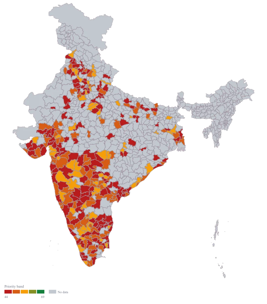
You are in strategy at a consumer brand and the annual expansion plan needs a shortlist. You have already built the composite score — headroom, current distribution, competitive intensity, weighted the way the last planning cycle agreed — and what you need now is for a room of twelve people to look at the same three bands and argue about districts rather than about the spreadsheet.
A map with three colours, not a gradient: the districts that clear your investment bar, the ones worth a smaller test, and the ones that are explicitly not this year. Because the bands come from your own thresholds, the map can honestly show a year where only four districts qualify.
The four choices behind it
How this map was made
Four questions, in the order the builder asks them. Every picture below is the real renderer on the real geography, so this is the sequence you will see on your own screen.
- Step 1
Choose Pan India at district level, the unit the shortlist is written in.
The 785 outlines come up empty, and that is already an argument the room needs to see: the plan names 315 of them, and the other 470 are not being discussed this year.

- Step 2
Paste the district column with the composite score beside it and the headroom column after it.
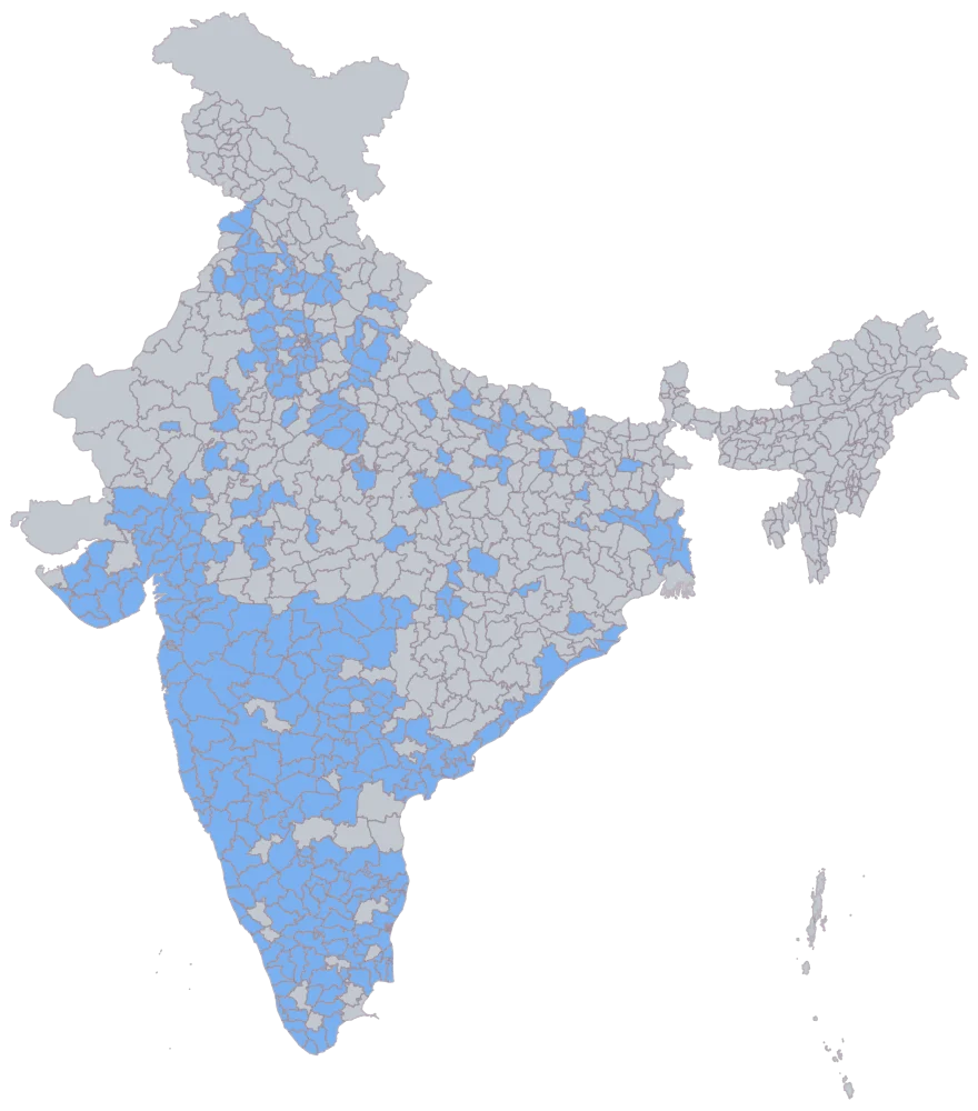
314 districts shade flat and Shravasti stays grey with the other 471, which is the correct drawing of a district whose underlying numbers you could not split. A district carved out after your master was built behaves the same way, so a grey district inside your plan is a boundary problem, not a low score.
- Step 3
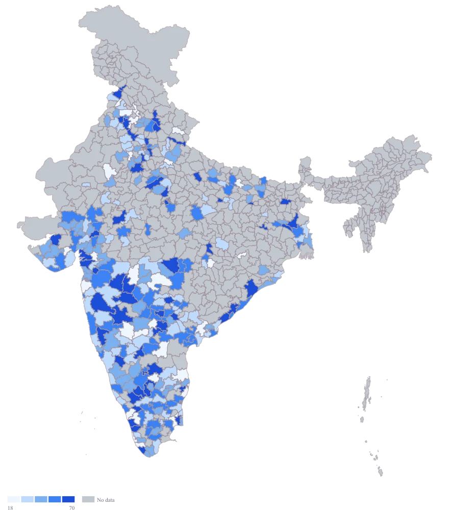
Send the priority score to area colour.
Five even bands are cut from the range in this sheet, so the thresholds come from your highest and lowest scores rather than from your investment bar, and next year a different top score will move every band under it.
- Step 4
Set the scale to custom breaks at 44 and 69 on the red to amber to green ramp, and title the legend Priority band.
Five shades collapse to the three the committee actually decides in: 64 districts green at 70 and above, 94 amber from 45 to 69, and 156 — Kolar, Gonda, Tapi and Narmada among them — red below 45. Because the breaks are your numbers rather than a range the sheet chose, they hold across cycles, and a year in which nothing clears the bar will draw with no green on it at all.
The sheet
Paste these columns straight from Excel. The first column names the place; the rest are numbers. Nothing is uploaded — your sheet is read in the browser.
| District | Priority score (0-100) | Headroom (₹ lakh) |
|---|---|---|
| Surat | 88 | 640 |
| Nagpur | 81 | 520 |
| Solapur | 74 | 310 |
| Dakshina Kannada | 69 | 280 |
| Dindigul | 62 | 190 |
| Virudhunagar | 58 | 160 |
| Saharanpur | 55 | 240 |
| Shivamogga | 47 | 130 |
| Kolar | 44 | 110 |
| Gonda | 38 | 95 |
| Tapi | 26 | 40 |
| Narmada | 0 | 12 |
| Shravasti | — | 60 |
| 24 Paraganas North | 46 | 74 |
| Agra | 44 | 214 |
| Ahmadabad | 69 | 594 |
The first 16 rows of 315. The map above is drawn from all of them — a national map wants a national sheet, and yours will be longer than this too.
Why this map
A priority score is a decision rather than a measurement, so set the scale to custom breaks at the two numbers your review actually uses — 70 and 45 in this sheet — and let the map draw high, medium and low instead of a smooth ramp that invites the room to relitigate every point of difference.
What goes wrong
Any scale that cuts its bands from the data is the wrong scale here, and that includes the automatic one the builder starts on. A scale fitted to this year’s spread will always fill its top band, whether or not a single district clears the bar you actually set, and next year the same band will hold a different set of scores. The map then cannot say “nothing qualified”.
Switch the scale to custom breaks and enter the thresholds your investment committee signed off — here, 70 and above is high, 45 to 69 is medium, below 45 is low. Keep those breaks fixed across cycles so this year’s map is comparable with last year’s, and so a genuinely thin year looks thin.
A composite score hides its own weights. Kolar at 44 and Shivamogga at 47 can sit in the same band for opposite reasons — one is mostly untapped headroom with no distribution in place, the other is well distributed with little room left — and one colour tells the reader to do the same thing in both.
Keep the component columns in the sheet next to the score, as the headroom column does here, and switch them on in the tooltip so hovering a district shows what drove it. When two districts in the same band need opposite actions, that is a sign the shortlist needs two maps: one for distribution expansion and one for depth in existing outlets.
Prioritisation sheets are usually assembled from older MIS, and district boundaries have moved. Tenkasi was carved out of Tirunelveli in 2019, so a sheet built on a pre-2019 master carries one Tirunelveli row covering both, and Tenkasi is drawn as no-data while Tirunelveli is coloured with a score that includes territory it no longer contains.
Before mapping, check your district master against the current list and split or restate the affected rows. Where you cannot split the underlying numbers, say so: leave the new district blank rather than copying the parent’s score into it, because a fabricated band in a prioritisation map becomes a budget line.
Other worked examples
- District-Wise Heat Map of India — Madhya Pradesh, district, colour
- Population Density Map of India by District — Pan India, district, colour
- Survey Results Map of India — Odisha, district, colour
- India Market Share Heat Map — Pan India, district, colour