Worked example
School Enrolment Map of India by District
You sit in a district education office and the household survey returns have landed as a block-level export: several rows for every district, a count of out-of-school children in one column and a net enrolment rate in another. The planning note wants a map by the end of the week, and the last time somebody made one the totals on it did not match the totals in the note.
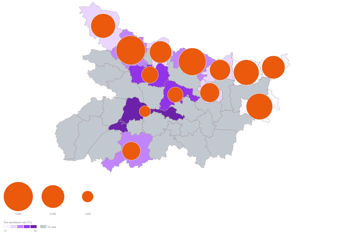
One map where the circle is how many children a district has to reach and the fill is how much of the age group is already in school, built from a sheet whose sum you can read back against your own return.
The four choices behind it
How this map was made
Four questions, in the order the builder asks them. Every picture below is the real renderer on the real geography, so this is the sequence you will see on your own screen.
- Step 1
Choose Bihar at district level.
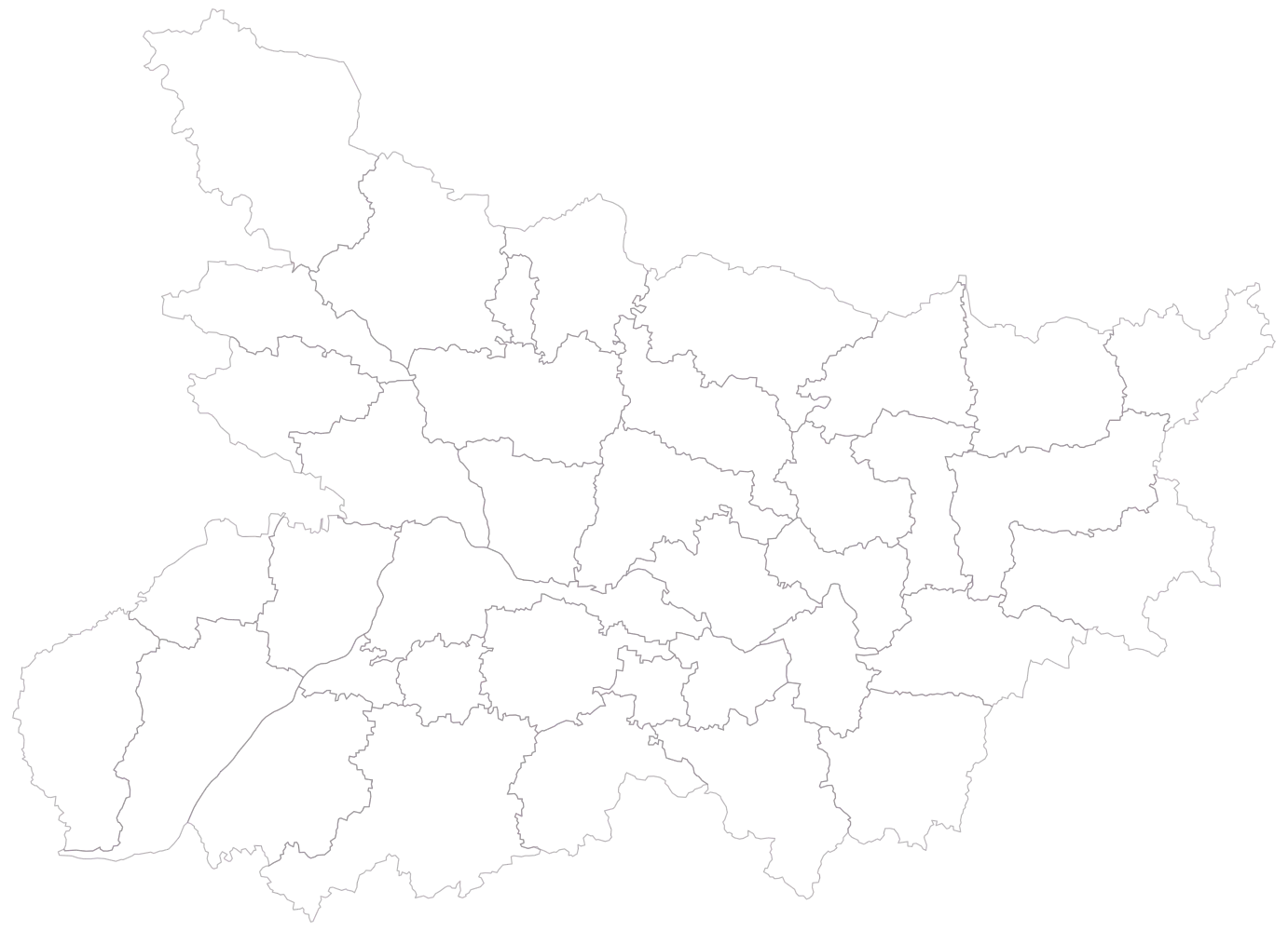
Thirty-eight district outlines, empty, no legend. Read the spellings off this outline before you touch the sheet: the shipped geometry uses Purbi Champaran and Pashchim Champaran rather than East and West, and Kaimur (Bhabua) with the bracket. An export that says East Champaran will not join.
- Step 2
Paste the collapsed sheet — one row per district — and match the names.
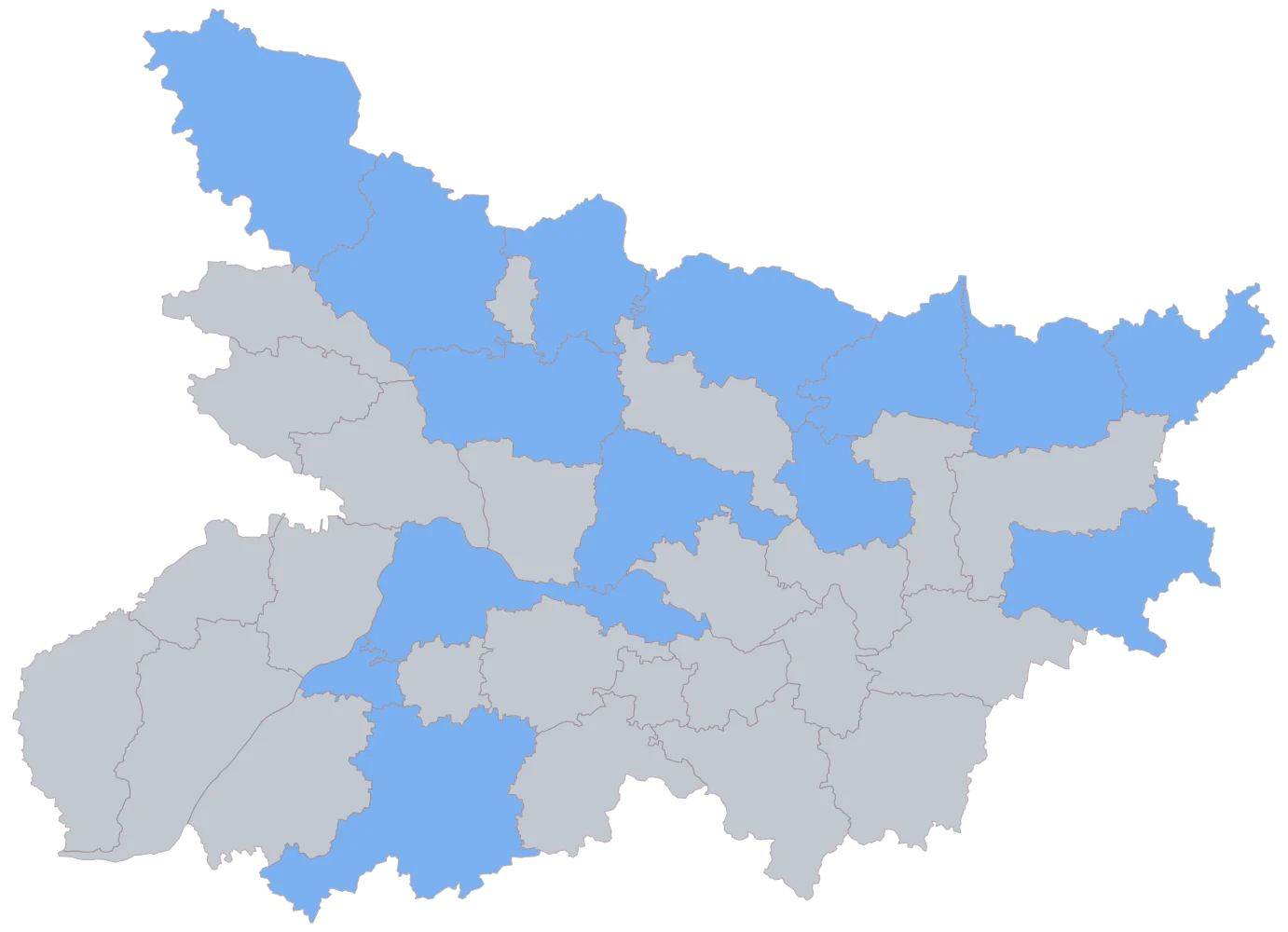
Fourteen districts turn flat blue and the remaining twenty-four stay grey. Sheikhpura matched by name and is grey anyway, because both its cells are empty, which is the first thing this picture teaches: a district staying grey does not tell you whether the name failed or the value was missing. The second is what it cannot teach at all — if your pivot left the block rows in, fourteen districts still come up blue and the map still looks right, so the row count in your sheet, not this image, is the check on the collapse.
- Step 3
Take the defaults: count on the bubble, rate on the fill, legend on.
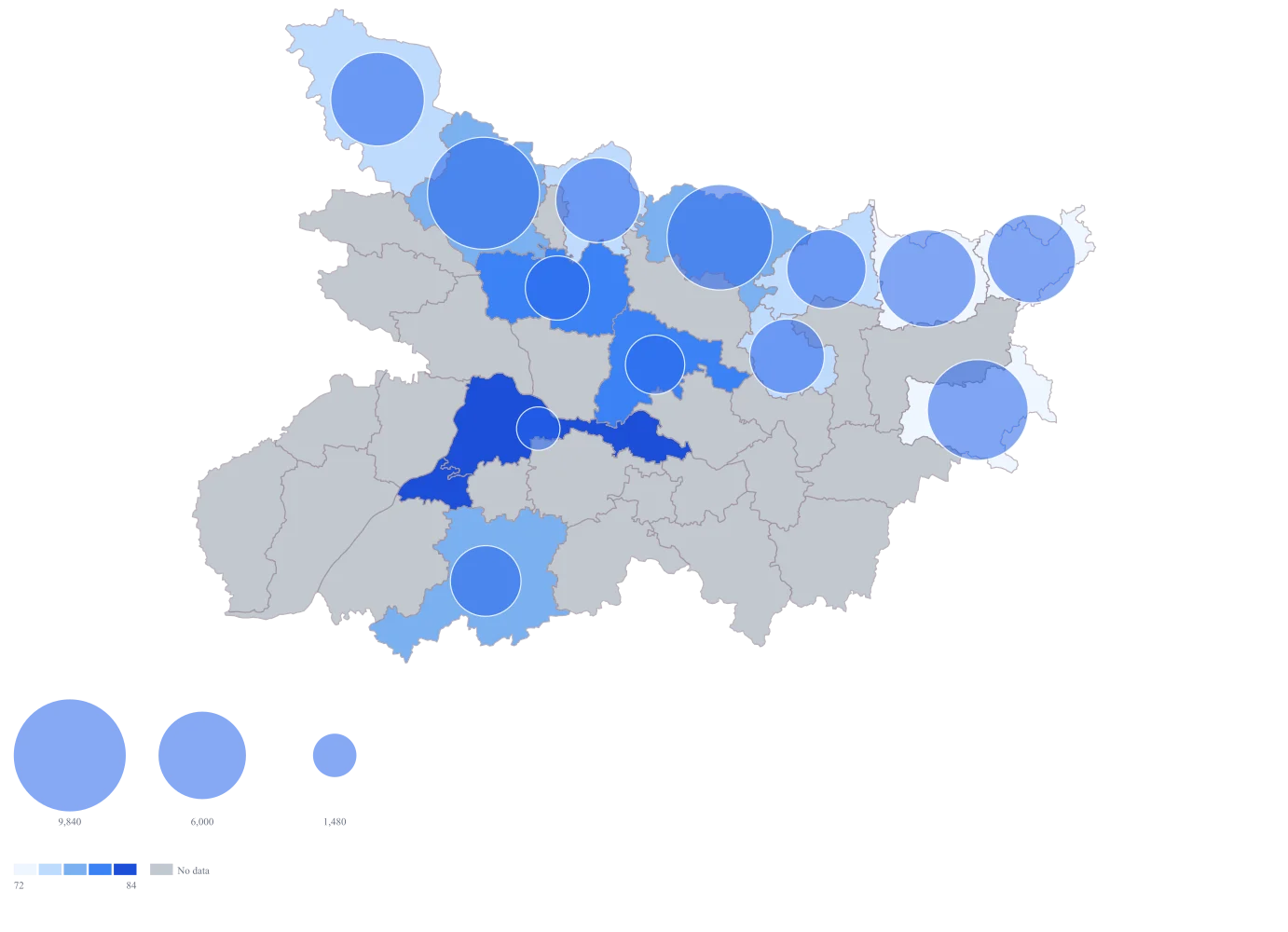
The map bands the rate by rank on its plain defaults, and the pattern is legible at once — the largest circles sit over the paler north-east, the smallest over the darker centre and south. Arwal draws no circle, because its count is a genuine 0. The circles and the fill are the same default blue, though, so the bubbles over the darker districts are nearly lost.
- Step 4
Switch the fill to the purple ramp, set the scale to equal intervals, set the bubble fill to #ea580c and title the legend "Net enrolment rate (%)".
The orange circles separate from the purple fill, so a small bubble on a pale district — a district with few children left to reach and a low rate — can be told apart from a small bubble on a dark one. Equal intervals replace the default rank banding, which moves four districts across band lines: Sitamarhi up a band, and Saharsa, Gaya and Muzaffarpur down one. That matters here because a band is now a fixed number of percentage points, so this map and the next quarter's can share a legend and be compared; rank bands cannot, since they move whenever the data does.
The sheet
Paste these columns straight from Excel. The first column names the place; the rest are numbers. Nothing is uploaded — your sheet is read in the browser.
| District | Out-of-school children identified | Net enrolment rate (%) |
|---|---|---|
| Purbi Champaran | 9840 | 76.4 |
| Madhubani | 8720 | 77.5 |
| Katihar | 7960 | 71.2 |
| Araria | 7410 | 69.8 |
| Pashchim Champaran | 6880 | 75.1 |
| Kishanganj | 6120 | 68.3 |
| Sitamarhi | 5640 | 73.9 |
| Supaul | 4930 | 74.6 |
| Saharsa | 4380 | 75.8 |
| Gaya | 3910 | 80.1 |
| Muzaffarpur | 3240 | 82.6 |
| Samastipur | 2760 | 81.3 |
| Patna | 1480 | 88.4 |
| Arwal | 0 | 86.2 |
| Sheikhpura | — | — |
Why this map
The workload is a count and the progress is a rate, and an office needs both in one view, so the count sizes the bubble and the rate fills the district. Purbi Champaran and Madhubani between them hold 18,560 of the 73,270 children on this sheet, about a quarter; Purbi Champaran alone holds between six and seven times what Patna does, on a rate twelve points lower. The rates run from 68.3 to 88.4, a spread of about twenty points. Every number here is invented sample data built to exercise the map — it is not an enrolment figure or a survey result for Bihar or for any district in it.
What goes wrong
The export arrives with one row per block, not one per district, so a district with fourteen blocks contributes fourteen rows carrying the same district name. The map takes one value per area, so those rows do not add themselves up: the last one to be read wins, and the district is then drawn with a single block's figure while looking exactly as convincing as a district whose total happened to be complete. Nothing on the map announces it.
Collapse the sheet to one row per district before you paste — a pivot, a group-by, a SUMIF, whatever your tool calls it — and then check the row count against the number of districts you expect. Sum the collapsed count column and tie it to the total in your own return, as done here: the thirteen non-zero rows add to 73,270. Sum only what may be summed. Counts add; the net enrolment rate does not, and a district rate has to be recomputed from its own numerator and denominator rather than averaged across its blocks.
Blocks do not all report in the same unit. Some returns give the count in plain children, some give it in thousands, and a few round it to lakh, so a single column ends up holding 9840, 9.8 and 0.098 for quantities of the same size. Every one of those parses as a number, so nothing fails; the district that reported in lakh simply sits at the bottom of the ramp looking like the best-performing place on the map.
Fix the unit in the column header before you collect, not after, and scan the collapsed column for order-of-magnitude jumps — a district three decimal places away from its neighbours is a unit error rather than an achievement. Name the unit in the legend title too, so anybody reading the finished map can see which one you settled on. Strip formatting while you are there: a count typed as 9,840 with a thousands separator, or carrying a footnote marker or a trailing space, arrives as no data and the district comes out grey.
Enrolment percentages rarely behave the way a reader assumes. A net rate counts only children of the official age for the stage, while a gross rate counts everybody enrolled in it, so the two have different denominators and the gross one can exceed 100. Stage shares overlap where a child is counted in more than one, and some blocks compute the base from the surveyed households while others use a projected child population. Mixed into one column, those become a ramp that appears to compare like with like and does not.
Pick one definition, write it out, and apply it to every row before mapping — this sheet is net enrolment on a single age base throughout. Keep the numerator and the denominator as their own columns beside the rate so any district you are challenged on can be recomputed in front of the person challenging you. Where two definitions genuinely both matter, map them as two maps with two legend titles rather than trying to blend them into one number.
Other worked examples
- Coverage vs Demand Map of India — Gujarat, district, bubble + colour
- District-Wise Sales Heat Map of India — Pan India, district, bubble + colour
- Health Facility Map of India by District — Tamil Nadu, district, bubble + colour
- Manufacturing Output Map of Telangana by District — Telangana, district, bubble + colour