Worked example
Manufacturing Output Map of Telangana by District
You are the market analyst for an industrial equipment supplier, working out which Telangana districts deserve a field visit this year. The return on your desk has output, workers and unit counts by district, and every reading of it so far has ended with somebody saying "so, Hyderabad" and the meeting stopping there.
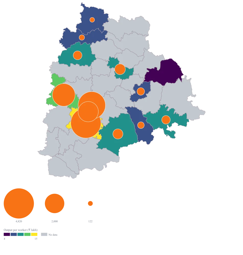
One map that carries scale and intensity at once — a circle for how much a district makes, a fill for how much it makes per worker — so a small district that is dense per worker stops being invisible next to the districts around the capital.
The four choices behind it
How this map was made
Four questions, in the order the builder asks them. Every picture below is the real renderer on the real geography, so this is the sequence you will see on your own screen.
- Step 1
Choose Telangana, and district as the level.
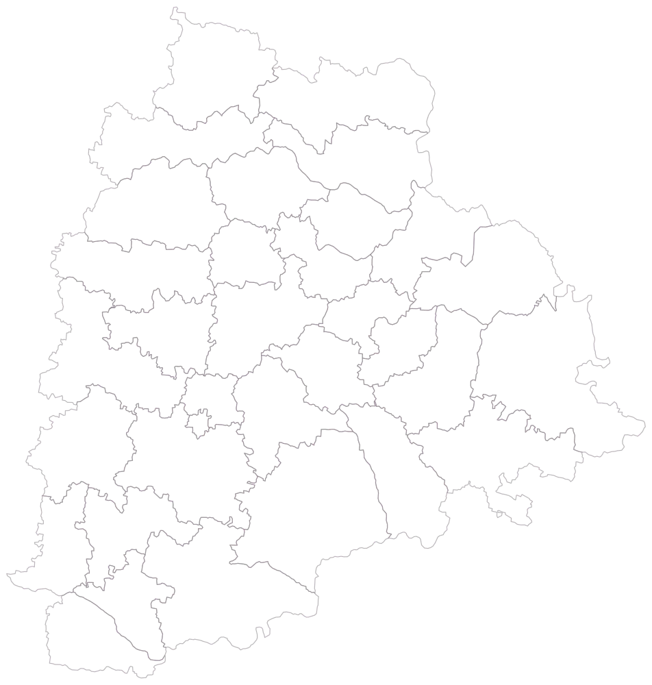
All thirty-three districts as empty outlines, no fill and no legend. Look at the middle of the frame before any data lands: Hyderabad is a speck against Nalgonda and Bhadradri Kothagudem, and knowing that now is what stops you being surprised later when the district with the fourth-largest reading is the hardest one to see.
- Step 2
Paste the sheet and match the district column.
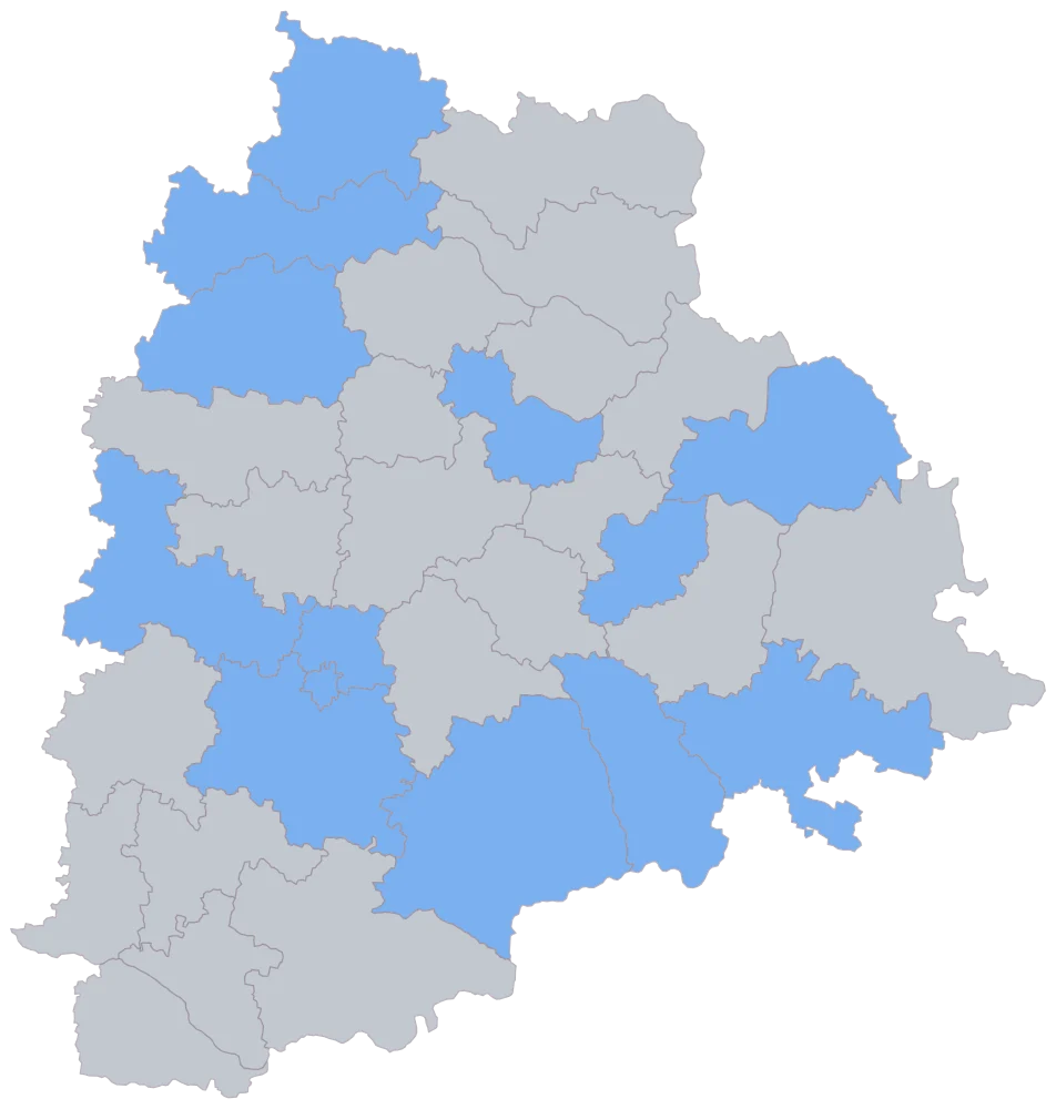
Fourteen districts take one flat blue, the remaining nineteen stay grey. This picture is purely the join — it tells you Medchal Malkajgiri, Jayashankar Bhupalapally and Kumuram Bheem Asifabad are spelt the way the geometry spells them, or that they are not — and it carries no information at all about the values behind them.
- Step 3
Set the map type to both, size by output value and colour by output per worker.
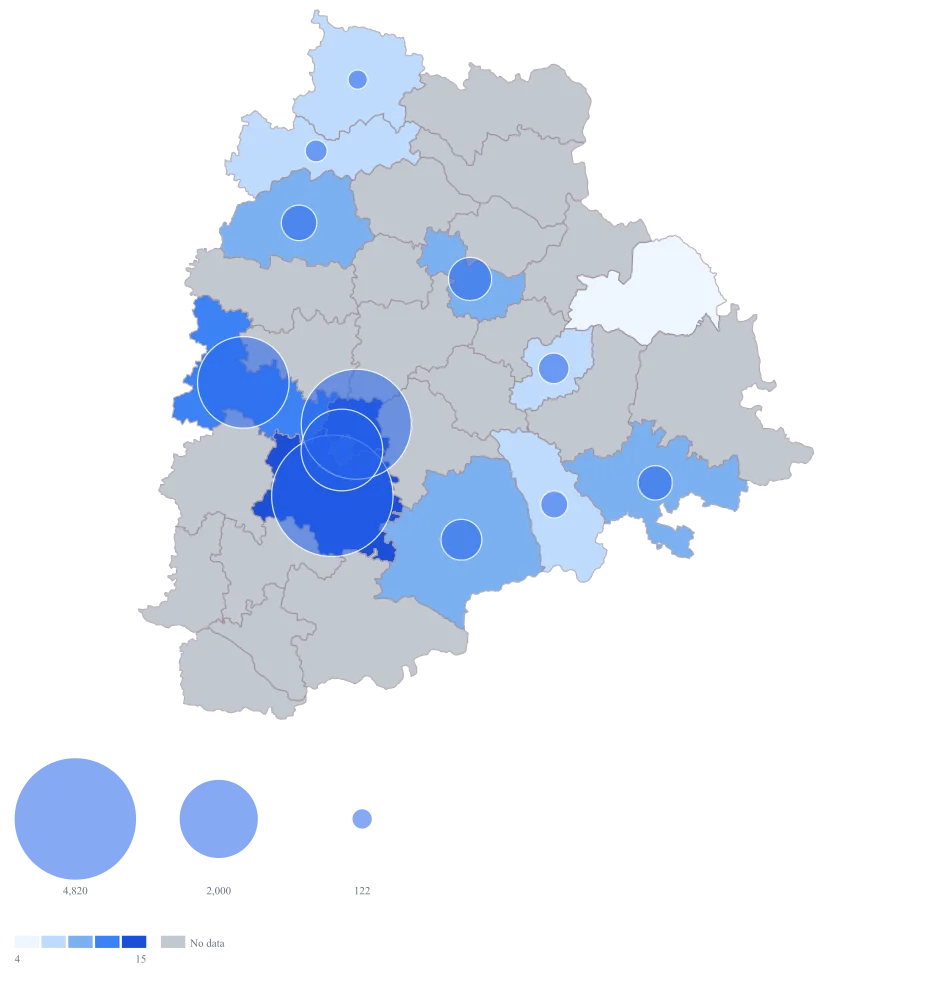
Thirteen districts take a fill on the default scale and twelve circles appear over them, Mulugu's zero drawing none. The problem is immediately visible and is the reason for the next step: the default bubble and the default fill are the same blue, so the four large circles around the capital are sitting on the four darkest fills and are close to invisible against them.
- Step 4
Take the palette to viridis, set the bubble fill to a warm orange (#f97316), and title the legend "Output per worker (₹ lakh)".
The circles now read as circles: orange against a purple-to-yellow ramp separates size from intensity everywhere on the map, including over the darkest districts where the two encodings previously cancelled each other. Viridis also fixes the zero problem — its bottom band is a deep purple that no reader will confuse with the no-data grey, so Mulugu's recorded zero and Narayanpet's absence stop looking like the same district twice. The legend title states which of the three possible metrics the colour is, which is the only place that can be said.
The sheet
Paste these columns straight from Excel. The first column names the place; the rest are numbers. Nothing is uploaded — your sheet is read in the browser.
| District | Output value, 2023-24 (₹ crore) | Output per worker (₹ lakh) | Registered units |
|---|---|---|---|
| Ranga Reddy | 4820 | 18.4 | 1420 |
| Medchal Malkajgiri | 3960 | 16.2 | 1180 |
| Sangareddy | 2740 | 14.7 | 860 |
| Hyderabad | 2180 | 11.3 | 990 |
| Karimnagar | 610 | 8.6 | 310 |
| Nalgonda | 545 | 9.1 | 264 |
| Nizamabad | 412 | 7.4 | 198 |
| Khammam | 388 | 8.2 | 176 |
| Warangal | 306 | 6.9 | 152 |
| Suryapet | 241 | 7.1 | 118 |
| Nirmal | 158 | 5.8 | 74 |
| Adilabad | 122 | 6.3 | 61 |
| Mulugu | 0 | 0 | 0 |
| Narayanpet | — | — | — |
Why this map
Two questions live in one district here — how much is made, and how concentrated the making is — so both go into one shape: the circle takes the total and the fill takes the output per worker. Read them apart and the page earns its title honestly: this is a map of a value per district, and it does not detect, name or draw a cluster. Nothing here groups districts, outlines a belt or plots a plant, because there are no pins, no latitude and longitude and no territory grouping anywhere in the product; what you get is thirteen readings placed on thirty-three shapes, and the clustering is a judgement you make by looking. All figures are invented sample data and describe no real factory, estate or company.
What goes wrong
One corner of the state swallows the scale. The four districts around the capital hold about five-sixths of the mapped output on this sheet, and Ranga Reddy alone is about forty times Adilabad, so on an automatic scale every other district collapses into one indistinguishable pale band and the map has effectively nothing to say about twenty-nine of the thirty-three shapes. The geometry makes it worse rather than better: Hyderabad is the smallest district in the file — Nalgonda covers roughly thirty-eight times its ground — so the loudest reading lands on a shape a reader has to be told to look for.
You have two honest instruments and both cost something. A quantile scale spreads the colours evenly over your districts, which makes the lower four-fifths readable and, in exchange, makes two adjacent bands mean a rupee gap that varies wildly down the ramp. Custom breaks at numbers you can defend keep the bands meaningful and let the top band be a band of four. Either way, say in the caption which you used, and never clip a value to fit — clipping redraws the largest district as smaller than it is, which is a different map, not a rescaled one. The alternative that costs nothing is to map the districts outside the capital region on their own, at their own scale, as a second exhibit.
This sheet is three maps wearing one name. Total output, output per worker and output per registered unit rank the districts differently, and the only thing on the finished picture that tells a reader which one they are looking at is the legend title. Adilabad's 61 units average ₹2 crore of output each, within a whisker of Karimnagar's 310 units at just under ₹2 crore — so a map of output per unit puts those two districts in the same band, while a map of output value puts Karimnagar at exactly five times Adilabad. Both maps are true. A reader who is shown one and quotes it as the other is not making a small mistake.
Write the legend title as the full metric, unit included — "Output per worker (₹ lakh)" rather than "Output" — and write it again in the slide heading. Keep all three columns in the sheet so the tooltip can show them, and when a decision turns on intensity rather than scale, publish the intensity map as its own exhibit instead of asking a room to hold the distinction in their heads while looking at a picture of totals.
A zero and a blank are different findings and this map draws them nearly alike. Mulugu is a real 0: it is inside the return and recorded no output, which is worth knowing. Narayanpet is genuinely absent from the return, which is worth knowing too, and a different thing. On the map Mulugu draws no circle, because a zero has no area, and takes the lowest colour band; Narayanpet draws no circle either and takes the no-data grey. If the lowest band of your palette is a pale, near-white blue, those two districts are three pixels apart in appearance and a reader will read the pair as one story.
Pick a palette whose bottom band cannot be mistaken for grey — the viridis ramp used in the refine step starts at a deep purple, which nothing on the map resembles — and leave no-data set to grey rather than white. Do not type a 0 into an absent district to tidy the map: an empty cell, a dash, NA, nil and none are all read as no data and will keep Narayanpet honest, while only a typed digit 0 becomes a zero. Then name both districts in the caption, because with no hatching or pattern fill available, the caption is doing work the map genuinely cannot.
Other worked examples
- Coverage vs Demand Map of India — Gujarat, district, bubble + colour
- District-Wise Sales Heat Map of India — Pan India, district, bubble + colour
- Health Facility Map of India by District — Tamil Nadu, district, bubble + colour
- School Enrolment Map of India by District — Bihar, district, bubble + colour