Worked example
Health Facility Map of India by District
You are a district health officer seconded to the state directorate, and the posting proposal for next year is due. You have a count of specialist units per district and a rate per lakh population beside it, and every review so far has ended with somebody pointing at the biggest number in the count column and calling it the best-served district.
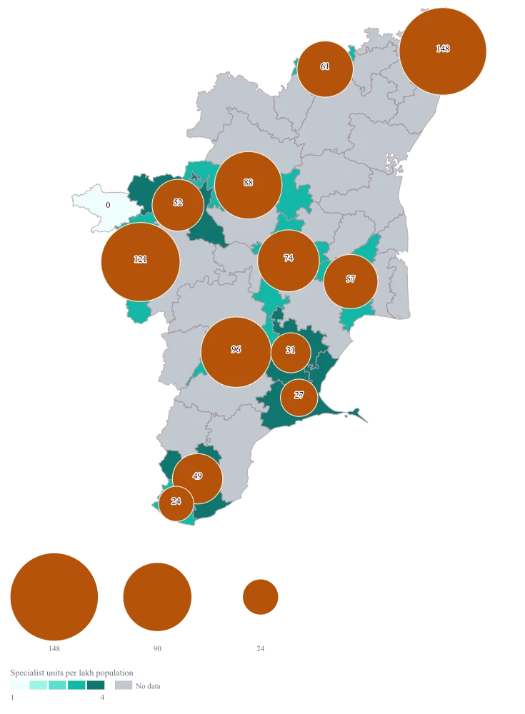
One map on which the size of a circle is how many units a district has and the colour underneath is how many it has per lakh people, so the argument about which of those two you meant is settled before the meeting starts.
The four choices behind it
How this map was made
Four questions, in the order the builder asks them. Every picture below is the real renderer on the real geography, so this is the sequence you will see on your own screen.
- Step 1
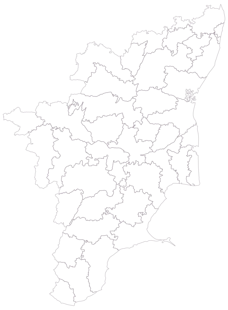
Choose Tamil Nadu at district level.
The state is drawn as outlines only — no colour, no legend, nothing joined yet. The shipped geometry carries 38 districts, and this is the moment to notice that it uses Tuticorin, Kanniyakumari and The Nilgiris. Those are the spellings your sheet has to match.
- Step 2
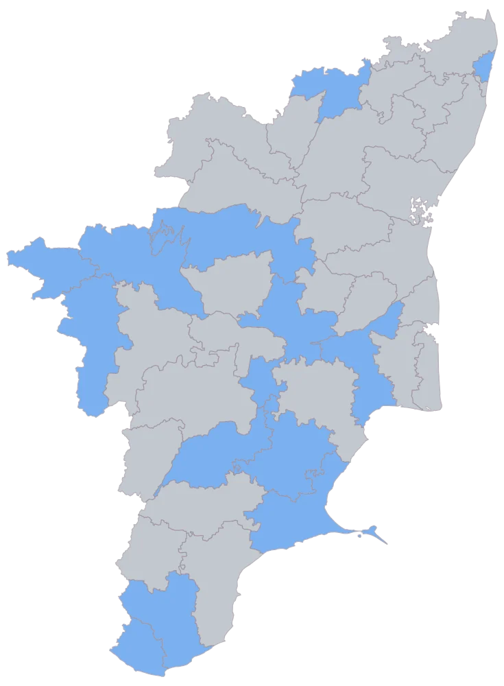
Paste the sheet, district column first, and let the names match.
Thirteen districts come up in one flat blue and the other twenty-five stay grey. This picture is the join and nothing else: it shows which rows carried a value to a district, not how big any value is. Mayiladuthurai matched by name and is still grey, because both its cells are empty — so this picture cannot tell a row that failed to match from a row that matched and had nothing to give. Any district you expected in blue and do not see is one or the other, and the sheet is where you find out which.
- Step 3
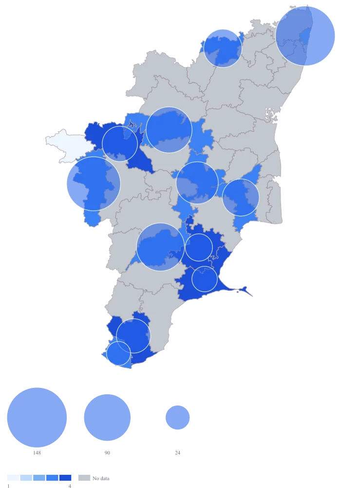
Take the defaults: count on the bubble, rate on the fill, legend on.
Both encodings appear at once, and the disagreement between them is immediately visible — the largest circles sit over the paler districts of the west and north, the smallest over the darker ones in the south-east. The default bubble and the default fill are the same blue, though, so Chennai's circle is hard to separate from the district beneath it, and The Nilgiris has no circle at all.
- Step 4
Switch the fill to the teal ramp, set the bubble fill to a contrasting #b45309, title the legend "Specialist units per lakh population" and turn value labels on.
The amber circles now read cleanly against the teal fill instead of vanishing into it, so the two numbers can be compared district by district. The value labels print the count, which puts a readable 0 on The Nilgiris where there is no circle to see, and they appear only on districts that joined — so grey Mayiladuthurai stays bare and the difference between none and unknown is finally legible. The legend title carries the denominator, which is what stops the map being read as a map of capacity.
The sheet
Paste these columns straight from Excel. The first column names the place; the rest are numbers. Nothing is uploaded — your sheet is read in the browser.
| District | Facilities with a specialist unit | Specialist units per lakh population |
|---|---|---|
| Chennai | 148 | 3.1 |
| Coimbatore | 121 | 3.4 |
| Madurai | 96 | 3.6 |
| Salem | 88 | 3.7 |
| Tiruchirappalli | 74 | 3.9 |
| Vellore | 61 | 3.8 |
| Thanjavur | 57 | 4.1 |
| Erode | 52 | 4.4 |
| Tirunelveli | 49 | 4.2 |
| Sivaganga | 31 | 5.2 |
| Ramanathapuram | 27 | 4.9 |
| Kanniyakumari | 24 | 3.3 |
| The Nilgiris | 0 | 0 |
| Mayiladuthurai | — | — |
Why this map
The question has two numbers in it, so the map carries both: the bubble is the district's own count and the fill is the same district's rate. On this sheet Chennai holds nearly five times Sivaganga's units, while Sivaganga's rate of 5.2 per lakh is about two-thirds higher than Chennai's 3.1 — the two encodings disagree, and that disagreement is the finding. Chennai and Coimbatore together hold 269 of the 828 mapped units, about a third. Every figure on this page is invented sample data: it is not a facility count for Tamil Nadu or for any district in it. The bubble is drawn at the centre of the district's shape and stands for the district total; it does not mark a building, and this map cannot plot one, because it has no pins and no latitude and longitude.
What goes wrong
A map of total facilities is, very nearly, a map of where the people live. Colour this sheet by the count column and Chennai, Coimbatore, Madurai and Salem go dark, which is a fact about population rather than about provision. Colour it by the rate and the order inverts: Sivaganga and Ramanathapuram, near the bottom of the count column, sit at the top of the ramp. Both maps are correct, and they answer different questions.
Decide the question before you decide the column. "Where is the most capacity?" is the count. "Where is a person least likely to reach a unit?" is the rate. On a map like this one, put the count on the bubble and the rate on the fill so the reader can see both and you are never quietly answering the other question. Write the denominator into the legend title — units per lakh population — because a rate with an unnamed base is not a rate anybody can check.
The Nilgiris carries a genuine 0 on this sheet: counted, and holding none. Mayiladuthurai is blank because its return had not come in. On the map those two look far more alike than they are. The 0 falls into the lowest band of the ramp, which on a pale palette is nearly white, and no-data is drawn in the shipped grey of #e5e7eb — light, and only a shade away from it. Worse, a count of 0 draws no bubble at all, so a district with a real, important zero has nothing on it and is easy to read as a district you never had a figure for.
Keep the two apart and say which is which. Set no-data to grey, choose a palette whose lowest band is a tint rather than white, and switch value labels on so the 0 is printed where there is no circle to read. Then write the distinction into the legend title or the caption in one line: grey means no return, the palest band means none. There is no hatching or pattern fill available, so this has to be done with the label and the caption rather than with a texture.
A unit count is capacity, not use. The same district shapes coloured by caseload per unit tell a nearly opposite story: the districts with the most units per lakh can be the ones whose units run quietest, and the ones that look thinly provided can be the ones running at the edge. A reader shown a map titled only "health facilities" will supply whichever of the two meanings suits the argument in the room.
Put the meaning in the legend title, not in the caption, because the legend is the part a screenshot keeps. Say "specialist units per lakh population" rather than "health coverage". If utilisation is what you actually want to argue about, map it as its own value with its own legend title on a second map beside this one, rather than hoping one ramp can carry capacity and use at the same time.
Other worked examples
- Coverage vs Demand Map of India — Gujarat, district, bubble + colour
- District-Wise Sales Heat Map of India — Pan India, district, bubble + colour
- School Enrolment Map of India by District — Bihar, district, bubble + colour
- Manufacturing Output Map of Telangana by District — Telangana, district, bubble + colour