Worked example
District-Wise Sales Heat Map of India
You are a national sales manager and the monthly review is on Thursday. The secondary sales sheet has one row per district and two columns your leadership argues about — value this year and growth against last year — and reading four hundred rows of it aloud has never once changed a decision.
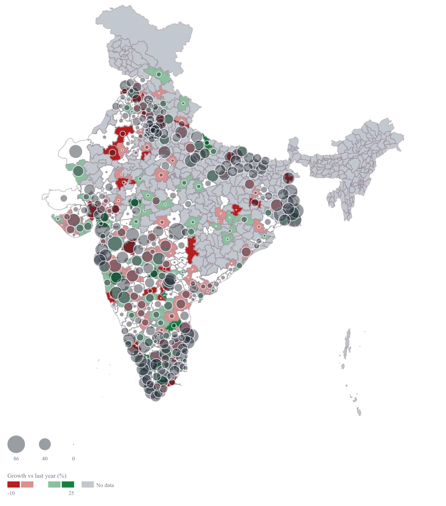
One map that answers both questions at once: where the money is, and which of those places has stopped growing. You can point at a large pale bubble and say that this district is a quarter of the region and flat, which is a different conversation from a small bright one.
The four choices behind it
How this map was made
Four questions, in the order the builder asks them. Every picture below is the real renderer on the real geography, so this is the sequence you will see on your own screen.
- Step 1
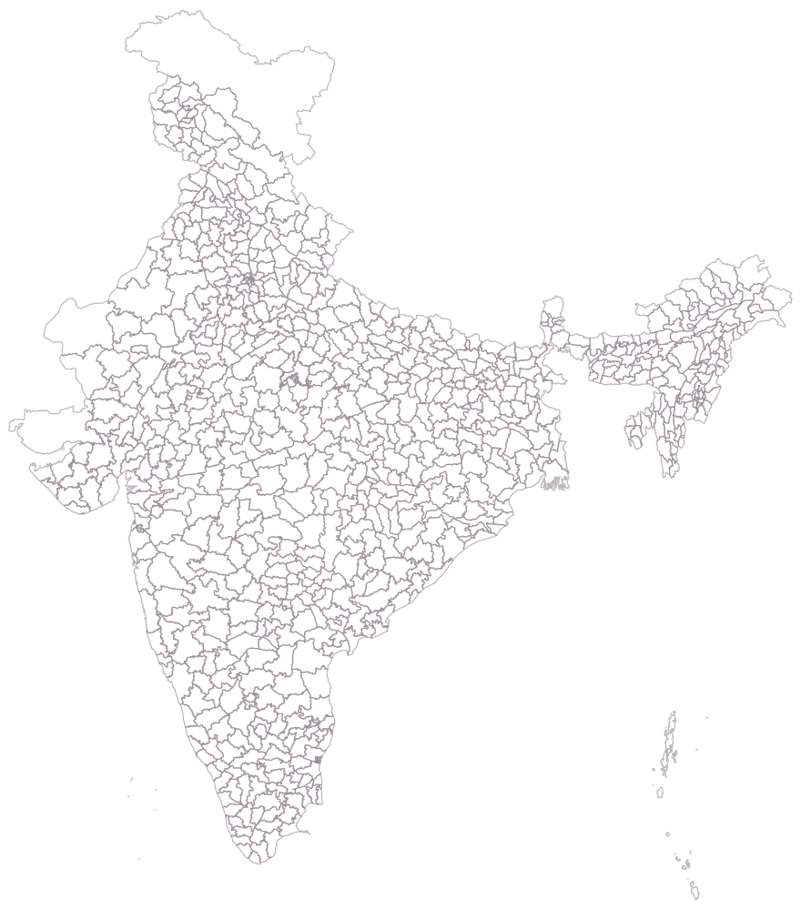
Choose Pan India at district level, because the review covers the country and not one region of it.
The 785 districts come up as empty outlines, which is the honest starting point for this deck: you ship to 401 of them, and the other 384 are going to be grey all evening.
- Step 2
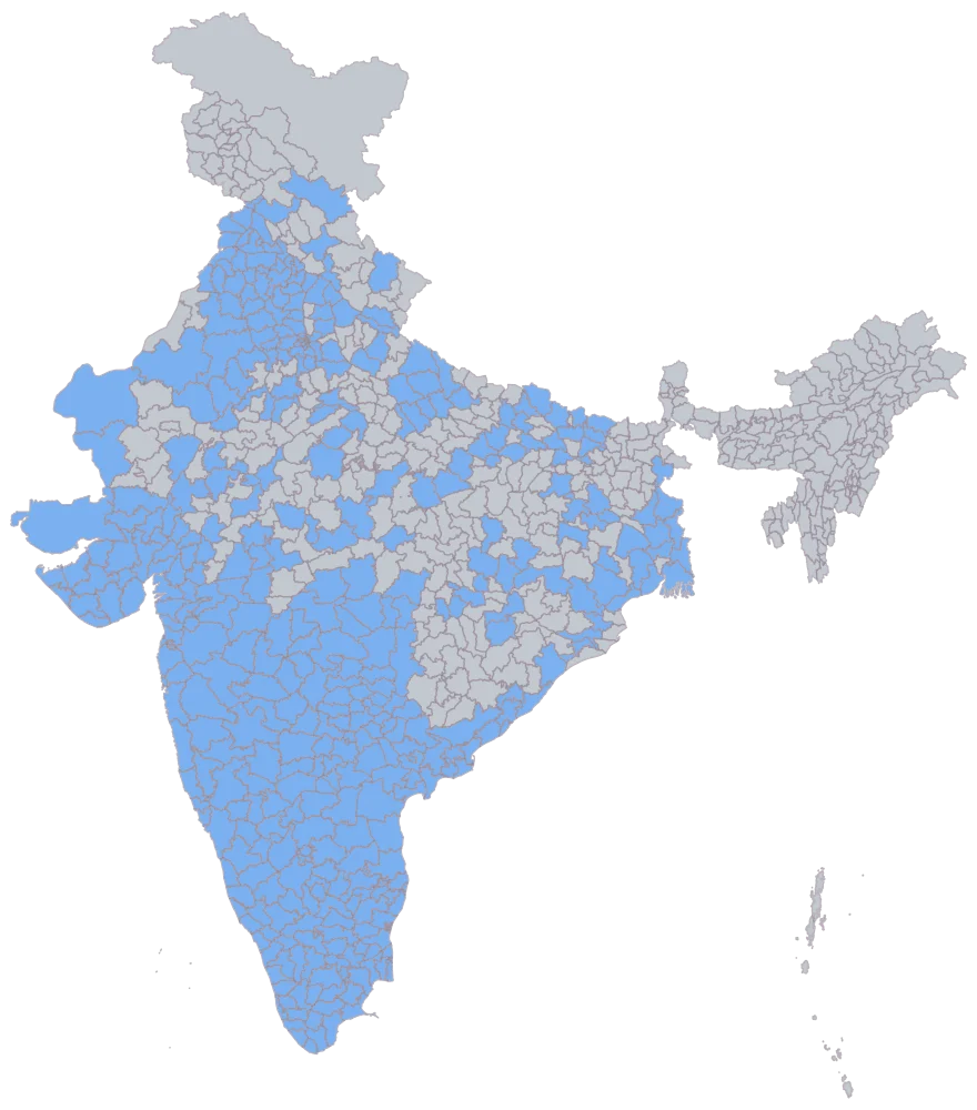
Paste the district column with secondary sales and growth beside it.
401 districts turn flat blue and 384 stay grey. That grey is the not covered you will have to define in the caption, and this is also the fastest check that a district you do ship to has not gone missing on a spelling.
- Step 3
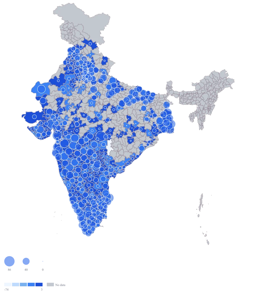
Send secondary sales to bubble size and growth to area colour.
Nagpur and Surat take the large circles as expected, but the colour is doing nothing: Gadchiroli at -100 stretches the automatic scale so far that two of the five bands come out empty, Gadchiroli has the lowest band to itself, and 247 of the 400 growth readings crowd into the top shade.
- Step 4
Set custom breaks at -10, 0, 15 and 25 on the red to green ramp, and give the bubbles a translucent slate fill.
The bands now carry what the review argues about. 30 districts have fallen by a tenth or more and take the deep red; 81 are down but shallow; 189 hold the white middle between nil and 15 per cent; 89 are growing; and 11 have run past 25. Gadchiroli at -100 shares the deep red band with the other steep fallers rather than owning a band of its own, which is correct, because all of them are movements of a few lakh rupees. Putting the outer breaks at -10 and 25 is what stops one district at -100 spending the whole ramp, and it also fills the top of the ramp: at breaks of 0 and 15 alone the growing districts come out white and vanish into the page.
The sheet
Paste these columns straight from Excel. The first column names the place; the rest are numbers. Nothing is uploaded — your sheet is read in the browser.
| District | Secondary sales (₹ lakh) | Growth vs last year (%) |
|---|---|---|
| Nagpur | 86.4 | 8.2 |
| Surat | 74.1 | 12.6 |
| Dakshina Kannada | 47.8 | 9.3 |
| Solapur | 41.7 | -3.4 |
| Saharanpur | 33.2 | 14.7 |
| Dindigul | 22.9 | 5.1 |
| Tuticorin | 19.6 | -1.8 |
| Udupi | 15.4 | 6.9 |
| Chandrapur | 13.7 | 2.6 |
| Kolar | 12.1 | 21.5 |
| Gonda | 9.8 | 18.2 |
| Bahraich | 6.3 | 27.4 |
| Dang | 4.2 | — |
| Gadchiroli | 0 | -100 |
| 24 Paraganas North | 61.3 | 15.5 |
| 24 Paraganas South | 61.8 | 16 |
The first 16 rows of 401. The map above is drawn from all of them — a national map wants a national sheet, and yours will be longer than this too.
Why this map
Two numbers, two encodings: the bubble carries how much a district sells and the fill carries which way it is moving, so size and colour disagreeing is exactly the signal you came for.
What goes wrong
You ship to 401 districts and the map draws 785, so every one of the 384 you left out of the sheet is drawn as no-data. Kandhamal, which is not in the sheet at all, and Gadchiroli, which is in it at nil, mean entirely different things — one you never sold into, the other you did and stopped — and a reviewer reading a grey district cannot tell which of the two they are looking at.
Decide what the white areas mean before you present, and say it in the caption. If a district is genuinely outside your distribution, leave it out and label the no-data colour "not covered". If it is covered and sold nothing, put a real 0 in the sheet, as Gadchiroli does here, so it lands at the bottom of the scale rather than falling off it.
Growth per cent on a small base swamps the colour ramp. Bahraich at +27.4% and Gadchiroli at -100% are both movements of a few lakh rupees, but they take the two ends of the scale and push Nagpur and Surat — where nearly all the money is — into the indistinguishable middle.
Set custom breaks that clip the tails, say -10% to +15%, so the ramp spends its range where the business is. If the tails still dominate, colour by the rupee change instead of the percentage; a district that grew by ₹6 lakh then looks bigger than one that doubled ₹40,000.
Secondary sales MIS is usually keyed to the distributor or depot, not to the district, and one distributor commonly bills across three districts. Splitting that billing equally across them invents geography that your ledger never recorded.
Map only at the level your data is honestly keyed to. Where a distributor spans districts, either aggregate your sheet up to the district that holds the majority of its retail outlets and footnote the approximation, or drop those rows. The map colours and sizes one value per district; it cannot group districts into a territory for you, so do that arithmetic in the sheet where it is visible and auditable.
Other worked examples
- Coverage vs Demand Map of India — Gujarat, district, bubble + colour
- Health Facility Map of India by District — Tamil Nadu, district, bubble + colour
- School Enrolment Map of India by District — Bihar, district, bubble + colour
- Manufacturing Output Map of Telangana by District — Telangana, district, bubble + colour