Worked example
Coverage vs Demand Map of India
You are putting next year's footprint together — where the teams go, where the camps are held, where the vehicles run. The case is being argued across two spreadsheets, what you already do in each district and what each district appears to need, and every meeting stalls with somebody holding two printouts side by side doing the join in their head.
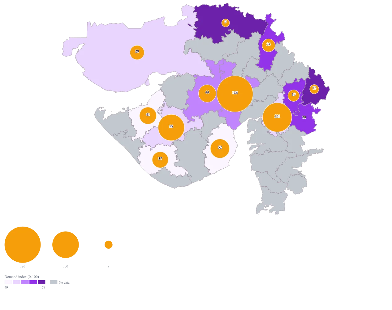
One map on which a small bubble sitting on a dark district is the finding: a place that needs a great deal and gets little from you. The districts you already serve well stop taking up the argument, because the map has already said so.
The four choices behind it
How this map was made
Four questions, in the order the builder asks them. Every picture below is the real renderer on the real geography, so this is the sequence you will see on your own screen.
- Step 1
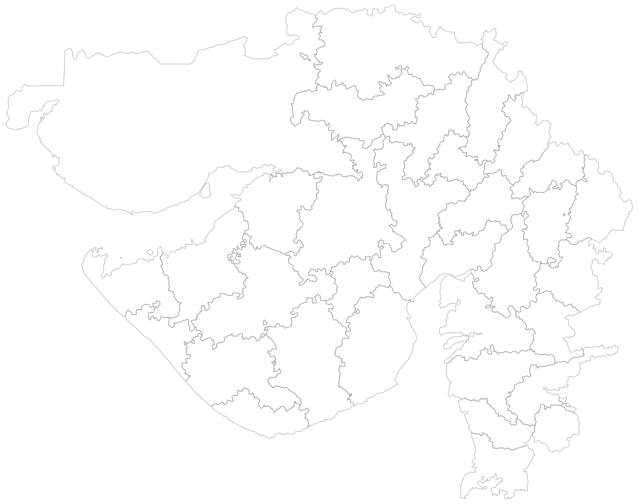
Choose Gujarat at district level, because the footprint is being argued district by district inside one state.
The state comes up in outline only, and it is worth a moment: Kachchh alone holds close to a quarter of the frame and will carry one of the smaller bubbles, so area is already competing with the thing you want read.
- Step 2
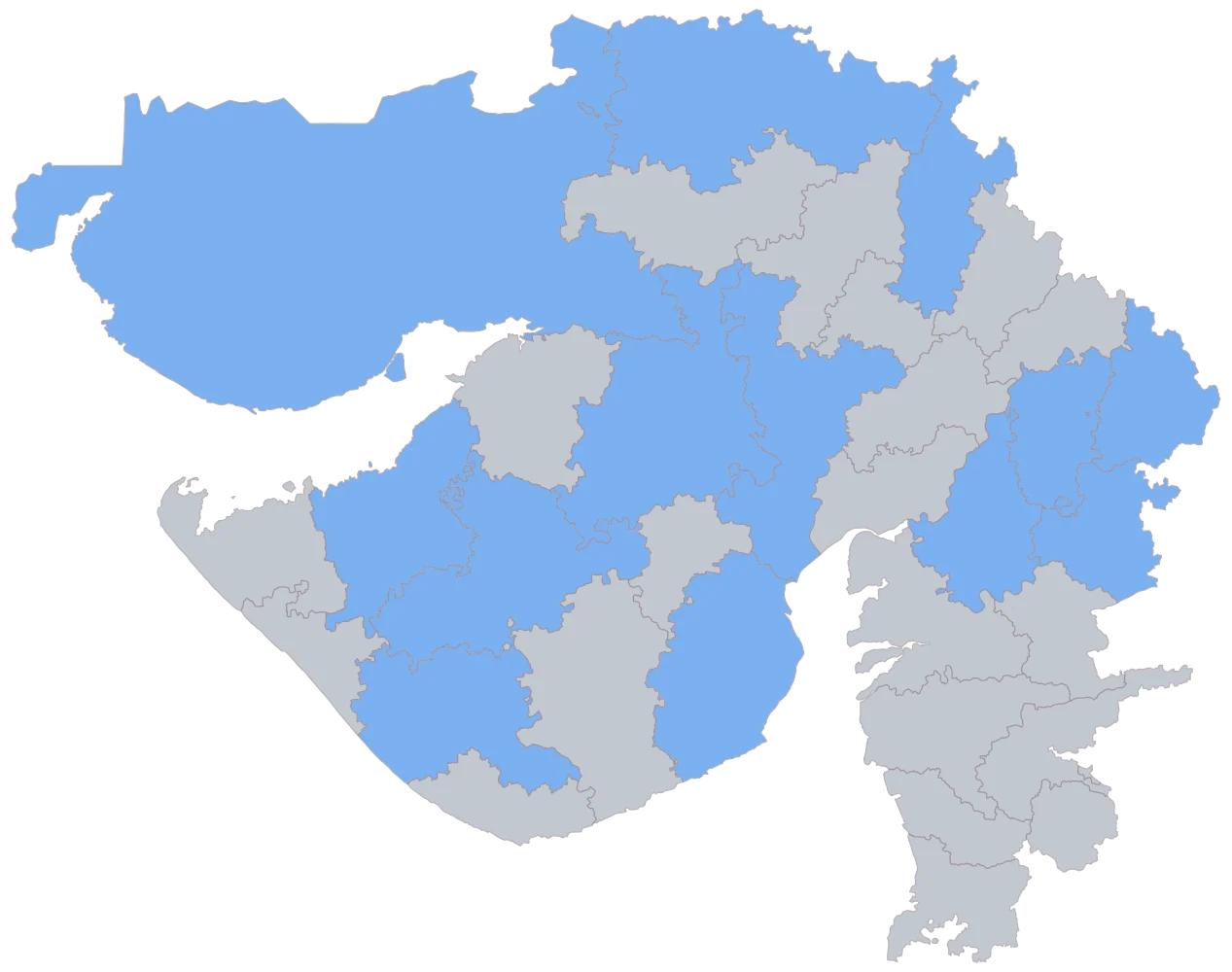
Paste all three columns at once, district, units served, and demand index.
Thirteen districts shade flat blue and the rest of Gujarat stays grey. Devbhumi Dwarka is grey because it is outside the plan altogether, and seeing that before either encoding is switched on is the only easy chance you get to notice it.
- Step 3
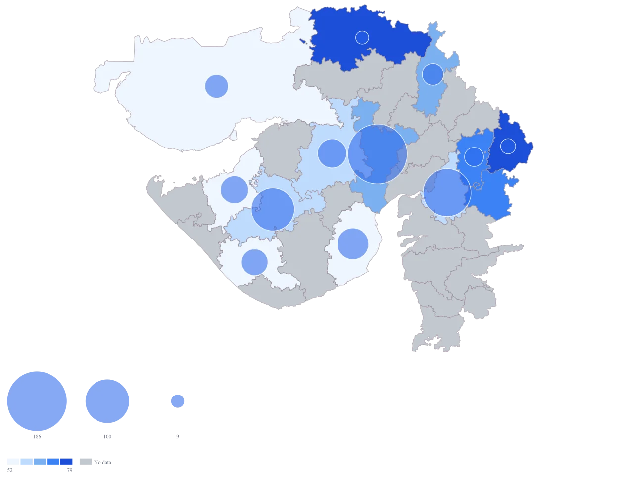
Send units served to bubble size and the demand index to area colour.
Both encodings arrive together and so does the shape of the argument: Banas Kantha and Dohad come up dark with small circles on them, while Ahmadabad carries the largest bubble on a middling fill.
- Step 4
Take the fill to purple, set the scale to quantiles, give the bubbles an amber fill, and switch value labels on.
Amber circles stop dissolving into the dark districts they sit on, which the default blue bubble does on exactly the districts you most need to read, and the quantile bands pull apart demand readings that were bunched between 43 and 88. The labels put the coverage figure on the map, so Chhotaudepur reads 0 where there is no circle to read at all.
The sheet
Paste these columns straight from Excel. The first column names the place; the rest are numbers. Nothing is uploaded — your sheet is read in the browser.
| District | Our coverage: units served (thousand) | Demand index (0-100) |
|---|---|---|
| Ahmadabad | 186 | 64 |
| Vadodara | 121 | 58 |
| Rajkot | 98 | 55 |
| Bhavnagar | 52 | 49 |
| Surendranagar | 44 | 61 |
| Jamnagar | 41 | 43 |
| Junagadh | 37 | 47 |
| Kachchh | 29 | 52 |
| Sabar Kantha | 24 | 66 |
| Panch Mahals | 19 | 71 |
| Dohad | 12 | 83 |
| Banas Kantha | 9 | 88 |
| Chhotaudepur | 0 | 79 |
| Devbhumi Dwarka | — | — |
Why this map
The question is a comparison between two numbers inside one district, so both belong in one shape: the bubble carries what you do there and the fill carries what the district needs. Banas Kantha holds the highest demand reading on this sheet on about a twentieth of Ahmadabad's volume, and that is visible at a glance only when the two encodings sit together. The bubble is the district's own total drawn at the centre of the district's shape — it does not mark a place, and this map cannot plot one, because there are no pins and no latitude and longitude anywhere in it.
What goes wrong
Every other map trains a reader to look for the loud thing, and here the finding is quiet: a small circle on a dark fill. The bubble also sits on top of the very colour it is meant to be compared against, so the districts where you are strongest are the ones that hide their own demand reading.
Set bubble size to small, and check that the fill is still readable underneath the largest circle — Ahmadabad here — before you present. Then put a ratio column in the sheet, demand divided by your volume, and sort by it, so the order you describe in words agrees with the map instead of depending on the room spotting it.
A district where you do nothing draws no bubble at all. Chhotaudepur is a real 0 on a high demand reading, which makes it one of the strongest cases on the sheet, and it appears as a coloured district with nothing on it — at a glance indistinguishable from Devbhumi Dwarka, which is blank because it is outside the plan altogether.
Switch value labels on so the 0 is legible where there is no circle to read, style no-data as grey rather than white, and name the zero-coverage districts in the caption. There is no hatching or pattern fill to fall back on, so the caption is doing work the map genuinely cannot do for you.
The two columns almost never come from one place. Your volume is your own system for a period you can name; the demand reading is a model, or a proxy you chose — population, a survey, last year's enquiries — on a scale with no units. Subtracting one from the other, or calling the difference a shortfall of so many units, produces a figure that looks precise and cannot be defended in a review.
Keep the columns as what they are: one measured, one ranked. Label the demand column with its source and its year in the caption, and use the map to order districts by how much attention they deserve rather than to size a target. If somebody needs a target, derive it in the sheet where the assumption is written down and can be argued with.
Other worked examples
- District-Wise Sales Heat Map of India — Pan India, district, bubble + colour
- Health Facility Map of India by District — Tamil Nadu, district, bubble + colour
- School Enrolment Map of India by District — Bihar, district, bubble + colour
- Manufacturing Output Map of Telangana by District — Telangana, district, bubble + colour