Worked example
Rainfall Map of India by District
You are a research fellow writing up a season of district rainfall, and the figure has to go into a paper where a reviewer will ask what the middle of your colour scale means. You have a departure column — this season against a long-period average — and a draft map on which a district that came in exactly on its average is already a shade of green.
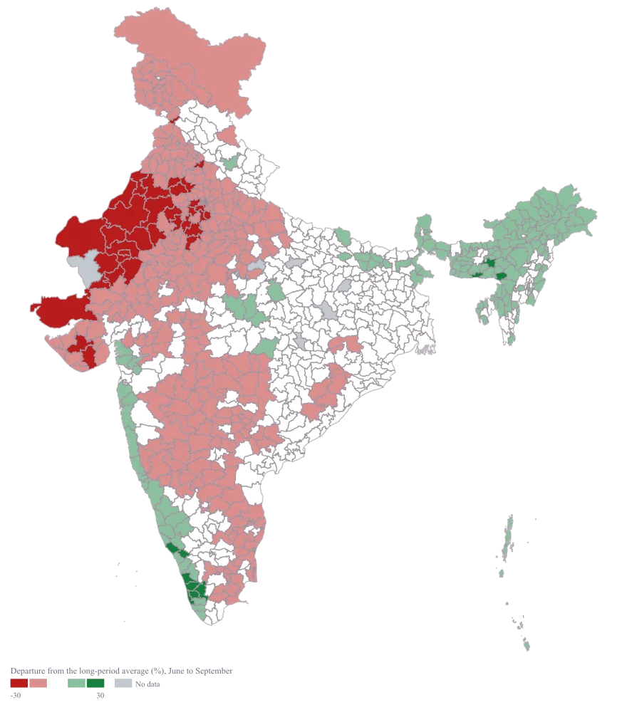
One diverging map whose neutral band sits symmetrically around zero, so a reader can tell surplus from deficit from ordinary without consulting the numbers, and whose title states the months it covers.
The four choices behind it
How this map was made
Four questions, in the order the builder asks them. Every picture below is the real renderer on the real geography, so this is the sequence you will see on your own screen.
- Step 1
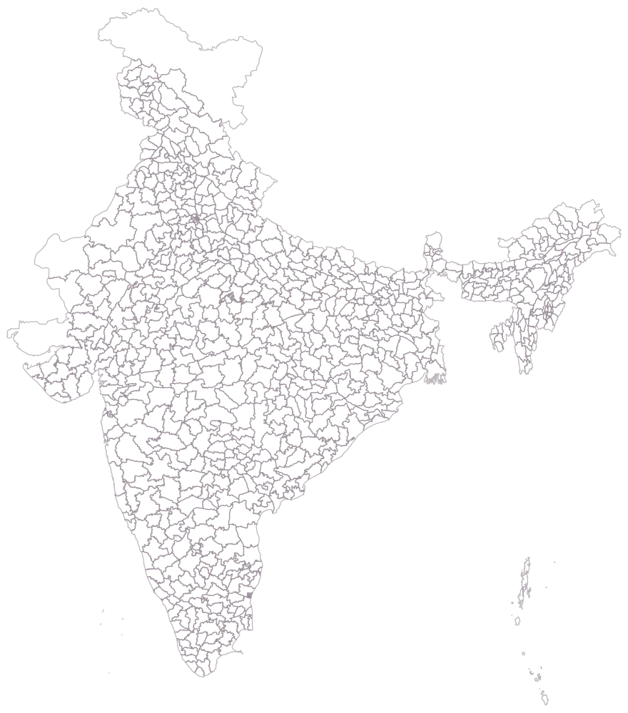
Choose India at district level.
The whole country is drawn as district outlines, empty, with no legend. There are 785 districts in the shipped geometry, so this is also the step that tells you how much of the country a sheet has to cover before the figure can honestly be captioned a map of India. Seven hundred and eighty rows reach 780 of them; the five they cannot reach are named at the join step rather than discovered in the finished image.
- Step 2
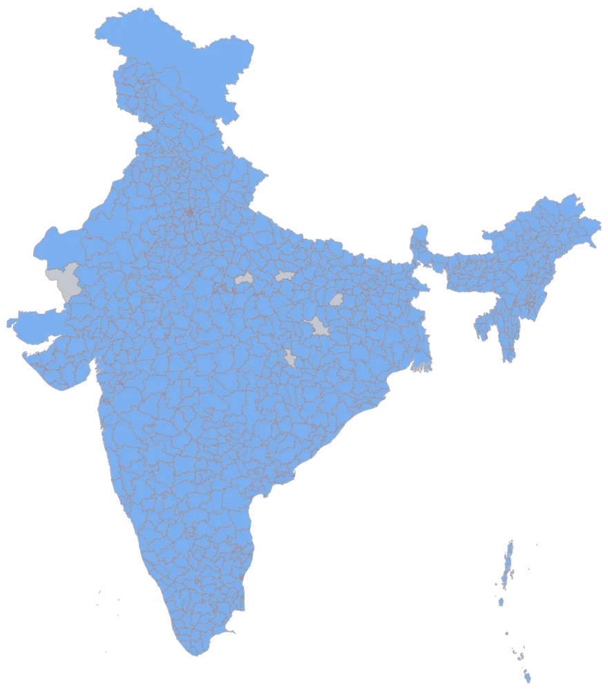
Paste the two-column sheet and match the district names.
779 districts come up in one flat blue and six stay grey, and those six are the whole of what the join has to tell you. Barmer matched by name and is grey because its cell is empty, so grey covers both a reading that is missing and a district the sheet never reached — the sheet tells them apart, this picture does not. The other five were never reached because a bare district name is not unique: the geometry holds Aurangabad, Pratapgarh, Bilaspur, Hamirpur and Balrampur twice each, an exact match on the name resolves to whichever of the pair the index found first, and so Bihar's Aurangabad, Uttar Pradesh's Pratapgarh and Hamirpur, and Chhattisgarh's Bilaspur and Balrampur have no row of their own. This is where you confirm the blue district is in the state you meant rather than its namesake elsewhere.
- Step 3
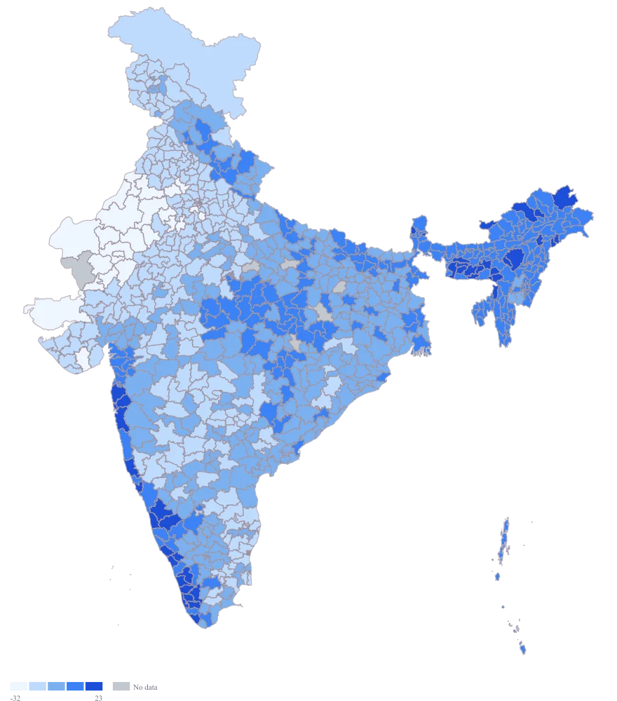
Colour by the departure column and take the plain defaults.
The spread is wide but not lopsided, so the automatic scale cuts the default blue ramp into five bands of equal width — −51 to −32.4, then −32.4 to −13.8, and so on — and that is precisely the wrong picture for this data. A single-hue sequential ramp runs light to dark across the whole range, so Pune's exact zero is simply somewhere along it and carries no special colour; worse, the band zero falls in opens at −13.8 and closes at +4.8, which paints a thirteen per cent deficit and a five per cent surplus the same shade. Nothing separates surplus from deficit. The values are shown correctly and the encoding is misleading, which is the most dangerous combination a map offers.
- Step 4
Switch to the red-to-green diverging ramp, set a custom scale with breaks at −30, −10, +10 and +30, and title the legend "Departure from the long-period average (%), June to September".
Zero now has a colour of its own. The middle band is white and covers −10 to +10, so Pune at 0, Cuttack at −4 and Chamoli at +6 read as near-normal together with 313 other districts; 34 sit in the deep red below −30 and 270 in the lighter red, 149 in the lighter green and ten in the deep green above +30. The red end gathers western Rajasthan and Kachchh, the green end Kerala and the Meghalaya hills, and the reader gets the sign of the anomaly without looking at a number. Two cautions come with it. Red-to-green is the classic failure for the roughly one man in twelve with red-green colour blindness, so keep the numbers in a table beside the figure; and the white middle band sits close to the grey used for no data, so name Barmer in the caption as a district with no reading rather than trusting the two tones to be told apart.
The sheet
Paste these columns straight from Excel. The first column names the place; the rest are numbers. Nothing is uploaded — your sheet is read in the browser.
| District | Departure from the long-period average (%) |
|---|---|
| Alappuzha | 34 |
| Kozhikode | 28 |
| East Khasi Hills | 21 |
| Nagaon | 17 |
| Dhemaji | 12 |
| Chamoli | 6 |
| Pune | 0 |
| Cuttack | -4 |
| Koraput | -11 |
| Solapur | -19 |
| Bathinda | -26 |
| Hisar | -33 |
| Bikaner | -41 |
| Jaisalmer | -48 |
| Barmer | — |
| Udupi | 28 |
The first 16 rows of 780. The map above is drawn from all of them — a national map wants a national sheet, and yours will be longer than this too.
Why this map
A departure from an average is a signed quantity with a real zero, so it is one of the few values that genuinely earns a diverging ramp: below the middle means less than usual, above it means more, and the middle means neither. Of the 779 districts carrying a figure here, 339 came in above their average, 420 below, and twenty — Pune among them — exactly on it. Every figure on this page is invented sample data assembled to demonstrate the scale; none of it is a rainfall reading for any district, any season or any year, and nothing here is attributed to any real measurement programme. What is not invented is the geometry: all 780 names on this sheet were read out of the shipped district file, so Alappuzha and Kozhikode are in Kerala, East Khasi Hills in Meghalaya, Nagaon and Dhemaji in Assam, Chamoli in Uttarakhand, Pune and Solapur in Maharashtra, Cuttack and Koraput in Odisha, Bathinda in Punjab, Hisar in Haryana, and Bikaner, Jaisalmer and Barmer in Rajasthan.
What goes wrong
A diverging ramp is a claim that the middle of your scale means something, and most rainfall columns do not support it. Put total millimetres on a red-to-green ramp and the neutral colour lands wherever the automatic breaks happen to put it — somewhere around the middle of the observed range — so a district is drawn as "ordinary" because it is ordinary relative to the other districts you happened to include, which is not a fact about rainfall at all. Change the set of districts and the invented middle moves.
Use a diverging ramp only on a value that is already signed around a fixed zero: a departure, a change, an anomaly. For totals use a single-hue sequential ramp instead. Then set the breaks yourself rather than leaving them automatic, and make the neutral band straddle zero symmetrically — the custom breaks of −30, −10, +10 and +30 used here put the pale middle band on −10 to +10, so it means near-normal and nothing else. Name the average in the caption: a departure is only as meaningful as the baseline period it is measured against.
One month is not the year. A departure computed over a single month, or over one spell of a season, will show a pattern that reverses a few weeks later, and a map whose title says only "rainfall map" carries no way for a reader to know which window it covers. That map is then reused next quarter by somebody who assumes it is current, and it is not the map's fault, because the map never said.
Put the period in the title and in the legend title, not only in a caption that gets cropped out of a screenshot — "departure from the long-period average (%), June to September" travels with the image. Where the seasonal pattern is the point, publish the windows as a set of maps sharing one legend and one set of breaks, so the panels can honestly be compared; recomputing the breaks per panel makes each one internally sensible and the set meaningless.
A choropleth spends its ink on land, and the land is not evenly populated. Jaisalmer, Barmer and Bikaner are among the largest districts in the country and take up a large part of the western frame, so a deficit there dominates the impression the map leaves. The districts on this sheet in Kerala and Assam are physically small, and a substantial surplus in Alappuzha occupies a sliver a reader has to be told to look for. The map is therefore area-weighted by construction, and no setting makes it population-weighted: this is a district map, not a cartogram, and it cannot resize a district to match the people in it.
Say so in one line of the caption, and put a short ranked table of the largest departures beside the map so the small districts are at least named. If the argument is about people rather than about land, carry a population column in the sheet, compute the share of population under each band yourself, and quote that figure in the text — the map orders the districts, the sheet does the weighting. Where the crowded end is the whole point, map one state instead of all of India so those shapes get the room to be read.
Other worked examples
- District-Wise Heat Map of India — Madhya Pradesh, district, colour
- Population Density Map of India by District — Pan India, district, colour
- Survey Results Map of India — Odisha, district, colour
- India Market Share Heat Map — Pan India, district, colour