Worked example
PIN Code Map of Tamil Nadu
You are the analyst for a retail chain's home-delivery business across Tamil Nadu, and returns have become the standing item. The state table has a returns rate against every PIN code the chain ships to, and a repeat-purchase figure beside it, and every attempt to present it so far has ended with somebody asking whether the two columns can be netted off against each other.
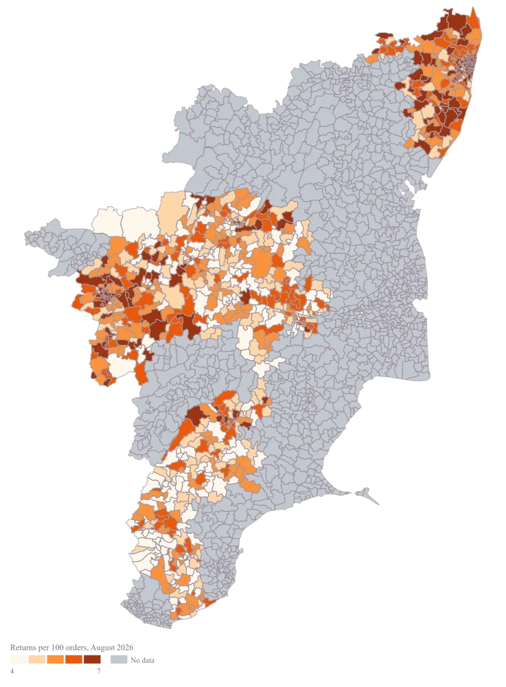
A Tamil Nadu map that puts the returns rate on the PIN areas it belongs to, with the period named on the legend and the second column deliberately kept off the map, so the exhibit says one thing and can be defended when it is challenged.
The four choices behind it
How this map was made
Four questions, in the order the builder asks them. Every picture below is the real renderer on the real geography, so this is the sequence you will see on your own screen.
- Step 1
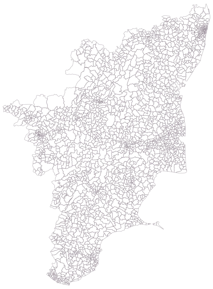
Pick Tamil Nadu and set the level to PIN code.
The map comes up as outlines only — 2,038 areas, no colour, no legend. At this density the mesh is the lesson: the rural codes read as recognisable shapes and the urban ones are a smudge of hairlines around Chennai, Coimbatore and Madurai. Whatever you shade next is going to be read at these sizes, so decide now whether the state is the right frame for the codes you care about.
- Step 2
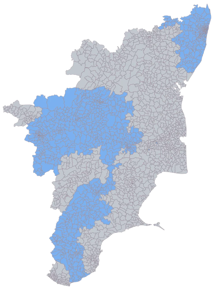
Paste the 919 rows with the PIN codes in the first column.
918 cells come up in one flat blue and 1,120 stay grey, and this picture is the join itself. The blue is a solid block — the north-east around Chennai, the western belt through Coimbatore, Tiruppur, Erode and Salem, and a southern arm down to Madurai and Tirunelveli — and the grey is the delta and the far south, where the chain does not ship. That contiguity is what makes the step worth pausing on: a mistyped code is a single grey cell inside the block, and this is the only moment it will ever be visible. By the next step it will be dressed in the same grey as the eleven hundred codes you never claimed. Count the shaded cells against the rows you pasted before you go on.
- Step 3
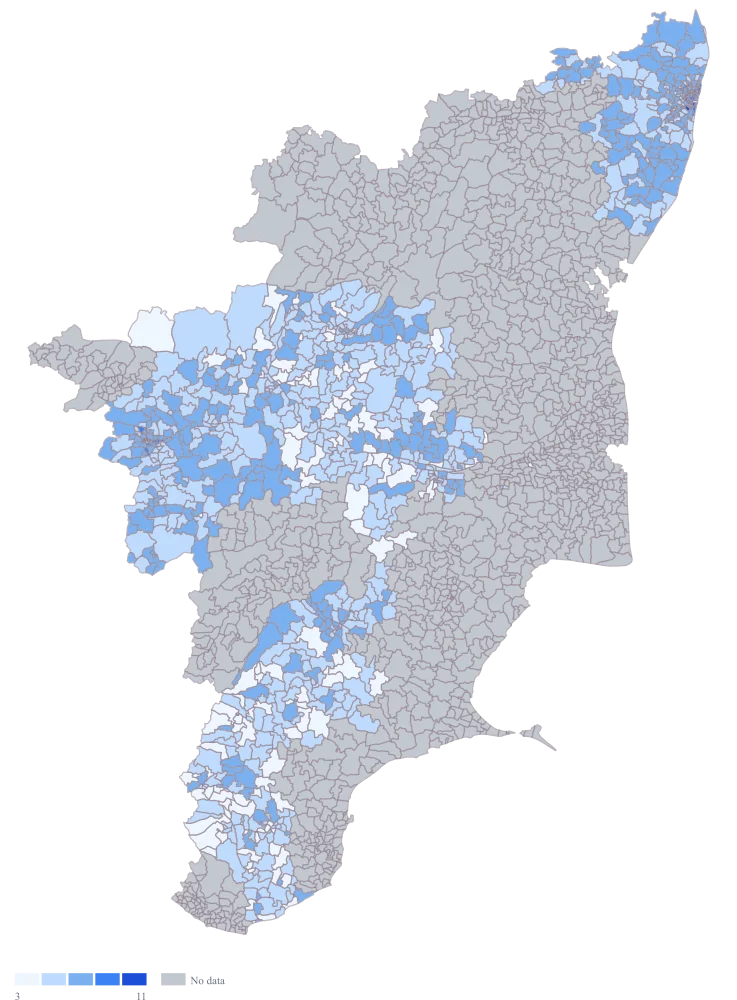
Switch the fill on with the default palette and the automatic scale.
The rate lands on the areas, and so does the geometry's bias: 614302 and the other large rural cells take far more of the coloured surface than their share of the readings, while the five Chennai codes carrying the highest rates are almost too small to register. 614302 is a genuine zero and takes the palest step on the ramp, which is a different colour from the grey of 627358 beside it, where the sheet is blank — though not by much, and not by enough to rely on. The default ramp spreads all 918 readings at even intervals, which drops 444 of them into a single band and leaves the top band holding three codes: 600020, 600042 and 600083.
- Step 4
Switch to the orange ramp with quantile buckets, and title the legend with the measure, its base and the month.
Quantile buckets size each step by how many codes fall into it rather than by the width of the range, so the five bands now carry between 177 and 194 codes each instead of one holding 444 and another holding three. That is the difference between a state drawn almost entirely in one shade of orange and one where the western belt, the Chennai fringe and the southern arm can be told apart. Orange reads as a warning where blue reads as neutral, which is the right register for a rate you want acted on. The legend now names the base and the period, so the map cannot be quoted as a count of returns and cannot be circulated in November as though it were November's.
The sheet
Paste these columns straight from Excel. The first column names the place; the rest are numbers. Nothing is uploaded — your sheet is read in the browser.
| PIN code | Returns per 100 orders | Repeat purchases per 100 customers |
|---|---|---|
| 600020 | 14.2 | 38 |
| 600042 | 12.6 | 41 |
| 600083 | 11.8 | 35 |
| 600001 | 10.4 | 29 |
| 600101 | 9.7 | 44 |
| 641001 | 8.9 | 33 |
| 636007 | 7.5 | 27 |
| 638001 | 6.8 | 25 |
| 625002 | 6.1 | 31 |
| 620017 | 5.4 | 28 |
| 627002 | 4.3 | 22 |
| 613005 | 3.6 | 19 |
| 614302 | 0 | 12 |
| 627358 | — | — |
| 600002 | 9.6 | 37 |
| 600017 | 9.6 | 43 |
The first 16 rows of 919. The map above is drawn from all of them — a national map wants a national sheet, and yours will be longer than this too.
Why this map
The mapped value is a rate — returns divided by orders — and a rate has already been divided once, so there is nothing left for a bubble to carry and no total a circle could stand for. Colour is the honest encoding, and the order column stays on the sheet where anybody can check the division. The five highest readings on this sheet are the five Chennai codes, and the top of them, 600020, is almost four times 613005 in Thanjavur. All of these are illustrative sample figures and are not the returns of any real retailer.
What goes wrong
A PIN area is as large as its postal round needs to be, and the map spends its ink accordingly. The Tamil Nadu geometry carries 2,038 areas, and one rural code such as 614302 in Thanjavur or 627358 in Tirunelveli occupies more of the frame than the whole of urban Chennai; meanwhile 600020, 600042, 600083, 600001 and 600101 — the five highest readings on this sheet — are specks a reader has to be told to look for. The impression the map leaves is that the problem is rural, and the sheet says the opposite.
Say the direction of the finding in words above the map, and put a short ranked table of the highest codes beside it so the places the map cannot draw legibly are at least named. Where the city is the finding, map the city's codes on their own instead of the whole state, and let the reader see a dozen urban cells at a size they can actually compare. No setting rescales an area to its volume — this is a PIN map, not a cartogram.
The two columns on this sheet are measured on different bases and look interchangeable. Returns per 100 orders is divided by orders; repeat purchases per 100 customers is divided by customers; and the number of orders a customer places differs from one code to the next, so the two denominators are not even related by a constant. 600101 reads 9.7 and 44, and the natural misreading is that out of the same hundred people, forty-four came back and nearly ten sent something back. Subtracting the columns, ranking on their difference or plotting one against the other all produce something that looks like analysis and is not.
Map one column and one only, and put its denominator in the legend title so the base travels with the picture. Keep the other column on the sheet with its own base written into the header, exactly as it is here. If the two genuinely need to be compared, rebuild one of them on the other's base in the sheet first — returns per 100 customers, say — where the recalculation is visible and can be argued with.
A map with no period on it will be forwarded for a year. The returns rate here is one month; three months later it is in a deck as the current picture of the state, and nobody who receives it can tell, because the only text on a PIN-level map with no labels is the legend and the legend says "Returns per 100 orders". A second map made later from a different month then contradicts the first and both are still circulating.
Put the period in the legend title, not only in the slide heading, because the image is what gets copied out and the heading is what gets left behind. Name it precisely enough to be falsifiable — the month and the year, or the exact date range — and where the sheet is refreshed on a cycle, put the refresh date there too. If the map is meant as a snapshot rather than a trend, say so in the caption, so nobody builds a direction out of two snapshots taken on different bases.
Other worked examples
- Delivery Volume Map by PIN Code — Haryana, pin code, colour
- District-Wise Heat Map of India — Madhya Pradesh, district, colour
- Population Density Map of India by District — Pan India, district, colour
- Survey Results Map of India — Odisha, district, colour