Worked example
Delivery Volume Map by PIN Code
You plan the network, and the Haryana leg is up for review. What you have is the raw delivery export — one row per scan, hundreds of thousands of them, with a PIN code on every line — and what the review wants is a picture of where the volume actually is. The last person to try pasted the export straight in and got a map of nothing.
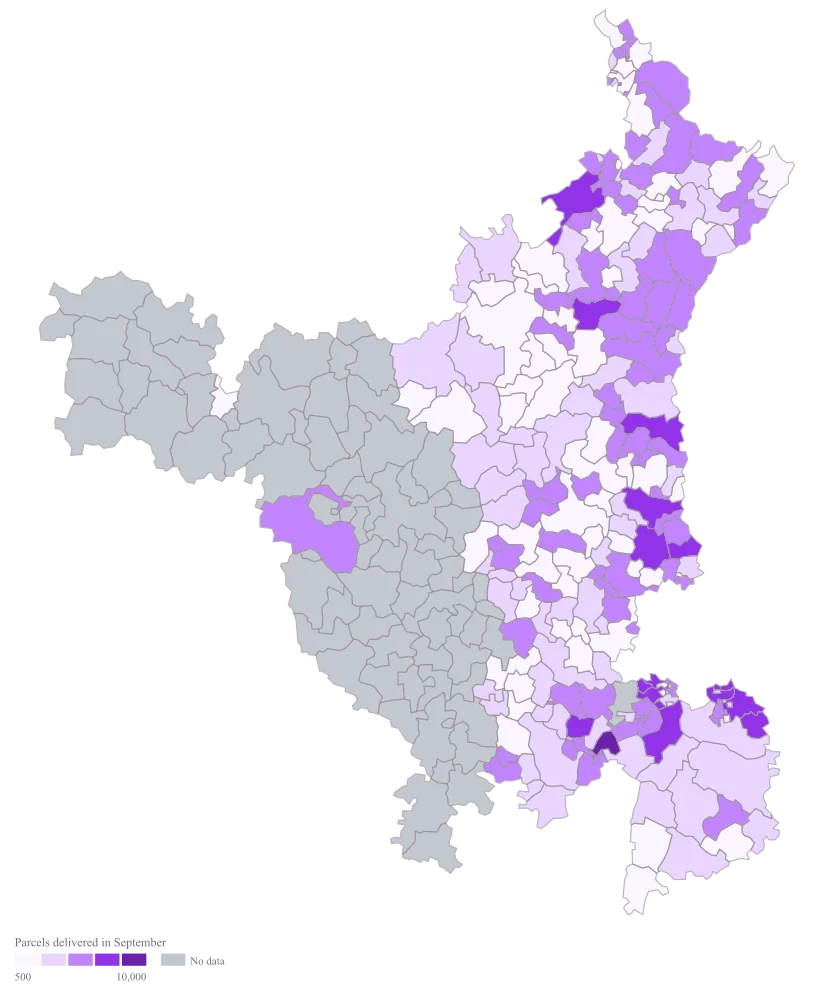
A Haryana map shaded by parcels per PIN code, built from an export you have aggregated yourself, on buckets you chose, so the hub does not flatten the rest of the state into a single colour.
The four choices behind it
How this map was made
Four questions, in the order the builder asks them. Every picture below is the real renderer on the real geography, so this is the sequence you will see on your own screen.
- Step 1
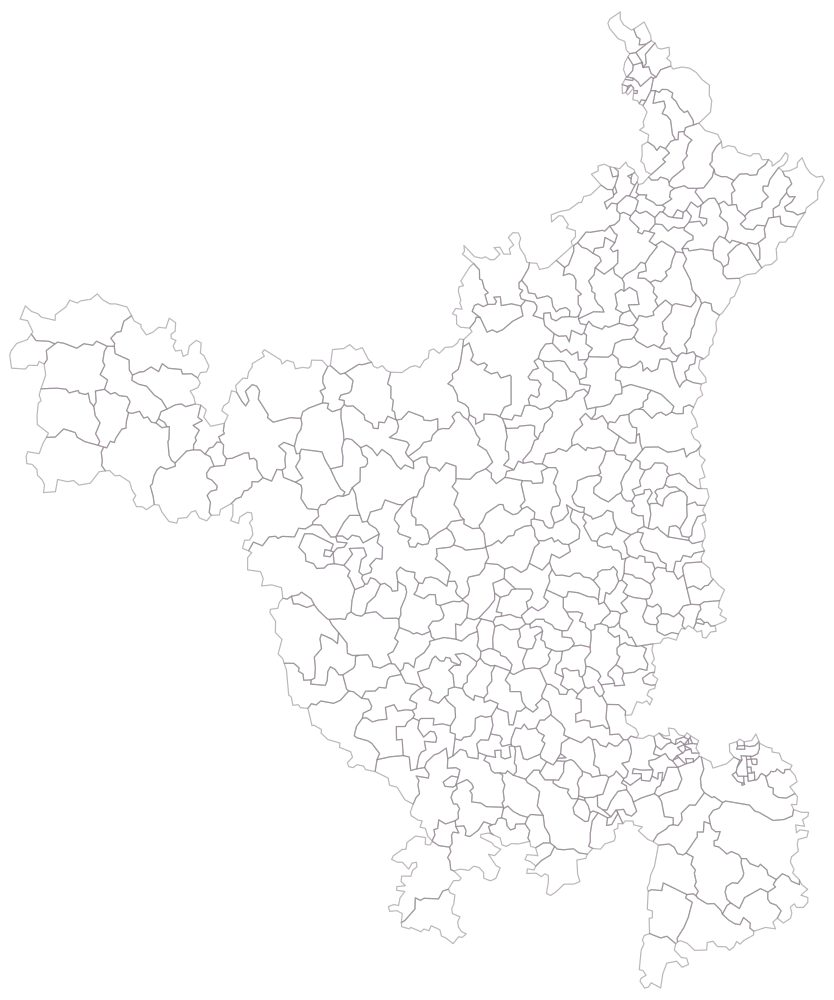
Choose Haryana at PIN-code level and look at it before you add anything.
Three hundred and twelve outlined areas, no colour and no legend. The mesh is coarse compared with a metro state, which is a small mercy: the codes in Gurgaon and Faridabad are legible next to the ones in Sirsa and Hisar rather than vanishing into them. It also shows you the western quarter of the state you are not about to shade, which is the context every subsequent picture is read against.
- Step 2
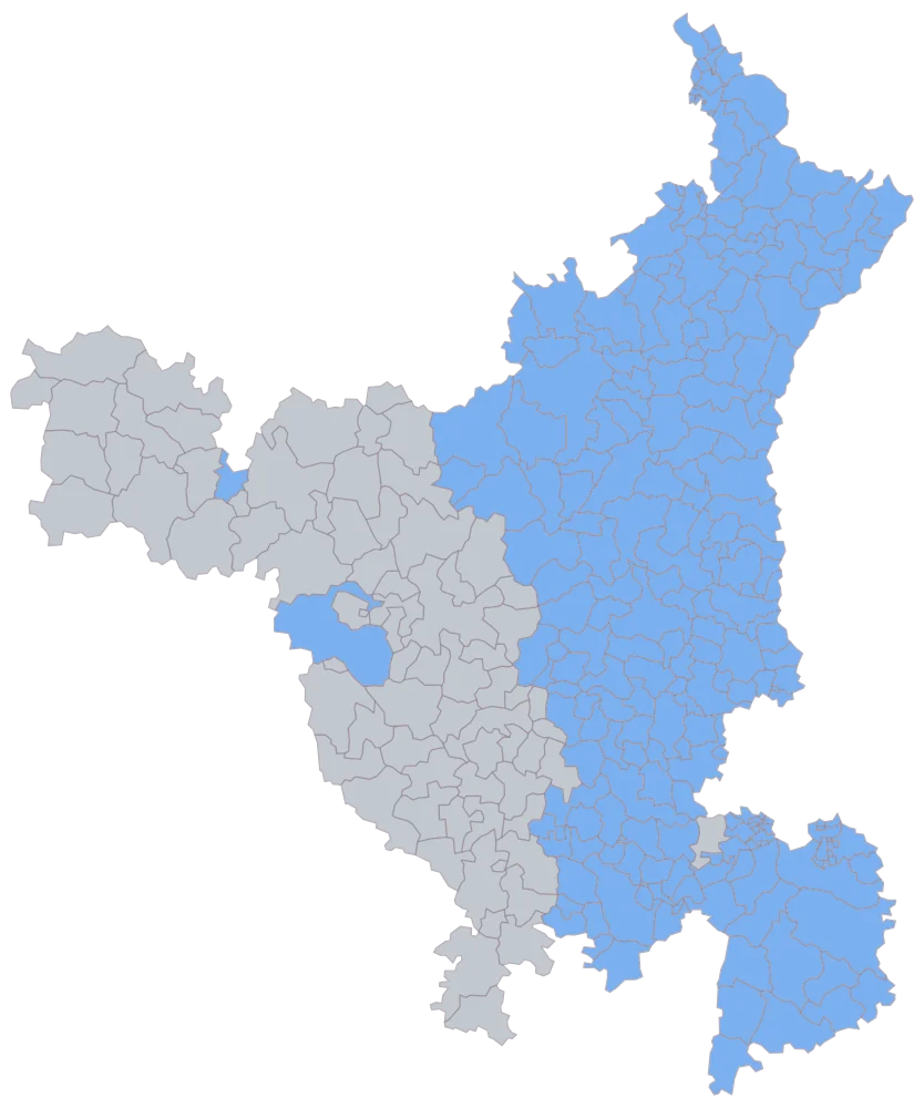
Paste the aggregated sheet — one row per PIN code, 237 of them.
236 areas take a flat blue and 76 stay grey. The grey is one block in the west — Sirsa, Fatehabad and Hisar, and the country down through Bhiwani and Dadri to Mahendragarh — which this network does not run, plus 122505, the one code the sheet deliberately leaves blank. Two codes inside that block are on the sheet anyway: Hisar town, and 125054, which logged nothing at all. This is also the moment the text-column question is settled: if a code was coerced to a number and came back with a separator, it is grey now, and it will be grey and unremarkable in every later picture too.
- Step 3
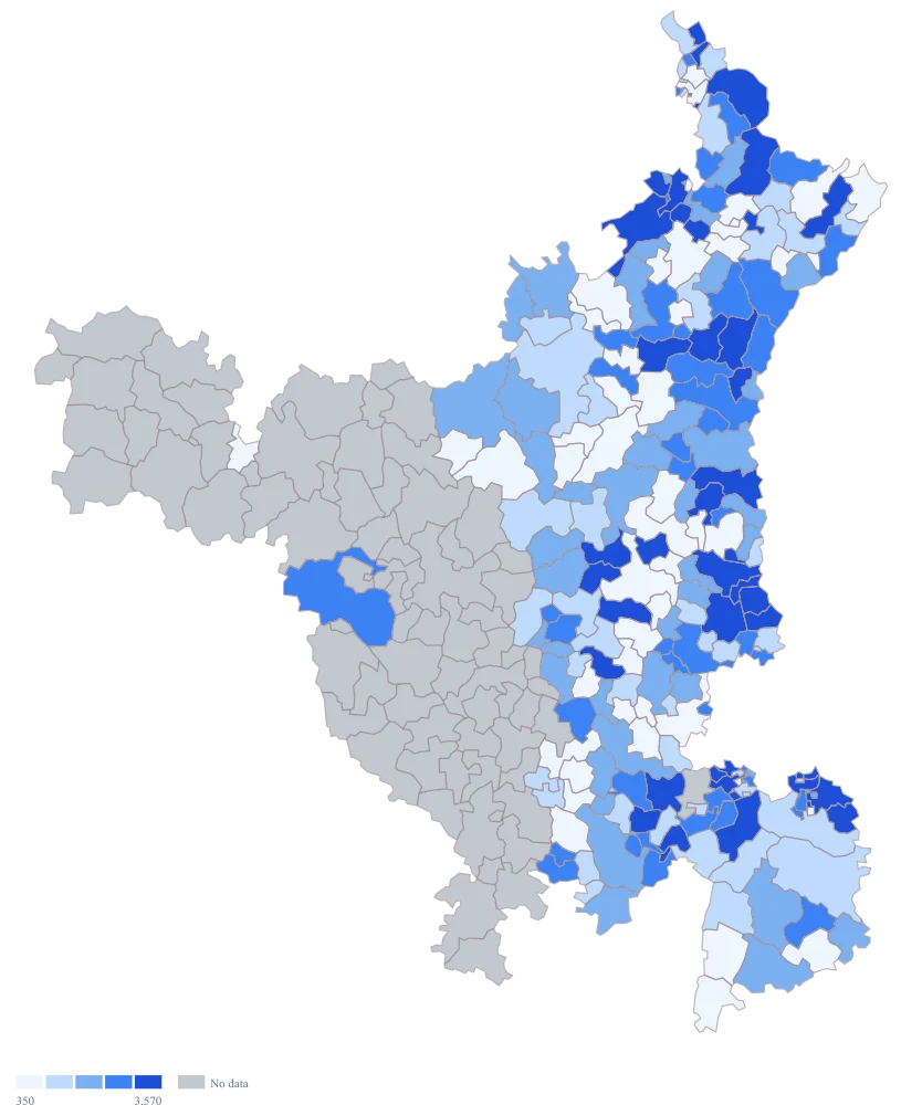
Turn the fill on with the default palette and leave the scale automatic.
The hub announces itself immediately and the rest of Haryana goes quiet. The automatic scale detects how far 86,400 sits from the rest and switches to quantile buckets rather than even intervals, which stops the other 235 codes collapsing into a single band — but its top bucket then runs from 3,660 all the way up to the hub, forty-seven codes deep, so the map is still saying a Panipat round and a sorting hub are alike. 125054 is a genuine zero and takes the lowest band, not the grey.
- Step 4
Set your own breaks at 500, 2,000, 5,000 and 10,000, move to the purple ramp, and title the legend.
The hub is now alone above 10,000, and 122018 on 9,240 drops into the band below it with seventeen others, so the map stops equating them. The lower three breaks are what make the rest of the state readable: the bottom bands carry 65, 71 and 81 codes rather than one of them carrying 235. All four thresholds are operational numbers rather than artefacts of this month's distribution, which means October's map can be laid beside September's and the bands compared. Purple is a different register from the default blue, which matters in a pack where the same state appears three times on three measures: nobody should have to read a legend to tell which map they are looking at.
The sheet
Paste these columns straight from Excel. The first column names the place; the rest are numbers. Nothing is uploaded — your sheet is read in the browser.
| PIN code | Parcels delivered in September | Delivery attempts logged |
|---|---|---|
| 122413 | 86400 | 93300 |
| 122018 | 9240 | 10120 |
| 122001 | 8150 | 8870 |
| 121003 | 7480 | 8260 |
| 131001 | 6100 | 6590 |
| 132103 | 5320 | 5810 |
| 121007 | 4870 | 5340 |
| 133001 | 3960 | 4290 |
| 125001 | 3410 | 3680 |
| 132001 | 2980 | 3210 |
| 123401 | 1640 | 1810 |
| 121102 | 1180 | 1340 |
| 125054 | 0 | 0 |
| 122505 | — | — |
| 122504 | 9150 | 10110 |
| 121013 | 8150 | 9000 |
The first 16 rows of 237. The map above is drawn from all of them — a national map wants a national sheet, and yours will be longer than this too.
Why this map
One count per PIN code and nothing to compare it against is exactly what a shaded map is for: the reader gets the distribution in a glance instead of scanning a sorted list for the break points. The single hub code on this sheet, 122413 in Gurgaon, carries 86,400 parcels against 574,280 across the whole sheet — one parcel in seven out of one code, and more than nine times the next code down. Every figure is invented for the example and describes no real network.
What goes wrong
A spreadsheet treats a column of six-digit codes as a column of quantities. It right-aligns them, offers to sum them, will happily autofill 122001 into 122002 down a drag, and renders anything longer in scientific notation; and once the column has been coerced, a round trip through CSV can bring back 1,22,001 with a separator in it, or a value with a stray decimal, neither of which matches anything in the geometry. The habit of forcing the column to text exists because codes elsewhere in the same sheet — a branch code, a route code, a state code — do lose their leading zeroes this way.
Format the PIN column as text before anything is pasted into it, not after, because converting a column back from number to text does not restore what was already lost. Check the obvious tells: the codes should be left-aligned, all exactly six characters, with no separators, no decimals and no trailing spaces. In fairness the leading-zero loss does not bite PIN codes themselves — Indian PIN codes run from 1 to 8 in the first digit and none begins with a zero — so what you are guarding against here is the coercion, the autofill and the separator, and the other identifier columns sitting beside it.
The export is one row per scan, and the map wants one row per area. Pasting the raw list gives the map fourteen thousand rows with the same code repeated, and what it does with the duplicates is not something you should be finding out during a review. The two columns here already show why the aggregation is a decision rather than a formality: 93,300 attempts produced 86,400 deliveries in 122413, so summing the wrong column gives a volume figure that is eight per cent too high and entirely plausible.
Aggregate in the sheet, with a pivot on the PIN column, before you go anywhere near the map. Decide explicitly what you are counting — delivered parcels, attempts, or unique consignments — and name it in the header, as here. Then tie the aggregated total back to the number your own report carries, because a filter you forgot is invisible once the numbers have become colours.
One code on this sheet is a sorting hub, and a hub is not a market. 86,400 parcels against a next-highest of 9,240 stretches any evenly spaced ramp so far that 235 of the 236 codes fall into the bottom band together and the map says only "there is a hub in Gurgaon", which you knew. The automatic scale notices skew of this shape and moves to quantile buckets on its own, which helps — but quantile then puts 122413 in one bucket with forty-six other codes, the smallest of them on 3,660, and a band holding both a sorting hub and a small-town round is not a group that means anything.
Take the hub out of the mapped set and state its figure in the caption, or keep it and set your own breaks so it sits alone above them. Round numbers that mean something operationally are better than breaks fitted to one month's data, because they hold still when next month's sheet arrives and a band therefore means the same thing in both maps. The same applies to any bulk account whose parcels are booked against the code of the office that raised them.
Other worked examples
- PIN Code Map of Tamil Nadu — Tamil Nadu, pin code, colour
- District-Wise Heat Map of India — Madhya Pradesh, district, colour
- Population Density Map of India by District — Pan India, district, colour
- Survey Results Map of India — Odisha, district, colour