Worked example
PIN Code Map of Delhi
You are the city operations lead for a Delhi delivery network, and the weekly call keeps circling the same argument: the riders say the north-west rounds are impossible, the hub managers say volume is volume, and nobody can point at anything. You have two numbers per PIN code — how many parcels it took last month, and how often the first attempt failed — and no way to put them in front of the room together.
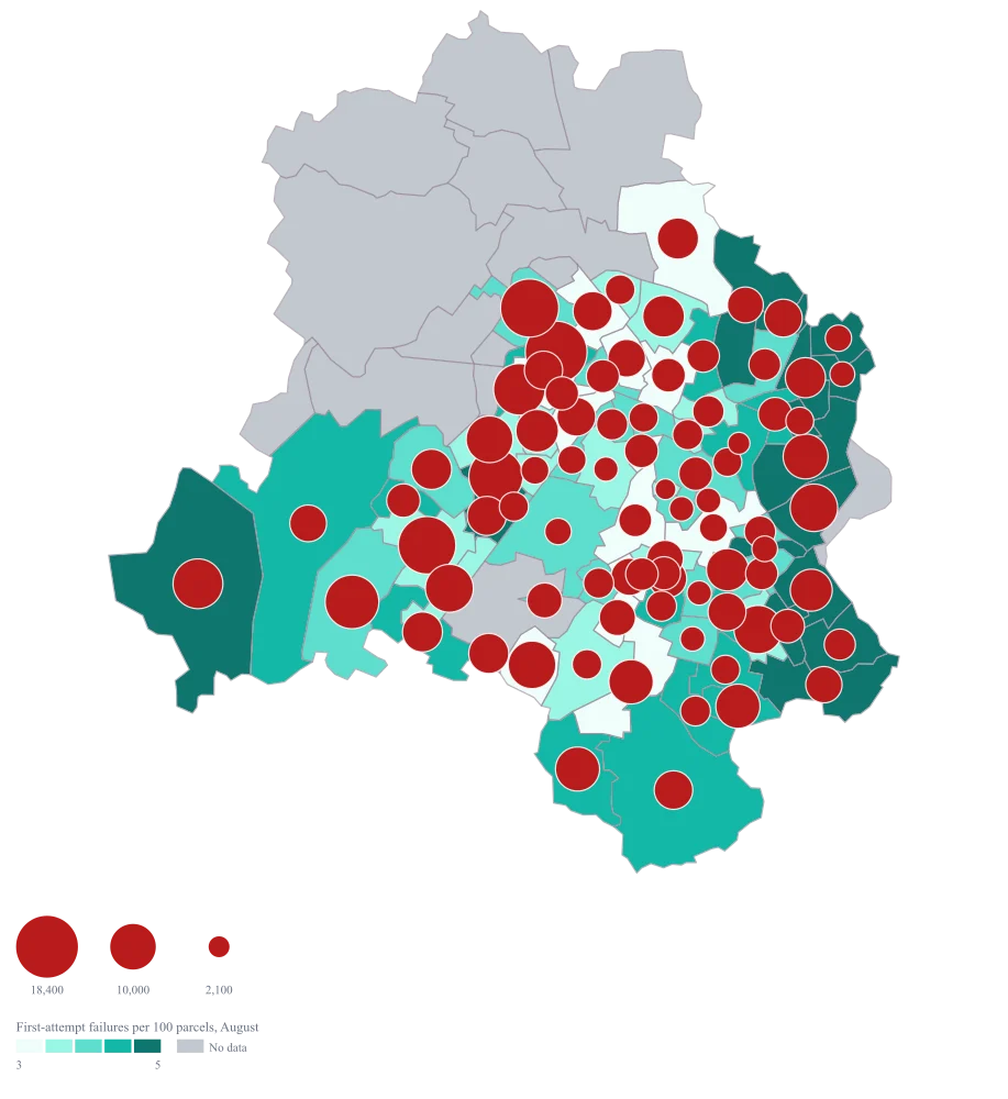
One Delhi map on which a large bubble sitting on a dark area is the argument won: a code carrying real volume that is also failing at the door. The codes that are merely busy stop taking up the meeting, because the fill has already said they are fine.
The four choices behind it
How this map was made
Four questions, in the order the builder asks them. Every picture below is the real renderer on the real geography, so this is the sequence you will see on your own screen.
- Step 1
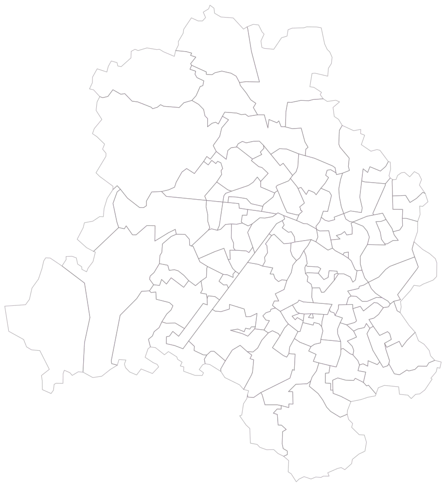
Choose Delhi at PIN-code level, before you touch the sheet.
The map draws ninety-eight PIN areas as outlines and nothing else: no colour, no legend, just the mesh. It is worth a few seconds, because this is the first honest look at how small the central cells are and how much of the territory sits in the handful of large peripheral ones. Whatever you paste next has to land in these shapes or it will not appear at all.
- Step 2
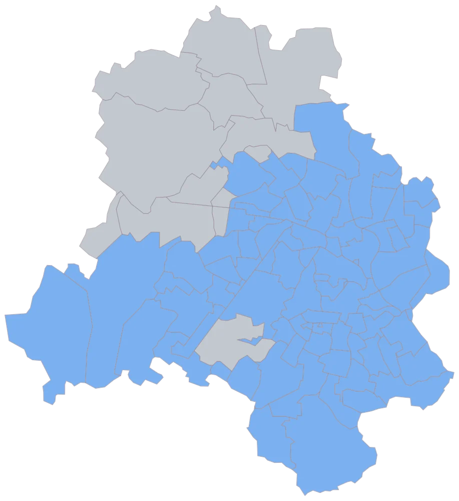
Paste the eighty-six rows, PIN codes in the first column, and let the map match them.
Eighty-five areas come up in one flat blue and thirteen stay grey, and the grey is the shape of the operation rather than a mistake: twelve of the thirteen are the outer north-western and western villages this network does not run, and they sit together in one corner of the city instead of being sprinkled through it. The thirteenth is 110037, which the sheet leaves blank on purpose. If a code you pasted is grey and is not one of those thirteen, fix it now, because from the next step onward it will look exactly like a part of Delhi you never had a figure for.
- Step 3
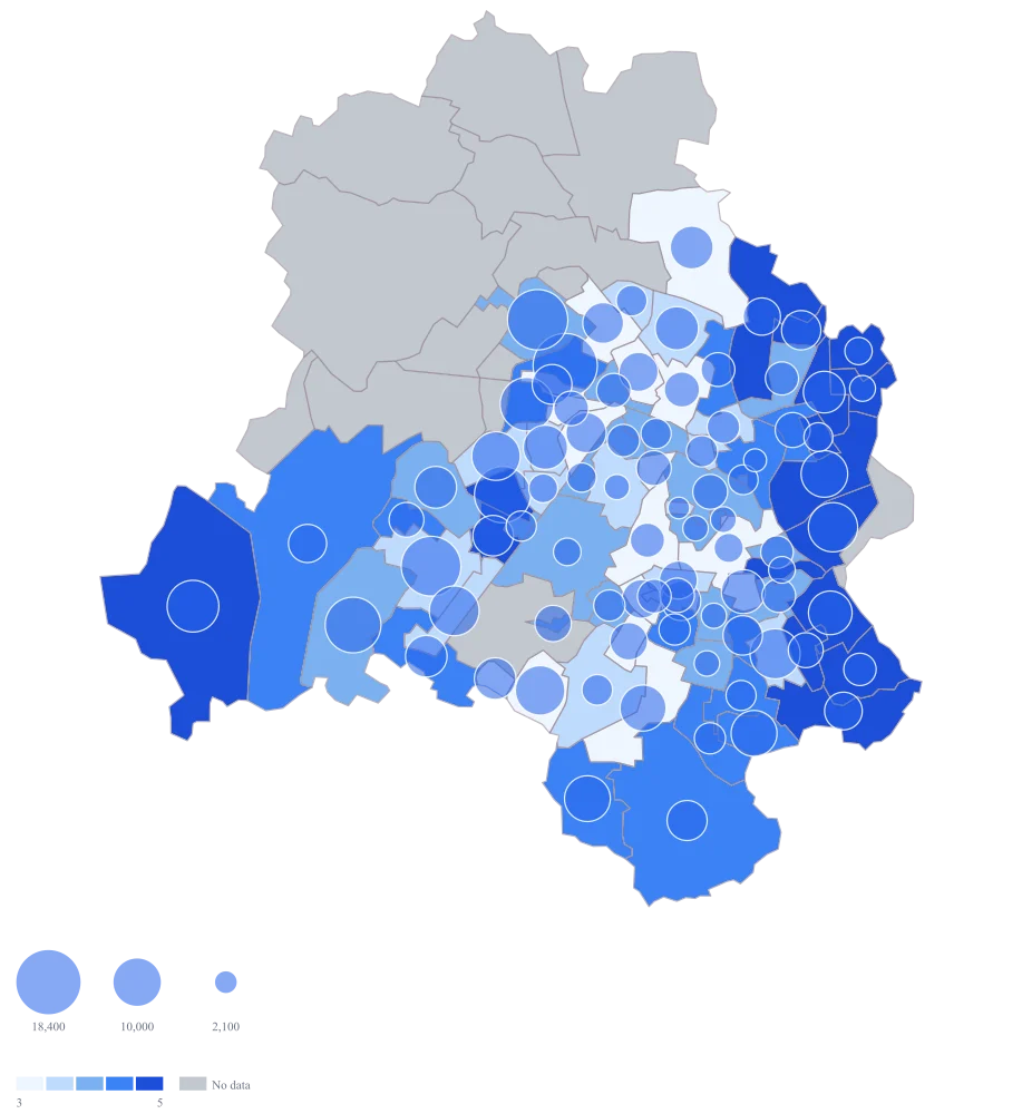
Switch on both encodings: bubbles sized by parcels handled, fill coloured by the failure rate, with the default palette and the automatic scale.
The map is finally answering the question, and it is also showing you the problem with it: the big north-western bubbles sit on pale fill, while 110094 and 110045 — still the worst two readings on the sheet, at 9.3 and 8.1 per hundred — are dark but carry smaller circles. Eighty-four codes take a fill and eighty-four carry a circle, and at this density that is already too many: through the centre the circles overlap each other, and the default bubble is the same blue as the default fill, so the ones over the darker areas are disappearing as well. 110096 is worth a second look — it handled nothing and has no failure figure, so it draws no circle and takes the grey, which is exactly what an area nobody measured looks like.
- Step 4
Move the fill to the teal ramp, switch the scale to quantile, give the bubbles a dark red, and title the legend with the measure and its period.
Red circles on a teal ramp separate the two readings completely, so a bubble over the darkest area is still legible instead of dissolving into it. The scale is the quieter half of it. Even intervals would put sixty-one of the eighty-four readings into the bottom two bands and leave the top one holding 110094 and 110045 alone; quantile buckets carry between fifteen and nineteen codes each, so the difference between a code at 3.6 and one at 5.1 becomes a difference you can see. At this many readings the automatic scale already goes to quantile by itself, because the tail above the median is long enough to trip it — setting it explicitly is what stops a flatter sheet next month from quietly coming back as even intervals. The legend title is doing the work no shape can: it says these are failures per hundred parcels for one month, so the map cannot be read as a count and cannot be circulated as though it were current in March.
The sheet
Paste these columns straight from Excel. The first column names the place; the rest are numbers. Nothing is uploaded — your sheet is read in the browser.
| PIN code | Parcels handled in August | First-attempt failures per 100 parcels |
|---|---|---|
| 110034 | 18400 | 4.2 |
| 110085 | 16250 | 3.8 |
| 110075 | 15900 | 2.9 |
| 110058 | 14100 | 5.1 |
| 110063 | 12750 | 4.6 |
| 110019 | 11200 | 3.1 |
| 110091 | 10850 | 6.4 |
| 110092 | 9700 | 7.2 |
| 110024 | 8600 | 2.4 |
| 110045 | 7350 | 8.1 |
| 110094 | 6900 | 9.3 |
| 110001 | 5400 | 3.6 |
| 110096 | 0 | — |
| 110037 | — | — |
| 110071 | 13850 | 3.5 |
| 110073 | 11950 | 5.5 |
The first 16 rows of 86. The map above is drawn from all of them — a national map wants a national sheet, and yours will be longer than this too.
Why this map
The two numbers are different kinds of number, so they need different encodings. Parcels handled is a count you may add up, and a bubble is the only mark on this map whose size can be added; failures per 100 parcels is a rate, and a rate must be coloured, because sizing it would invite somebody to total the circles and arrive at a failure figure that means nothing. The figures here are illustrative sample data, not the traffic of any real network.
What goes wrong
Delhi's PIN geometry is ninety-eight areas packed into a territory you can drive across in an afternoon, and the central codes are only a few square kilometres each. A bubble sized large enough to be read is therefore wider than the area it belongs to, and the moment you scale it up so the smaller codes are visible, the run from 110001 through to the codes around it fuses into one blob and you can no longer tell which circle is whose. A state like Tamil Nadu, where the same geometry carries 2,038 areas, does this at a far worse scale.
Keep bubble size small and let the fill carry the pattern, because the fill cannot overlap. Where the centre is the point of the exhibit, map the centre on its own rather than the whole territory: the same circles drawn over a dozen codes that fill the frame have room, and drawn over the eighty-four on this sheet at city scale they do not. If you need both the crowded centre and the periphery in one pack, produce two maps rather than one compromise.
A PIN code is a postal routing instruction, not a place and not an administrative area. The geometry is explicit about it: 110001 records its district as "Central, East, New Delhi, South East", because the area the code covers crosses four district boundaries, and several of the central codes are served out of the same sorting arrangement. So a plan that says "we will fix the North West" cannot be read off a PIN map without arithmetic, and two codes sitting side by side may be one operational unit rather than two.
Decide before you map whether the decision is postal or administrative. If it is postal, keep the PIN as the unit and stop describing it in district language. If it is administrative, add the district to your sheet, aggregate to it, and use a district map instead — the codes will not divide cleanly, and choosing the unit in the sheet is honest in a way that eyeballing the map afterwards is not.
A bubble carries its value in its area, not in its radius, and almost every reader reads the radius. 110034 handled 18,400 parcels against 110001's 5,400 — about three and a half times as many — but the circle is drawn at only about one and four-fifths the radius, because that is what makes the areas sit in the right ratio. A reader measuring across the circle therefore comes away thinking the gap is roughly two to one, and a reader who has been told circles are area and tries to correct for it usually over-corrects.
Never ask the room to compare two bubbles by eye when the difference matters. Put the numbers on the map or in the tooltip, keep a short ranked list beside it, and use the bubbles for what they are good at — showing where the weight of the operation sits — rather than for reading values off. If the exact ratio is the finding, state it in words in the caption, because no circle will carry it for you.
Other worked examples
- Warehouse Coverage Map by PIN Code — Gujarat, pin code, bubble + colour
- Coverage vs Demand Map of India — Gujarat, district, bubble + colour
- District-Wise Sales Heat Map of India — Pan India, district, bubble + colour
- Health Facility Map of India by District — Tamil Nadu, district, bubble + colour