Worked example
Literacy Rate Map of Bihar by District
You research education outcomes and the district table on your desk was assembled from block-level returns by three different people over two years. The committee that reads your note has seen the ranked list before and has learned to argue about positions in it, which is precisely the habit the note is meant to break.
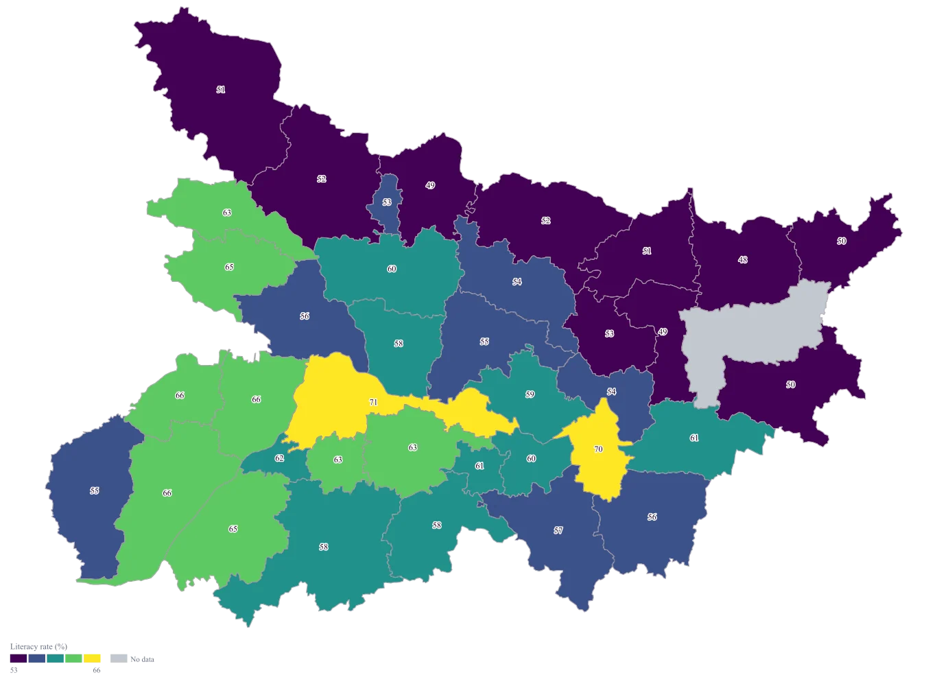
A district map of Bihar on which the size of the gaps is what the reader sees first, so the argument moves off which district is fourteenth and on to how far apart the top and the bottom of the state actually are.
The four choices behind it
How this map was made
Four questions, in the order the builder asks them. Every picture below is the real renderer on the real geography, so this is the sequence you will see on your own screen.
- Step 1
Choose the District level and set the area to Bihar, then read the district names off the map's own list before you touch your sheet.
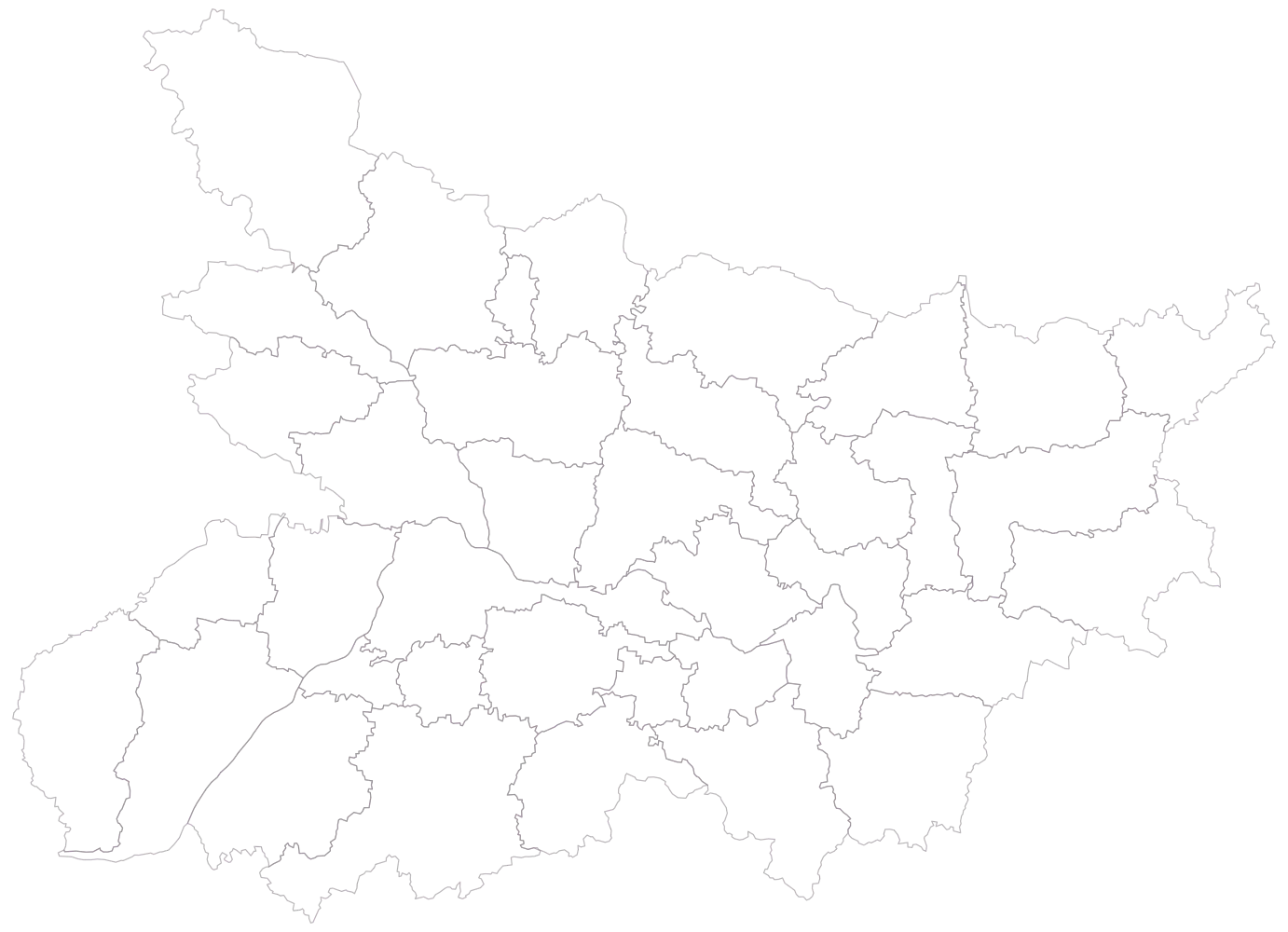
The state's 38 districts are drawn empty, no colour and no legend. The list behind that outline is the authority on spelling — it is where you find that the geometry says Purbi Champaran and Kaimur (Bhabua) — and reading it now is what stops the join failures on the next step rather than diagnosing them afterwards.
- Step 2
Paste the district table and compare the matched count against your own row count before looking at anything else.
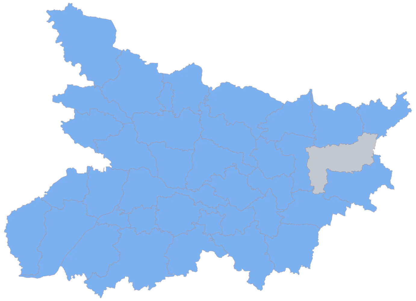
All thirty-eight names resolve, thirty-seven districts shade in one flat blue and Purnia alone stays grey, because its row is empty rather than because its name failed. This is the join and only the join, and on a sheet reconciled from block returns it is also a completeness check: once the sheet names every district, any grey beyond your own known blanks either failed to match or never got aggregated up from its blocks, and both are fixed in the sheet rather than on the map.
- Step 3
Point the colour at the literacy rate column and leave the scale on automatic.
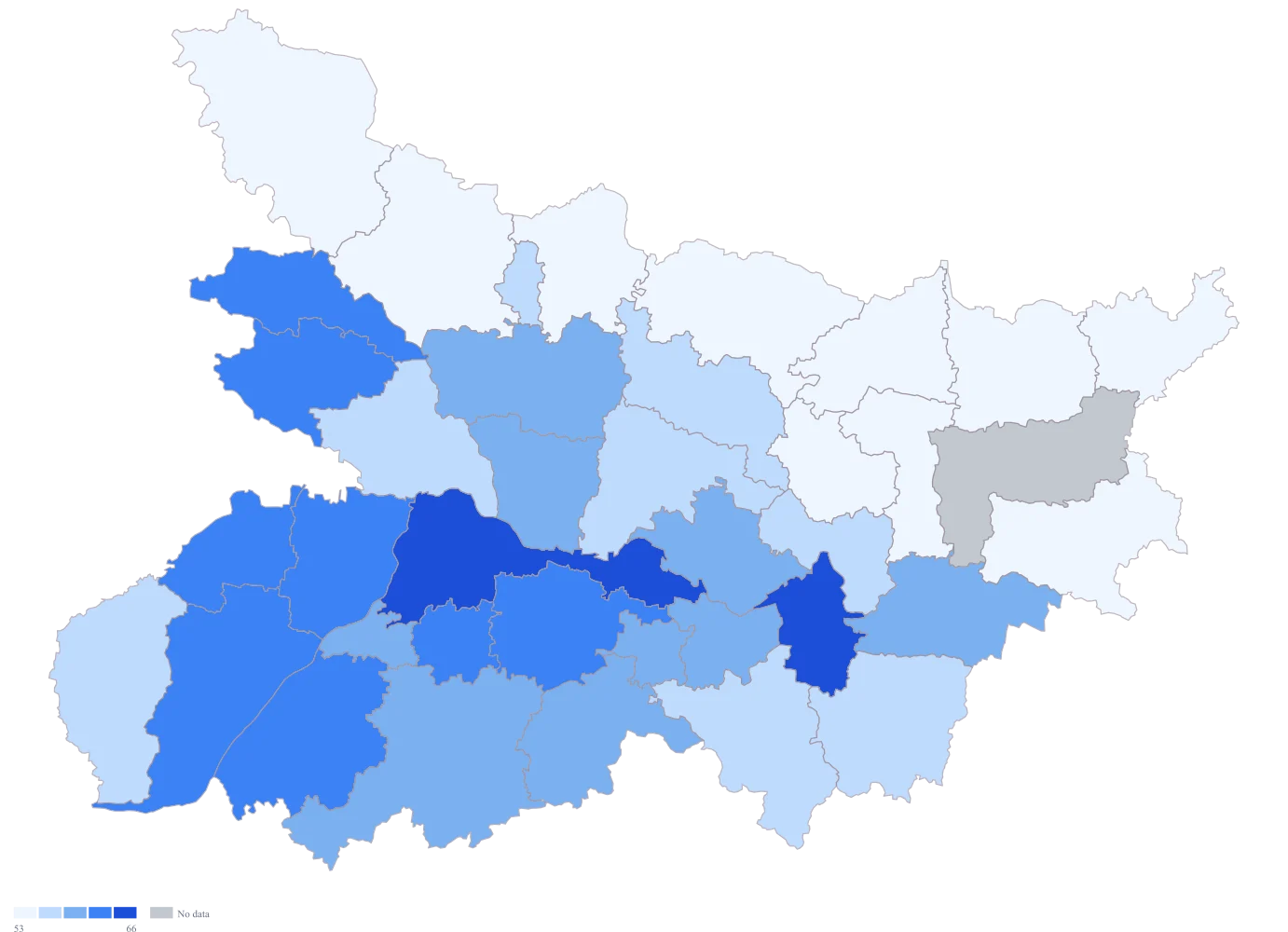
The spread is not lopsided, so the automatic scale stays on even widths and the ramp appears with bands of exactly four and a half points each, breaking at 52.7, 57.2, 61.7 and 66.2 and holding ten, eight, nine, eight and two districts. The picture is roughly right — the north-east of the state comes out pale, the districts along the Ganga darker — but the values themselves are not on it, so a reader still has to move their eyes to the legend and back for every district they care about, which is exactly the reading habit that turns a map into a ranking.
- Step 4
Change the palette to viridis, turn on value labels, and title the legend "Literacy rate (%)".
All thirty-seven figures are now on the map itself, so Patna at 70.7 and Munger at 70.4 are visibly the same figure while Rohtas at 66.1 is visibly not — the thing a rank ordering hid, and the thing that only survives being shown on every district rather than on a chosen fifteen. Viridis is perceptually uniform and monotonic in lightness, so equal steps in the rate look like equal steps in the colour and the map survives both a photocopier and a colour-blind reader, which matters for a note that will be printed and passed around a committee room.
The sheet
Paste these columns straight from Excel. The first column names the place; the rest are numbers. Nothing is uploaded — your sheet is read in the browser.
| District | Literacy rate (%) | Population aged seven and above (thousand) | Change in the rate since the previous round (percentage points) |
|---|---|---|---|
| Patna | 70.7 | 4820 | 3.1 |
| Munger | 70.4 | 1180 | 2.6 |
| Rohtas | 66.1 | 2410 | 4.2 |
| Bhojpur | 65.7 | 2380 | 3.8 |
| Nalanda | 62.8 | 2450 | 2.9 |
| Bhagalpur | 61.3 | 2570 | 3.4 |
| Muzaffarpur | 59.6 | 3910 | 2.2 |
| Gaya | 58.4 | 3620 | 4.7 |
| Vaishali | 57.9 | 2810 | 1.8 |
| Saran | 56.2 | 2960 | 0 |
| Kaimur (Bhabua) | 54.6 | 1350 | 2.4 |
| Purbi Champaran | 52.3 | 4020 | 3.6 |
| Pashchim Champaran | 51.4 | 3180 | 2.7 |
| Kishanganj | 49.8 | 1330 | 5.1 |
| Araria | 48.2 | 2340 | 4.4 |
| Purnia | — | — | — |
The first 16 rows of 38. The map above is drawn from all of them — a national map wants a national sheet, and yours will be longer than this too.
Why this map
A literacy rate is a share of a population, so colour carries it and the population it was computed over stays on the sheet as the check. The spread across the thirty-seven districts carrying a figure is 22.5 percentage points, and it is not spread evenly: the top two are three tenths of a point apart while the second and third are 4.3 apart, which is more than fourteen times as wide. A map of the values shows that; a map of the ranking would have drawn those two gaps identically. Every figure here is invented to exercise the map and is not a literacy rate for any district.
What goes wrong
Districts get renamed and split between the year your data was collected and the year the geometry was cut, and the join then finds nothing and says nothing. The shipped geometry spells Bihar's two Champaran districts Purbi Champaran and Pashchim Champaran, and spells the Kaimur district Kaimur (Bhabua). Put "Bhabua" through the matcher against this geometry and it comes back as a review with no assignment — the row is lost. Worse, put "East Champaran" through and it comes back proposing Pashchim Champaran, the western district, at a score high enough to be offered as a suggestion, because "east" and "west" differ by fewer characters than the rest of the name does. Accept that suggestion and East Champaran's figure is drawn on West Champaran.
Read the unmatched and the suggested lists, every time, and never accept a suggestion on a name whose only distinguishing part is a direction word — those are exactly the pairs where a near-match is a wrong match. Reconcile your district names against the map's own list before you paste rather than after, and keep the reconciliation as a lookup in the project so the next round of data does not repeat the exercise. Purnia is blank on this sheet because its returns had not come in, which is a different thing from a district that failed to join, and only your own reconciliation can tell you which kind of blank you are looking at.
The committee is used to a ranked list, and a ranking throws away the only thing that matters here. Patna and Munger are separated by three tenths of a point — well inside anything you would call a difference — and they occupy positions one and two, which the table renders as a meaningful order. Rohtas, in third, is 4.3 points below Munger. A map coloured by rank would draw those two gaps as the same step, and would draw the 22.5-point span of the state as thirty-seven equal increments, which is a picture of the sorting and not of the state.
Colour the rate itself and never the position. Turn value labels on so the numbers are on the map rather than in a legend a reader has to translate, and write the first line of the caption about the size of the spread rather than about who is top. Where the note has to name an order, say the gap alongside the position — "first and second, three tenths of a point apart" is a sentence that survives being quoted, and "first and second" is not.
This table was assembled from block-level returns, and a rate does not add up. Several blocks belong to one district, and the two wrong ways to get from one to the other are both easy: averaging the block rates, which gives a large block and a small one the same say, or letting each block row overwrite the district as it is loaded, which quietly leaves the district holding whichever block happened to be last. The second failure is the dangerous one, because it produces a complete-looking map with no gaps in it at all.
Aggregate before you map, and aggregate the counts rather than the rates: sum the literate persons and sum the population aged seven and above across a district's blocks, then divide once. Check the result by tying your district population totals to a figure you already trust — if they come up short, some blocks were dropped, and the rate on top of them is wrong in a way the map cannot show. Get to one row per district before the sheet goes anywhere near the builder, because the builder maps what it is given and cannot know that three of your rows were meant to be one.
Other worked examples
- District-Wise Heat Map of India — Madhya Pradesh, district, colour
- Population Density Map of India by District — Pan India, district, colour
- Survey Results Map of India — Odisha, district, colour
- India Market Share Heat Map — Pan India, district, colour