Worked example
Growth Rate Map of Karnataka by District
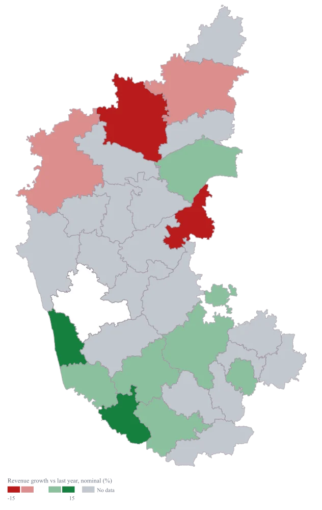
You handle regional performance for a consumer business in Karnataka, and the annual review wants one picture of which districts moved. You have this year and last year by district, the growth column is already computed, and the first draft of the map coloured every district on one pale-to-dark ramp, on which the four districts that shrank looked merely quiet.
A map with a real middle: districts that fell take one colour, districts that grew take another, and the flat district sits at the neutral centre where it belongs rather than being rounded into whichever end of the ramp it is nearest.
The four choices behind it
How this map was made
Four questions, in the order the builder asks them. Every picture below is the real renderer on the real geography, so this is the sequence you will see on your own screen.
- Step 1
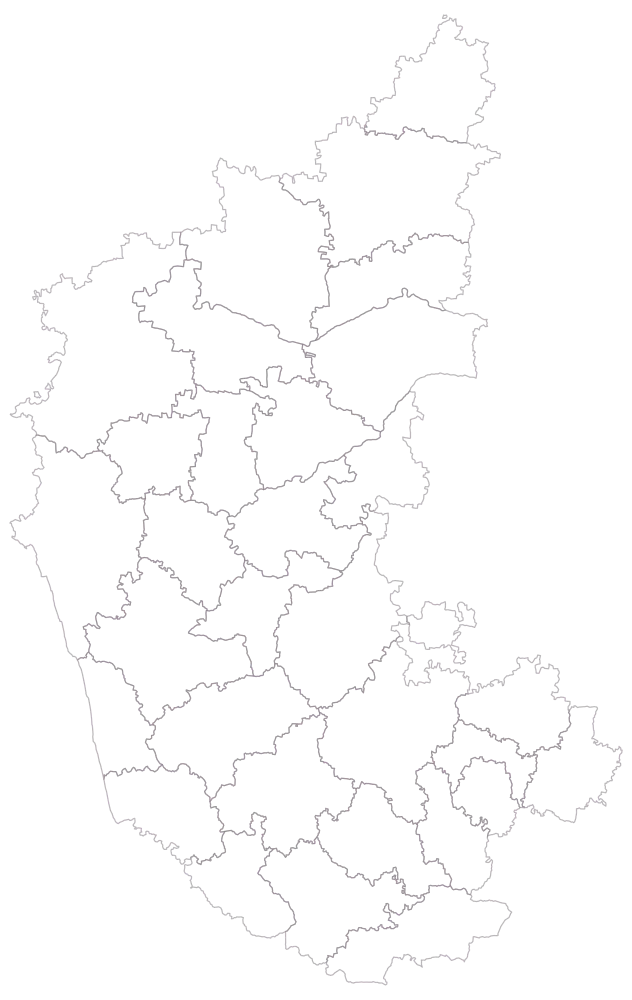
Choose Karnataka, and district as the level.
Thirty-one district outlines, empty, no legend. Bengaluru Urban is the smallest shape in the file and Belagavi is about six times its size, which is worth registering before the colours arrive: the district carrying the largest revenue on this sheet is the one with the least room to show a colour.
- Step 2
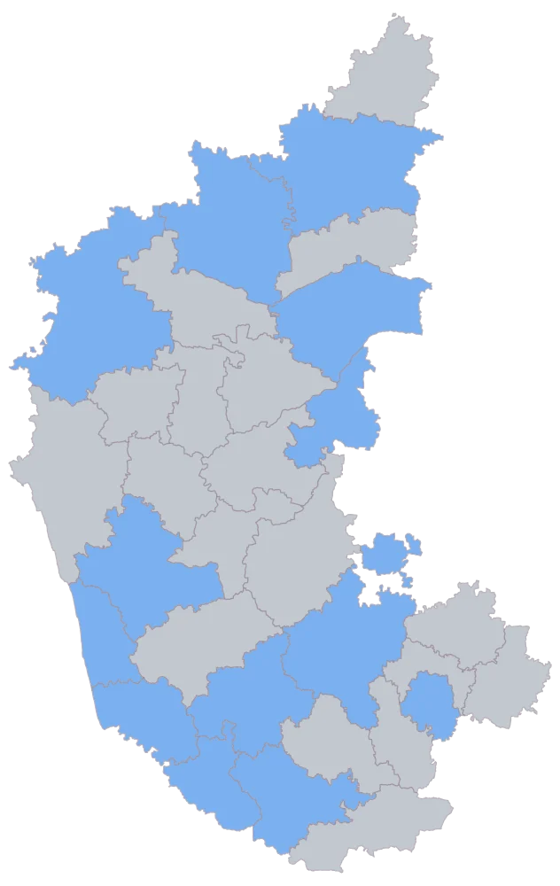
Paste the sheet and match the district column.
Fourteen districts come up in one flat blue and seventeen stay grey. The current spellings are the join key and several of them changed in the last decade, so this is where a sheet still carrying the older forms of Ballari, Mysuru, Belagavi, Kalaburagi or Vijayapura fails to shade — and it fails silently, which is why looking at this picture is the step.
- Step 3
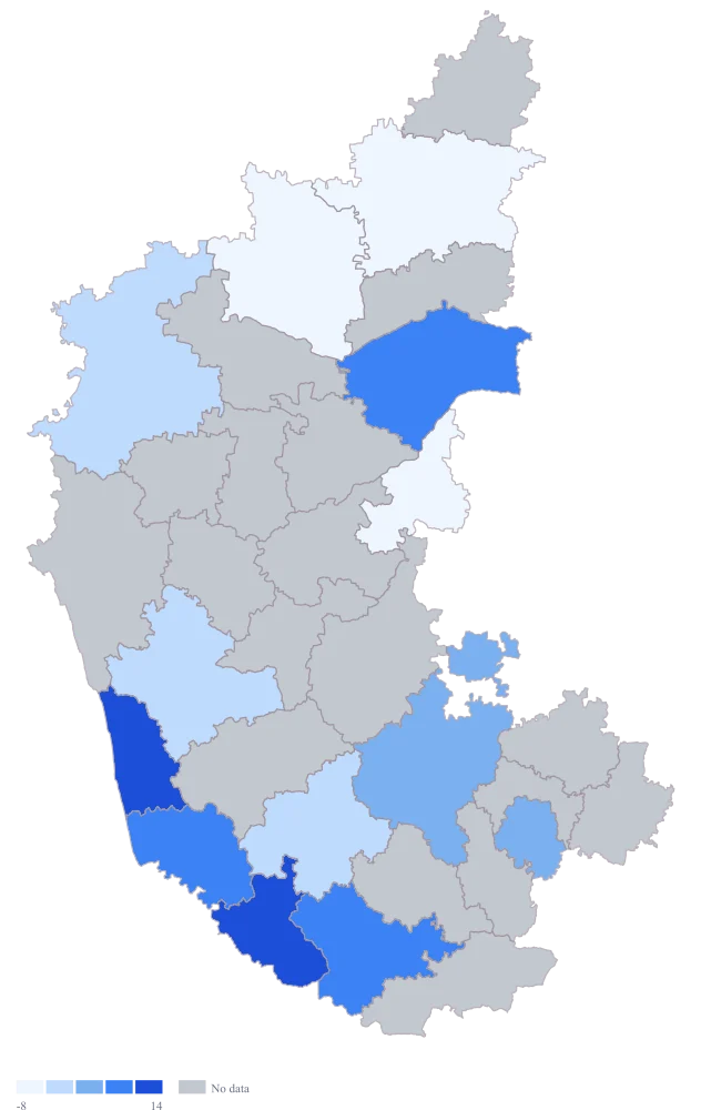
Set the map type to colour and choose the growth column.
Thirteen districts take a shade on the default scale, Yadgir stays grey. This is the version that cannot be published: the palette runs pale to dark in one hue, so Kodagu's +100 pins the top of the range, everything between -17.8 and +19.1 is squeezed into the pale end, and there is nowhere on the ramp that means "did not move".
- Step 4
Switch the palette to red-to-white-to-green, set the scale to custom with breaks at -15, -0.5, +0.5 and +15, and title the legend "Revenue growth vs last year, nominal (%)".
The map splits at zero. Ballari and Vijayapura take the deep red band, Belagavi and Kalaburagi the lighter red, Shivamogga sits white in the middle on exactly 0, six districts take the light green and Udupi and Kodagu the deep green. The four falls are now the first thing a reader sees instead of the last, and the word nominal in the legend title is what stops the green from being read as more than it is.
The sheet
Paste these columns straight from Excel. The first column names the place; the rest are numbers. Nothing is uploaded — your sheet is read in the browser.
| District | Revenue growth vs last year (%) | Revenue this year (₹ lakh) | Revenue last year (₹ lakh) |
|---|---|---|---|
| Kodagu | 100 | 6 | 3 |
| Udupi | 19.1 | 168 | 141 |
| Dakshina Kannada | 13.6 | 486 | 428 |
| Raichur | 13 | 104 | 92 |
| Mysuru | 9.5 | 612 | 559 |
| Tumakuru | 7.4 | 248 | 231 |
| Bengaluru Urban | 6.2 | 1840 | 1732 |
| Hassan | 5.2 | 162 | 154 |
| Shivamogga | 0 | 198 | 198 |
| Belagavi | -6.1 | 372 | 396 |
| Kalaburagi | -7.7 | 262 | 284 |
| Ballari | -15.3 | 149 | 176 |
| Vijayapura | -17.8 | 97 | 118 |
| Yadgir | — | 58 | — |
Why this map
Growth is a rate, so colour carries it and nothing is sized: a circle cannot be drawn for a district that shrank without either inventing a sign or hiding one. The two rupee columns stay on the sheet beside it, because the rate is the thing being mapped and the levels are the thing that decides whether the rate deserves to be believed. All figures here are invented sample data and are not any business's results.
What goes wrong
Growth can be negative, and a sequential ramp has no way to say so. On one pale-to-dark scale, Vijayapura at -17.8 per cent and Shivamogga at exactly 0 land in neighbouring pale bands and read as "low growth" and "lower growth" — two flavours of the same thing — when one of them is a business that shrank by a sixth and the other is a business that did not move. Four of the thirteen mapped districts here fell. A single-hue ramp draws all thirteen as points on one line from less to more, and there is no position on that line that means zero.
Use a diverging palette and put its neutral colour on zero. The refine step here sets red-to-white-to-green with breaks at -15, -0.5, +0.5 and +15: the two breaks either side of zero give the flat district a band of its own, and the outer pair are symmetric, so a fall of fifteen points and a rise of fifteen points are drawn with equal weight. Keep those breaks symmetric whenever you do this — a diverging scale that is wider on the green side is an editorial decision wearing the costume of a neutral one.
A per cent on a tiny base is not a comparable number. Kodagu went from ₹3 lakh to ₹6 lakh, which is +100 per cent and, on any scale that includes it, the loudest district on the map. The movement is three lakh rupees. Bengaluru Urban grew 6.2 per cent over the same year, which is one hundred and eight lakh rupees — thirty-six times as much money, drawn in a quieter colour. Nothing is wrong with either arithmetic; the map is simply answering a question nobody meant to ask.
Set a minimum base before you look at the results — a level of last-year revenue below which the district does not get a percentage at all — and blank the growth cell for every district beneath it, so those draw as no data and the sentence you write about them is "grew from ₹3 lakh to ₹6 lakh" rather than "+100%". Keep both rupee columns in the sheet so the tooltip can show what a per cent is standing on. Where the tiny-base districts are the point of the exercise, they need a map of the rupee change, which is a different map and a different legend.
The two rupee columns are rupees from two different years, and comparing them without saying so makes the map partly a map of inflation. A district reading +5 per cent in money may have sold less than it did last year; a district reading 0, like Shivamogga, has certainly sold less. The map cannot know this, and a reader will take every green district as a district that grew.
Say in the legend title and the caption that the figures are nominal and name both periods, so the reader supplies the deflation themselves rather than being led past it. If the review needs real growth, deflate in the sheet with a stated index and a stated base year, map the deflated column, and keep the nominal column beside it — the deflator is an assumption and it belongs somewhere it can be argued with, not buried inside a colour. Never compare this map against one built on a differently based series; two maps of growth are only comparable when their years and their deflators are the same.
Other worked examples
- District-Wise Heat Map of India — Madhya Pradesh, district, colour
- Population Density Map of India by District — Pan India, district, colour
- Survey Results Map of India — Odisha, district, colour
- India Market Share Heat Map — Pan India, district, colour