Worked example
Employment Map of India by District
You are a labour economist finishing a working paper, and the district table is assembled: a workers-per-thousand reading for each district you could source, drawn from more than one round and more than one collecting agency. The map you put on page three will be quoted far more often than the sixty pages behind it, so it has to be defensible line by line.
A shaded map on fixed, stated bands, on which two districts take different colours only when the difference is one you are prepared to argue for, and on which the districts you could not source stay visibly unsourced instead of quietly joining the bottom band.
The four choices behind it
How this map was made
Four questions, in the order the builder asks them. Every picture below is the real renderer on the real geography, so this is the sequence you will see on your own screen.
- Step 1
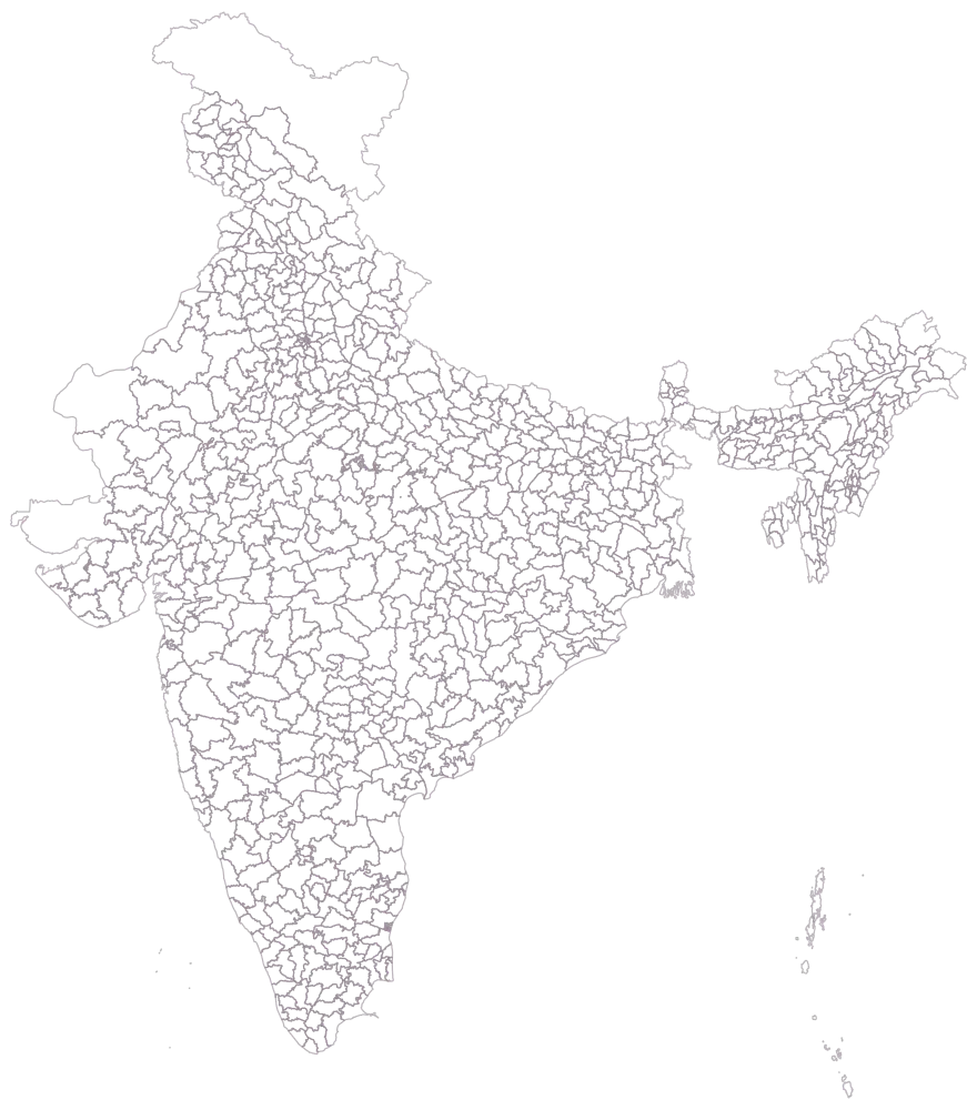
Choose India, and district as the level.
The bare district outlines of the whole country, no fill and no legend. Worth a pause: your table covers every state, so almost everything here is about to take a colour, and at this zoom a great many of the districts — Thrissur, Kamrup Metro, Lakhisarai, most of the Kerala coast and most of Delhi — are small enough that you will need to name them in the prose whatever the map does.
- Step 2
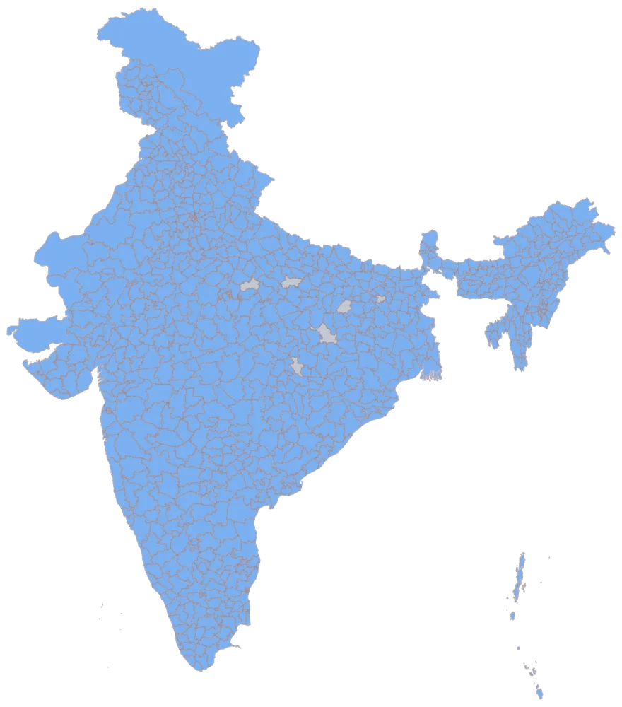
Paste the sheet and match the district column.
780 districts take one flat blue and six stay grey. This is the picture that proves the names matched, and it matters more here than usual: your rows came out of different published tables with different spellings, so this is where a table that writes a district one way and the map another shows up, as a district that failed to shade. Five of the six greys are the standing cost of a Pan India sheet keyed on names — Aurangabad, Bilaspur, Balrampur, Hamirpur and Pratapgarh each name a district in two different states, one row can only carry one of them, and the match takes the first: Aurangabad in Maharashtra, Bilaspur and Hamirpur in Himachal Pradesh, Balrampur in Uttar Pradesh, Pratapgarh in Rajasthan. Their five namesakes stay grey, and a paper that needs all 785 has to disambiguate them outside the name column.
- Step 3
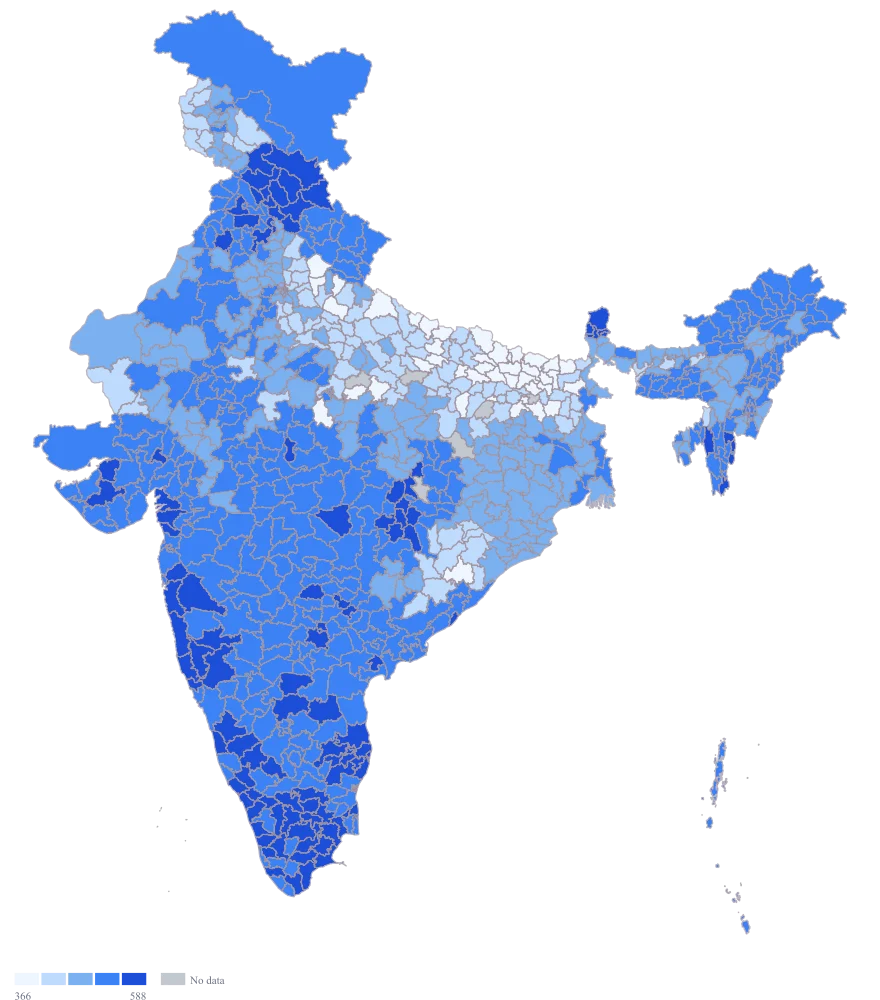
Set the map type to colour and choose the workers-per-thousand column.
779 districts take a shade on the default automatic scale, and the six greys of the previous step stay grey. The automatic scale picks its own breaks from your spread, which is fine for a first look and wrong for a paper: those breaks will move the moment you add a district, so two printings of the same map could disagree.
- Step 4
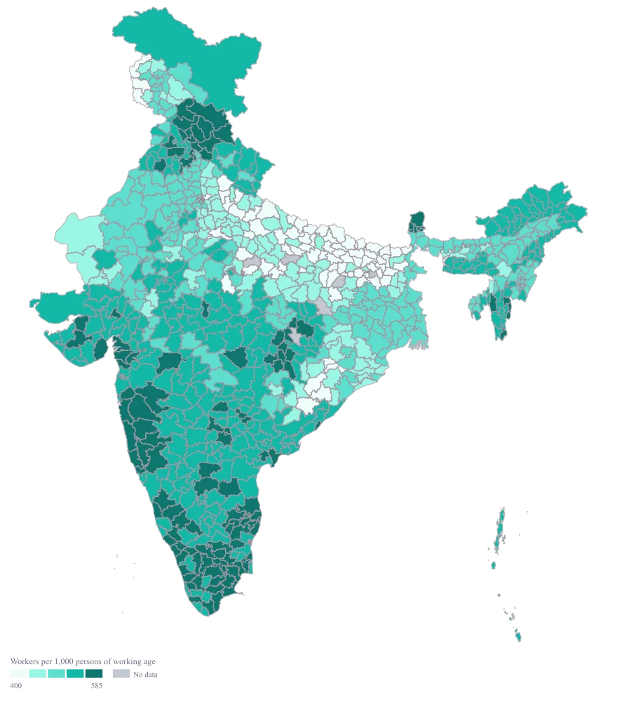
Switch the scale to custom with breaks at 400, 470, 530 and 585, take the palette to teal, and title the legend "Workers per 1,000 persons of working age".
Five fixed bands instead of a ramp that reshapes itself: 75 districts below 400, 100 to 470, 193 to 530, 290 to 585 and 121 above. The two middle breaks are set where they are because the sheet is bunched — half of it lies between 478 and 570 — so they cut through the crowd instead of around it, and Kishanganj, Ranchi and Ludhiana still land in the first band, the middle one and the last. Because the breaks are numbers you chose rather than quantiles, the map can honestly show a thin band, the colours mean the same thing in next year's edition, and the legend title states the denominator — which is the one thing a reader has to know before they are allowed to compare two districts at all.
The sheet
Paste these columns straight from Excel. The first column names the place; the rest are numbers. Nothing is uploaded — your sheet is read in the browser.
| District | Workers per 1,000 persons of working age | Change since the previous round (per 1,000) |
|---|---|---|
| Ludhiana | 648 | 12 |
| Coimbatore | 631 | 9 |
| Surat | 627 | 21 |
| Thrissur | 604 | 4 |
| Nashik | 566 | 7 |
| Kamrup Metro | 541 | 15 |
| Ranchi | 498 | 6 |
| Purba Bardhaman | 472 | 3 |
| Sonbhadra | 431 | 11 |
| Balangir | 409 | 2 |
| Kishanganj | 376 | 8 |
| Rayagada | 352 | 0 |
| Sheohar | 341 | 5 |
| Lakhisarai | — | — |
| Udupi | 644 | -1 |
| Shivamogga | 616 | 3 |
The first 16 rows of 780. The map above is drawn from all of them — a national map wants a national sheet, and yours will be longer than this too.
Why this map
The mapped value is a rate — workers over working-age population — so there is nothing left for a circle to carry, and sizing one by a rate would invite a reader to add the circles together, which a rate does not permit. Colour is the honest encoding, and the change column stays beside it on the sheet as the thing that tells you whether a reading moved or merely got recounted. Every figure here is invented sample data and is not an employment estimate for any district.
What goes wrong
Official tables withhold cells. A reading held back because the sample in that district fell below the publication threshold, or because the disclosure rules suppressed it, comes out of the source as a dash, an asterisk or an empty cell — and the temptation, when a map is nearly finished and one district is stubbornly grey, is to type a 0 and move on. That 0 is not a missing value made tidy; it is a fabricated finding that says a district has no workers, and it will sit at the bottom of your ramp looking exactly as authoritative as the 779 readings you actually have.
Leave the cell empty, as Lakhisarai is here, and let the district draw as no data. The parser is on your side: an empty cell, a dash, NA, nil and none are all read as no data rather than as zero, so a suppression marker copied straight out of the source table does the right thing on its own. Only a typed digit 0 becomes a zero. Then say in the caption how many districts are grey and why — six of the 785 here, and only one of them for this reason — and keep suppressed apart from not-sourced in your own notes even though the map draws them the same grey.
Two sources do not count the same people. Whether unpaid work in a family enterprise counts as employment, whether a person who worked a single day in the reference week counts, whether the reference period is a week or a year — these differ between a national round and a state's own collection, and they move a district's reading by tens of points without anything on the sheet changing. A Pan India ramp then draws that methodological seam as though it were a geographical one, and the regional pattern you are about to explain is an artefact of who did the counting.
Record the source and the round against every row before you map, and map only the districts that share one definition. Where a second source is unavoidable, make a second map for it and put them side by side rather than merging them under one ramp with a footnote. If a reviewer can draw the boundary between your sources on your map with their finger, the map was not ready.
Ranks are evenly spaced by construction, so a map of ranks tells you the order and hides every gap. Coimbatore at 631 and Surat at 627 are four points apart with five districts between them; Purba Bardhaman at 472 and Sonbhadra at 431 are forty-one points apart with sixty-two districts between them — the same handful of rank positions buying ten times the distance in either case. The sheet is bunched besides: nearly 400 of its 779 readings fall between 478 and 570, a quarter of the range holding half the country. A rank map spends its darkest colours on that crowd and its palest on the same crowd, and the reader comes away believing the districts are strung out evenly between the top and the bottom, which is the one thing your data does not say.
Map the reading, not the rank, and set the bands yourself rather than accepting quantiles — quantiles will always fill the darkest band whether or not anything in it is remarkable. The refine step here uses four fixed breaks, which means next year's map is comparable with this one and a year in which everything moved up genuinely looks like one. If the ordering is what a particular paragraph is about, put a ranked table beside the map; a table is the right object for a rank.
Other worked examples
- District-Wise Heat Map of India — Madhya Pradesh, district, colour
- Population Density Map of India by District — Pan India, district, colour
- Survey Results Map of India — Odisha, district, colour
- India Market Share Heat Map — Pan India, district, colour