Worked example
Crop Yield Map of India by District
You are an agricultural economist preparing the district figure for a paper on yield variation. Your sheet has yield per hectare and the harvested area it was computed from, and your first draft put yield on a bubble — which a reader immediately, and correctly, read as a map of how much the district grows.
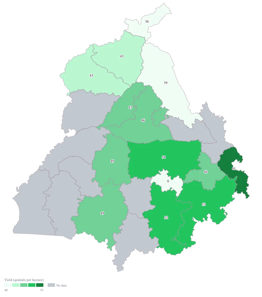
One shaded map of yield per hectare with the area it rests on still visible beside it, so the two districts a reader would otherwise confuse — the highly productive one and the merely efficient one — stay separate.
The four choices behind it
How this map was made
Four questions, in the order the builder asks them. Every picture below is the real renderer on the real geography, so this is the sequence you will see on your own screen.
- Step 1
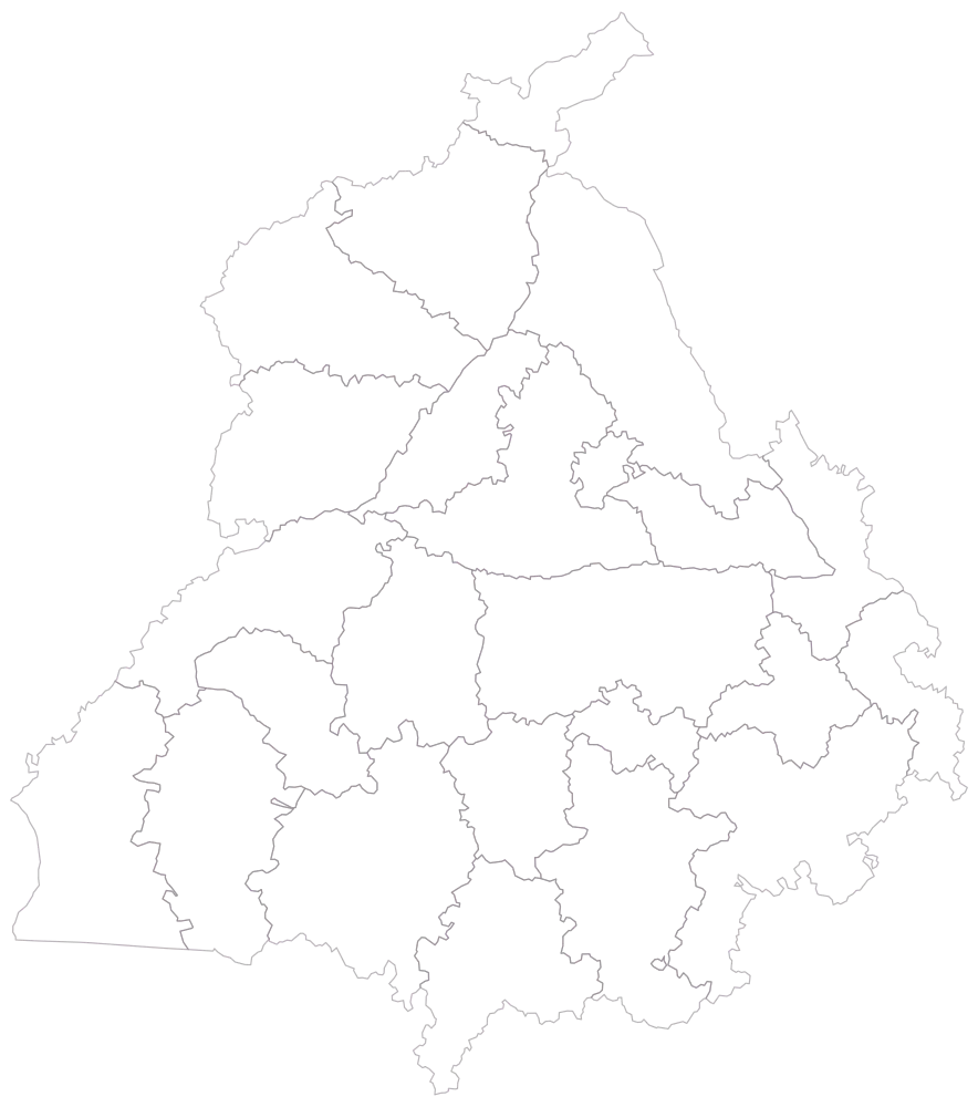
Choose Punjab at district level.
Twenty-three district outlines, empty, no legend. The spellings here are the ones that catch exports: the shipped geometry uses S.A.S Nagar, Sri Muktsar Sahib and Shahid Bhagat Singh Nagar, and it carries Malerkotla as its own district. A sheet that says Mohali or Nawanshahr will not join.
- Step 2
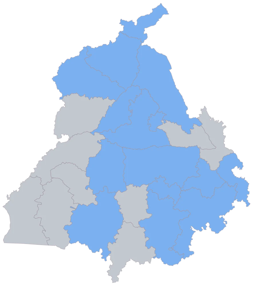
Paste the three-column sheet, district column first.
Fourteen districts come up in one flat blue and the remaining nine stay grey. Barnala is among the grey ones although its name matched, because both its cells are empty. The flat fill is worth pausing on for the opposite reason: it shows S.A.S Nagar joining perfectly well, and the join cannot tell you that its 61.0 rests on 300 hectares. That check is arithmetic on the sheet, not something any picture of the join will reveal.
- Step 3
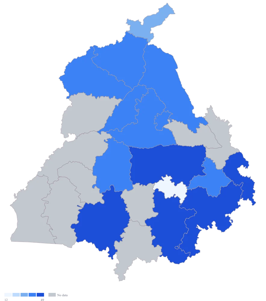
Colour by the yield column and take the plain defaults.
The defaults band by rank, which puts four districts in the palest band and three in the darkest. Two problems show up straight away: S.A.S Nagar shares its dark band with Ludhiana and Patiala, so the thinly based outlier is presented as merely one of the strong districts, and Malerkotla's 0 shares the palest band with Pathankot's 36.2, so a failed harvest and a low one are drawn the same.
- Step 4
Switch to the green ramp, set a custom scale with breaks at 40, 45, 50 and 55, title the legend "Yield (quintals per hectare)" and turn value labels on.
The bands are now five quintals wide and read off round numbers, so a reader can go from a shade back to a range without squinting at the legend, and the same breaks can be reused on next season's map for a fair comparison. S.A.S Nagar is left alone in the top band, which is the honest picture of a rate built on a very small base — conspicuous, and therefore questioned. The value labels print the yield on each shaded district and appear only where a value joined, so grey Barnala stays bare and Malerkotla's 0 is legible as a number rather than inferred from a pale fill.
The sheet
Paste these columns straight from Excel. The first column names the place; the rest are numbers. Nothing is uploaded — your sheet is read in the browser.
| District | Yield (quintals per hectare) | Area harvested (hectare) |
|---|---|---|
| S.A.S Nagar | 61 | 300 |
| Ludhiana | 54.2 | 254000 |
| Patiala | 52.8 | 231000 |
| Sangrur | 51.6 | 272000 |
| Bathinda | 49.4 | 198000 |
| Moga | 48.7 | 165000 |
| Fatehgarh Sahib | 47.9 | 84000 |
| Kapurthala | 46.5 | 92000 |
| Jalandhar | 45.8 | 148000 |
| Gurdaspur | 43.1 | 172000 |
| Amritsar | 42.6 | 159000 |
| Hoshiarpur | 39.4 | 118000 |
| Pathankot | 36.2 | 41000 |
| Malerkotla | 0 | 3200 |
| Barnala | — | — |
Why this map
Yield is production divided by area, so it is a rate, and a rate is coloured and never sized: a circle invites the eye to add circles up, and adding yields together produces a number belonging to no district. Colour carries the rate and the area column stays on the sheet as the check on it. The sheet is built so the trap is visible — Sangrur's yield of 51.6 is below Ludhiana's 54.2, yet Sangrur harvests 272,000 hectares against Ludhiana's 254,000, so Sangrur's total production is the larger of the two. All figures here are invented sample data made to demonstrate the arithmetic; they are not yields, areas or production figures for Punjab or for any district in it.
What goes wrong
Yield per hectare and total production are different maps, and the one a reader assumes is almost always production. Size a bubble by yield and the reader reads volume, which is wrong twice over: wrong because a rate has no volume, and wrong because the ordering differs. On this sheet the yield ranking puts Ludhiana above Sangrur while the production arithmetic — 51.6 × 272,000 against 54.2 × 254,000 — puts Sangrur above Ludhiana.
Colour the yield, leave bubbles off, and keep the area column beside it so production can be recovered whenever somebody asks for it. If total production is what the argument needs, compute it as its own column and map it as its own map with its own title; do not ask one ramp to imply both. And never average the yields: the yield of a group of districts is their total production over their total area, not the mean of their rates.
A ratio is only as stable as its denominator. S.A.S Nagar here is computed over 300 hectares — Sangrur's base is more than nine hundred times larger — and at that size a single good or bad plot moves the rate by several quintals. It comes out as the highest yield on the sheet and would drive the top of the ramp, while its total harvest is smaller than Ludhiana's by a factor of more than seven hundred. Malerkotla is the same problem from the other end: a genuine 0 on a small area, which sits in the lowest band beside Pathankot's real but ordinary 36.2, as though a total failure and a modest harvest were neighbours on a continuum.
Set a minimum area before you look at the results and blank every district below it, so those are drawn as no-data rather than colouring the map — and say in the caption that grey means base too small, which is a different statement from no data at all. Keep the area column in the tooltip so any district you are challenged on can be checked in one step. Where a 0 is a genuine failure rather than a low reading, name it in the caption: the ramp can show that it is lowest and cannot show that it is categorically different.
Band count is a decision people make by accident. This builder offers three to seven groups and starts at five, and five gets shipped because it was already there. Too few bands and Ludhiana, Patiala and Sangrur collapse into one colour, which erases the variation the paper is about; too many and the reader cannot carry a shade from the map back to the legend, so a seven-band ramp on a thirteen-district sheet asks for a precision the eye cannot deliver and the data does not support.
Choose the count from the reading task. Three or four bands for a figure that has to survive being printed small or in greyscale; five or six where the reader will genuinely compare neighbours. Then place the boundaries on round numbers people already use rather than leaving them to the data — the breaks of 40, 45, 50 and 55 used here give bands five quintals wide, all five of them occupied. Note that the breaks you supply are matched to the band count and the extras are dropped, so a fifth break on a five-band ramp disappears without a warning: supply exactly one fewer break than you have bands.
Other worked examples
- District-Wise Heat Map of India — Madhya Pradesh, district, colour
- Population Density Map of India by District — Pan India, district, colour
- Survey Results Map of India — Odisha, district, colour
- India Market Share Heat Map — Pan India, district, colour