Worked example
Census Data Map of India by District
You keep the data library for a research group and the request that keeps arriving is the same one: a district map of a census variable, for the whole country, by Thursday. The census table you hold is keyed on codes from the year it was taken, the map you have to draw it on is current, and in the years between the two, districts have been split, renamed and created from nothing.
A Pan India district map of one census variable in which every blank is a blank you can explain, and a caption that states the vintage of the figures rather than letting the reader assume they are this year's.
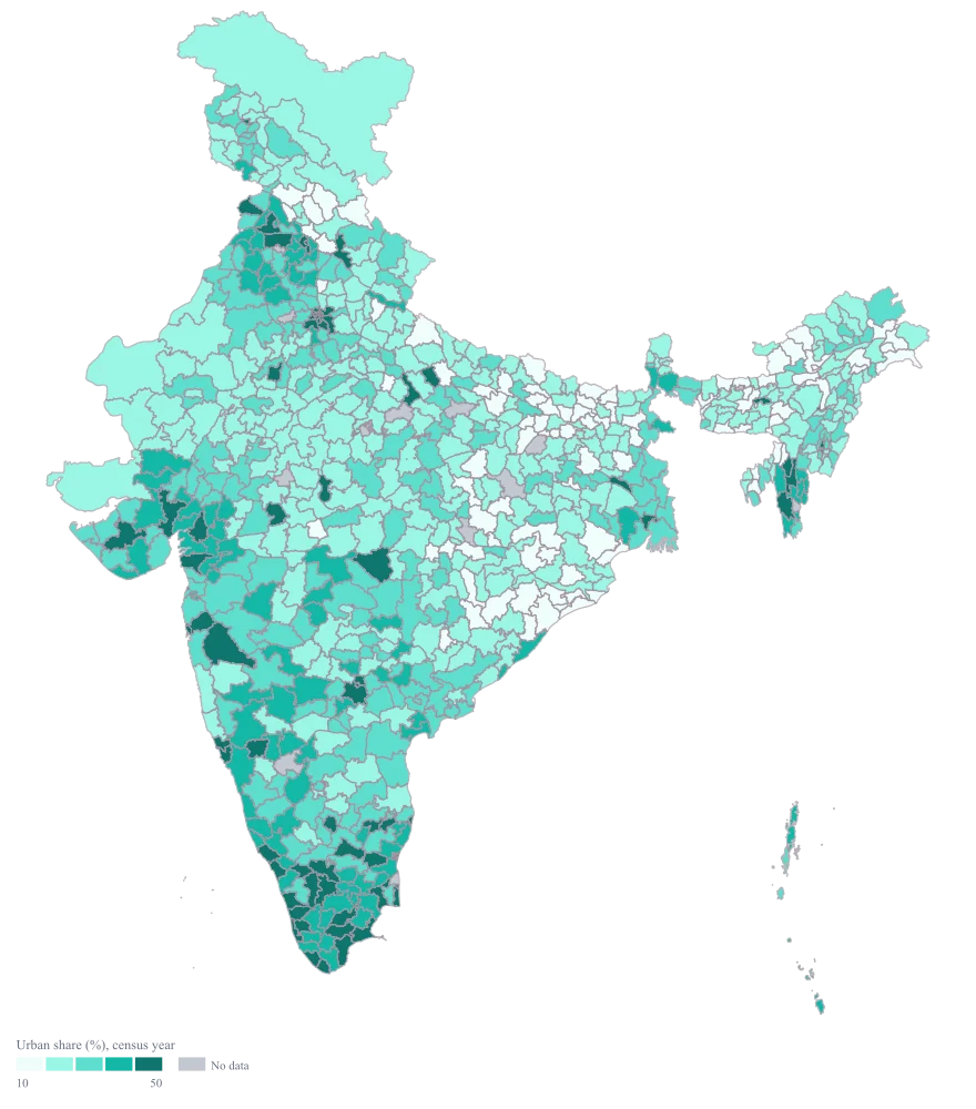
The four choices behind it
How this map was made
Four questions, in the order the builder asks them. Every picture below is the real renderer on the real geography, so this is the sequence you will see on your own screen.
- Step 1
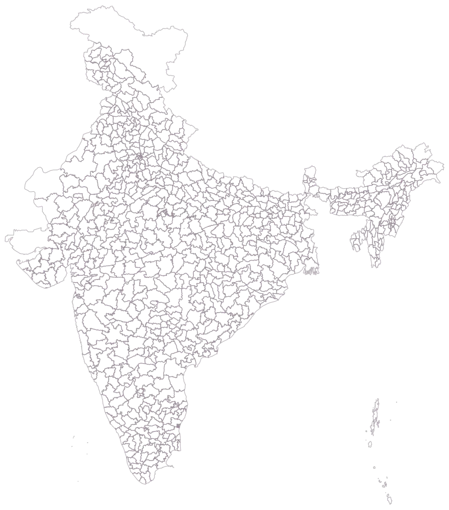
Choose the District level and set the area to India, and count what you are given before you load anything.
The whole country is drawn as 785 empty district outlines, no colour and no legend. This is the moment to notice that the map holds districts as they are now, including ones created long after your census was taken, and that a few of those outlines have no possible row in your table. Every blank you will see later is decided here.
- Step 2
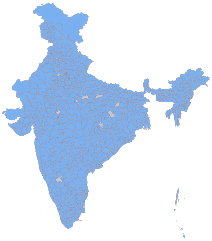
Paste the sheet with the district name first, then read the matched list against your own row count and check the duplicated names by hand.
772 districts come up in flat blue, eight more join and stay grey because their cells are empty, and five outlines are never reached at all — one row per distinct district name is as far as a name-keyed sheet can go, and Aurangabad, Pratapgarh, Bilaspur, Hamirpur and Balrampur each name two districts. On a Pan India sheet this picture is the only place a silent mis-join shows itself: look at where the blue is, not just how much of it there is. If a figure you believe belongs to Bihar has shaded a district in Maharashtra, it will be perfectly obvious here and invisible three steps later.
- Step 3
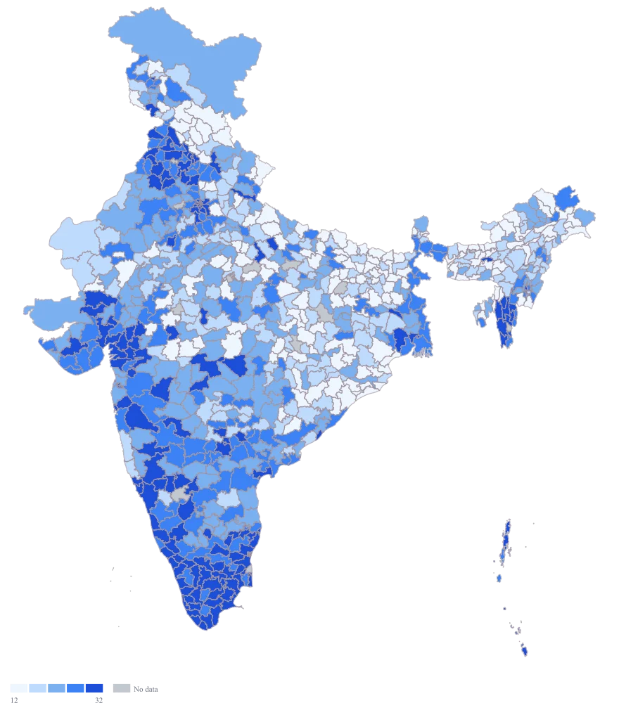
Point the colour at the urban-share column and leave the scale on automatic.
The ramp and legend appear. The automatic scale looks at the spread, finds the long tail a census share always has — a handful of city districts at or near 100 while the median district sits under 20 — and quietly bands by rank rather than by width, so the five colours hold about 155 districts each. That is already a defensible map. What it is not is a quotable one: the cuts land at 12.2, 16.9, 22.9 and 32.4, four numbers that describe this sheet and nothing else, and that will move the moment a row is added.
- Step 4
Switch the scale to custom, set the breaks at 10, 20, 30 and 50, change the palette to teal, and title the legend with the variable and its census year.
The legend now reads in shares a reader already has a feel for — under a tenth of the population in areas classed as urban, under a fifth, under three-tenths, under a half, and everything above — and the bands hold 92, 298, 202, 98 and 82 districts. That is a less even split than equal counts gave, and the unevenness is the point: these five cuts mean the same thing on next decade's sheet and on a state map drawn beside this one, where rank-based bands would silently redraw themselves for every sheet and quietly stop being comparable. The teal ramp is a single hue running light to dark, so it survives greyscale and colour blindness alike, and the dated legend title does the one thing this map most needs: it stops a reader taking a decade-old count for a current one.
The sheet
Paste these columns straight from Excel. The first column names the place; the rest are numbers. Nothing is uploaded — your sheet is read in the browser.
| District | Population in areas classed as urban (%) | Households enumerated (thousand) |
|---|---|---|
| Chandigarh | 97.3 | 235 |
| Mumbai | 96.8 | 664 |
| Kolkata | 94.2 | 1024 |
| Chennai | 92.6 | 1108 |
| Hyderabad | 89.4 | 872 |
| Bengaluru Urban | 81.5 | 2140 |
| Kamrup Metro | 78.3 | 246 |
| Surat | 64.7 | 1286 |
| Pune | 58.9 | 2058 |
| Thane | 52.1 | 2394 |
| Aurangabad | 41.3 | 712 |
| Beed | 22.4 | 528 |
| Jaisalmer | 13.2 | 128 |
| Dantewada | 8.6 | 118 |
| Kinnaur | 0 | 19 |
| Niwari | — | — |
The first 16 rows of 780. The map above is drawn from all of them — a national map wants a national sheet, and yours will be longer than this too.
Why this map
A census variable is one value per district and there is nothing to weigh it against, so shading the district by it is the entire map. The range here runs the full width of the scale — from Kinnaur, with nothing at all classed as urban, to the eight districts that are entirely so — and 772 of the 780 rows carry a figure, which is the shape that makes a national census map worth drawing at all. The figures are invented illustrations built to exercise the map, not census values; nothing on this page reports what any district was actually counted as.
What goes wrong
A bare district name is not unique in India, and a Pan India sheet is where that bites. The shipped geometry genuinely holds Aurangabad twice — Maharashtra and Bihar — and Bilaspur twice, and Hamirpur twice, and Pratapgarh twice, and Balrampur twice. A row that says only "Aurangabad" is an exact match on the name, so the matcher does not flag it, does not offer a choice and does not report a problem: it resolves to whichever of the two the index reached first, which here is Maharashtra. If you meant Bihar's Aurangabad, the figure has landed several hundred kilometres away and nothing anywhere will tell you.
Never map a Pan India district sheet from names alone. Carry the state through from your source and reconcile against the map's own district list before you paste, so the ambiguous handful are resolved deliberately rather than by index order. Check the five duplicated names by hand every time — it takes a minute and it is the only error on this list that produces a perfectly plausible map with the values in the wrong places. This sheet does the only thing a name-keyed sheet can do honestly: it carries one row per distinct name, so Aurangabad goes to Maharashtra's, Pratapgarh to Rajasthan's, Bilaspur and Hamirpur to Himachal Pradesh's and Balrampur to Uttar Pradesh's, and the other five — Aurangabad in Bihar, Pratapgarh and Hamirpur in Uttar Pradesh, Bilaspur and Balrampur in Chhattisgarh — are left visibly grey instead of being quietly given somebody else's number.
Census figures are old by construction: the count happens once a decade, so on the day it is published it already describes a country that has moved on, and by the end of the decade it describes one that is gone. Meanwhile the geometry keeps up with the present. Eight districts are blank on this sheet — Niwari, Agar Malwa, Mayiladuthurai, Vijayanagar, Malerkotla, Charki Dadri, Bajali and Hnahthial — not because they were missed but because none of them existed when the count was taken. Each was carved out of a neighbour afterwards, so none has a census row at all. Every other district created since the count carries its parent district's figure here, which is the other way of handling the same problem and needs saying just as loudly.
Put the census year in the legend title or the caption, in words, and expect to be reading it aloud in the meeting. Style no-data as grey and state that grey means "no row for this district in this census", which is a different sentence from "no data". Where a new district matters to the argument, say in the text that its figures are inside its parent district's value rather than leaving a hole the reader has to interpret. Kinnaur is a genuine 0 here — nothing in the district is classed as urban — and that is a measurement, so it sits on the scale and must not be styled as missing.
A Pan India ramp assumes every district was counted the same way, and for a variable like this one it was not. What counts as an urban area is partly a state administrative decision — a place becomes a statutory town when the state constitutes a municipality there — so two districts with identical settlement patterns in different states can land in different bands because one state has constituted municipalities freely and the other has not. The ramp presents that as a fact about how people live, and it is partly a fact about how states legislate.
Read the variable's definition before you map it nationally, and if the definition has a state-level component, say so in the caption in one sentence. Where the comparison has to be defensible, map one state at a time, or restrict the national map to a variable with a single national definition — a headcount, an age, a household size — and leave the administratively defined ones to state-level exhibits where everything on the page was counted under the same rules.
Other worked examples
- District-Wise Heat Map of India — Madhya Pradesh, district, colour
- Population Density Map of India by District — Pan India, district, colour
- Survey Results Map of India — Odisha, district, colour
- India Market Share Heat Map — Pan India, district, colour